The YouTube Music playlist and album redesign first rolled out for Android tablets, though it gradually began trickling down to some phones, too. Some of these changes were made with Material You in mind, thus enabling users to experience a more consistent UI experience across all Google apps. YouTube Music is now getting another visual update which includes some new buttons that are more in line with the Material You design principles.
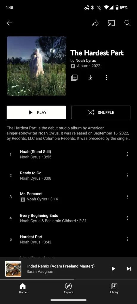
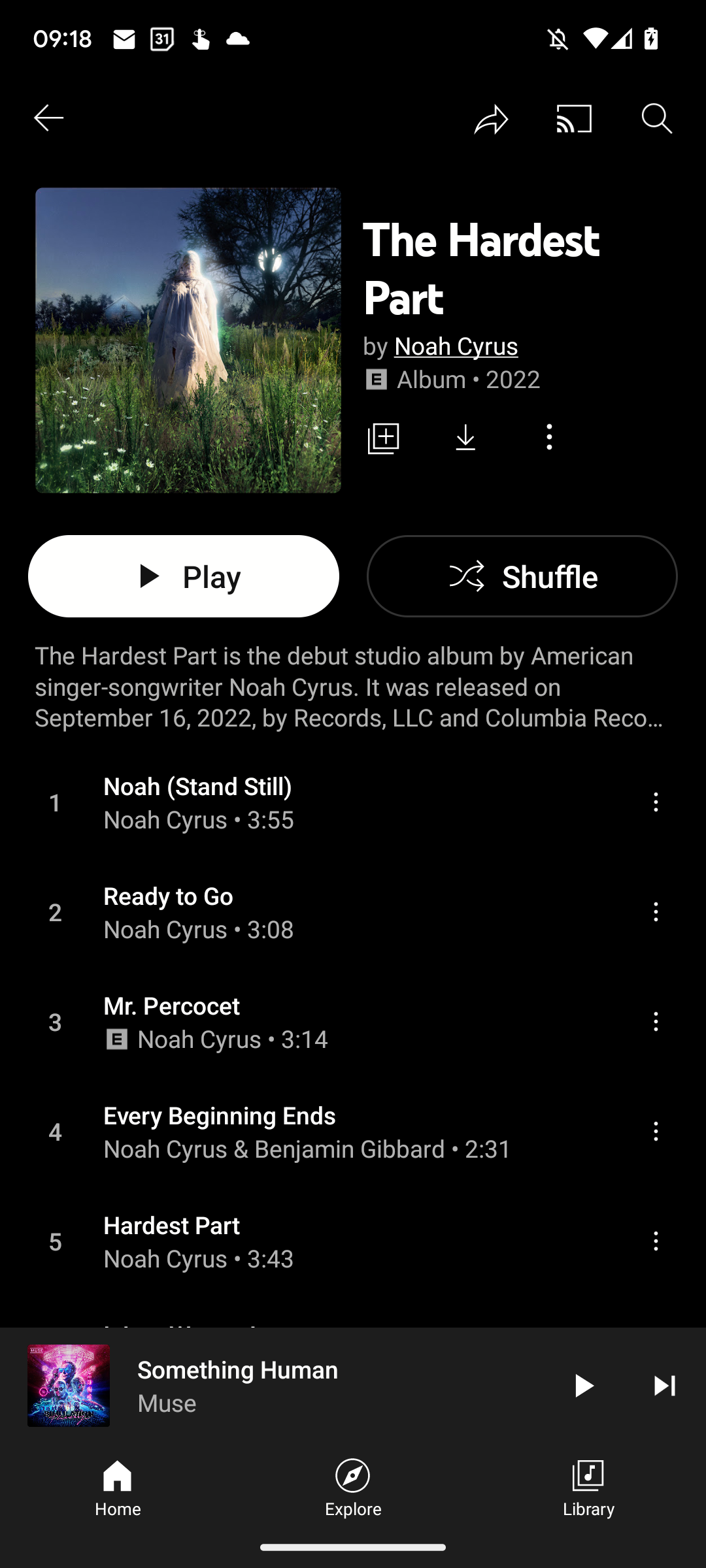
Google has been slight and subtle with the rollout of the new tablet-oriented YouTube Music UI for Android phones. While we wait for its arrival, it seems like the company has quietly made some adjustments to the shape and general look of some of the buttons in the app. The first of these changes see the current rectangular shuffle button being ditched in favor of a pill-shaped button, appearing on both playlist and album views, per 9to5Google.


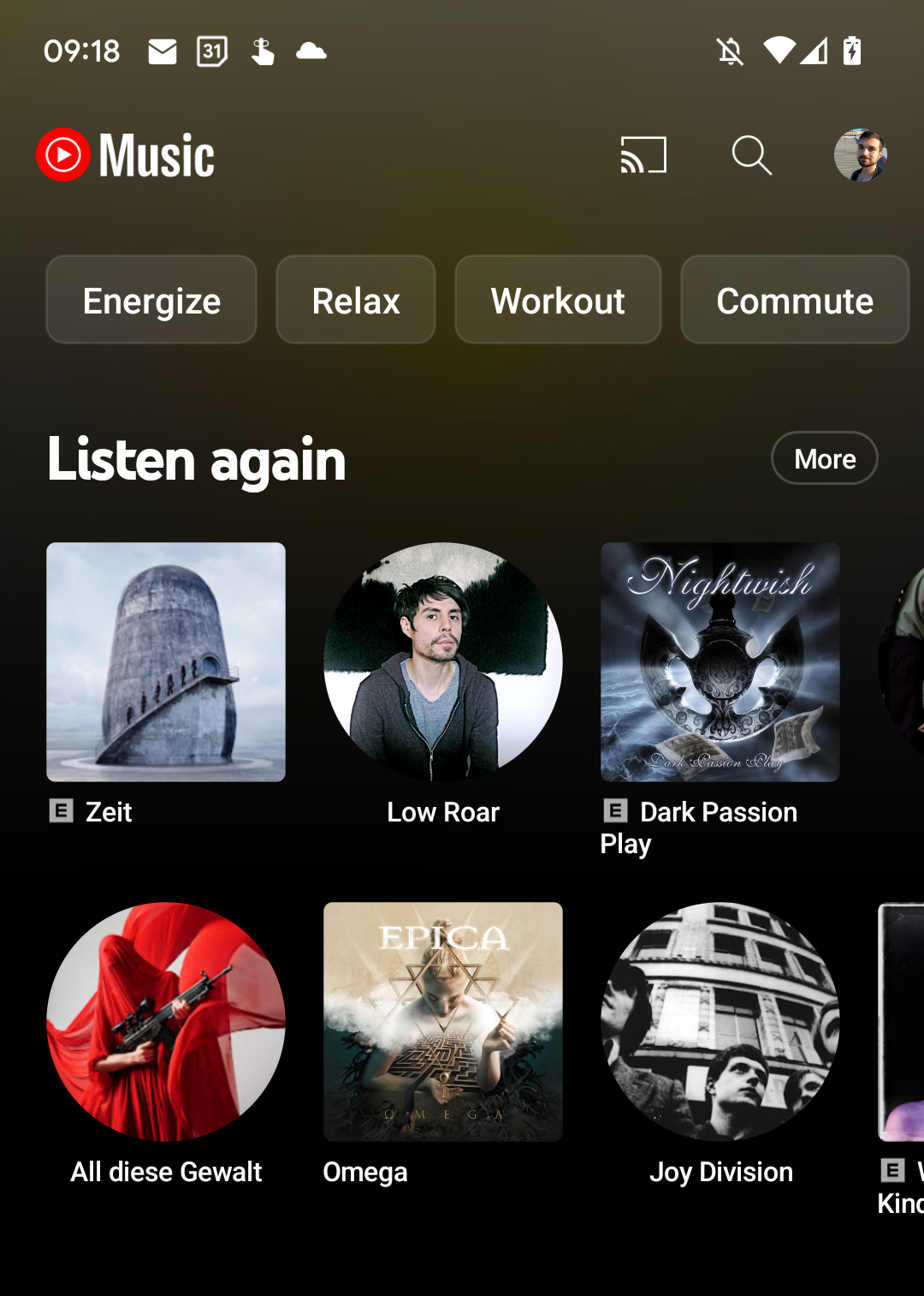
Furthermore, the top of the Home feed which includes mood filters such as Workout, Energize, Relax, etc, is now situated within rectangular-shaped boxes and rounded corners instead of the usual pill format. To cap off these inclusions, the "More" button next to playlists like Listen again, Mixed for you, and so on, is now located within its own pill-shaped button, rather than being in a separate block of text.
The feature is not widely available for all users, but it seems to be available for a handful of users already including some of Android Police's regular readers. While these are not major inclusions to YouTube Music, Material You fans will certainly appreciate its arrival on their phones.
Thanks: Nick


