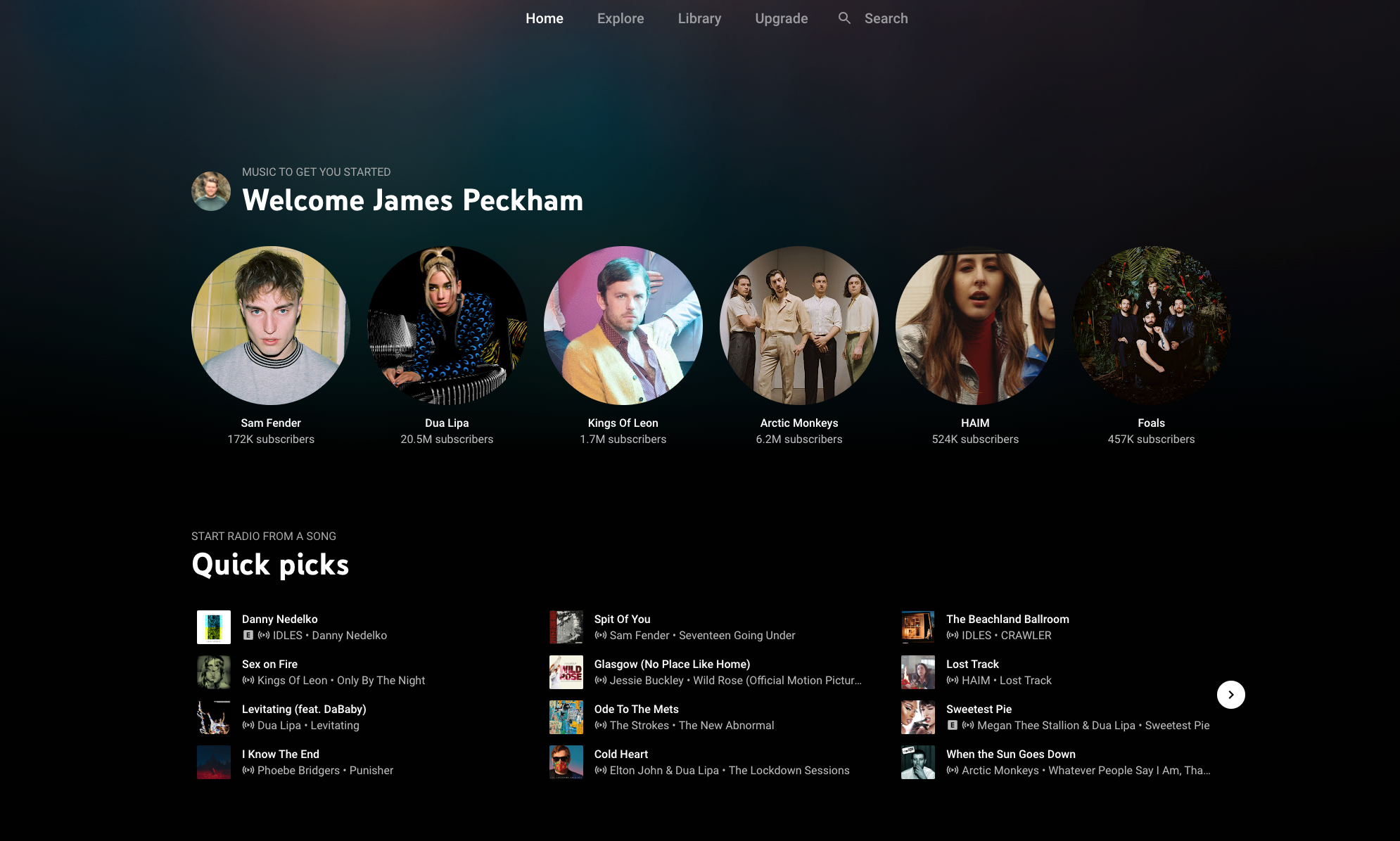
YouTube Music just had a minor tweak that may make finding what to listen to on the streaming service a touch more enjoyable. For the first time, YouTube Music is displaying a color at the top of the interface on the homepage. Previously, this has been a dark screen, but a new update rolling out for users now shows a rotating color palette on this part of the menu.
First spotted on Reddit by u/Lower-Biscotti, I’ve found the feature appears for me on the YouTube Music Android app and the web player. Others have said it appears in the iPhone app as well. It’s not rolling out for everyone yet, as some other Android Police writers are still seeing the old design, so it seems to be a slow rollout. There's no official word from YouTube on when you will get this new look.
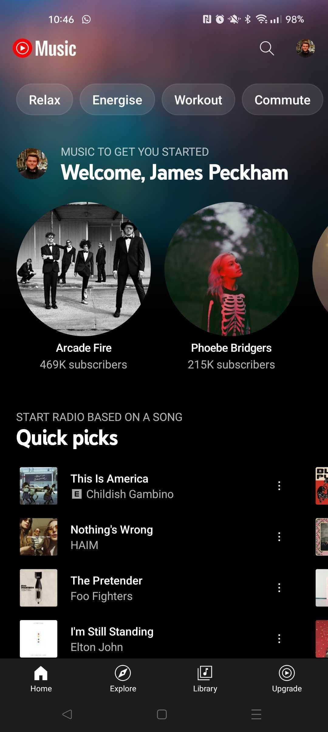
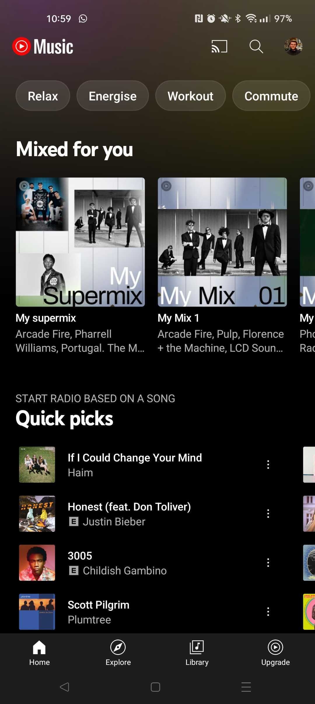
The splash of color in the mobile app sits behind the YouTube Music logo, the pills for different Moods, and stretches down into the first row of music selections. It also stretches up to the system status bar, so the colors sit behind your notifications and elements like the clock and battery life. You can’t pick this color, and it changes when you leave and return to the app. It also sometimes changes when you refresh the homepage.
During my testing, I’ve seen two different designs in the app, and there doesn’t seem to be a clear reason for the colors it is picking. You can see an example of the design on the web player at the top of this article, plus below we've compared the old design to the new look on the Android app.
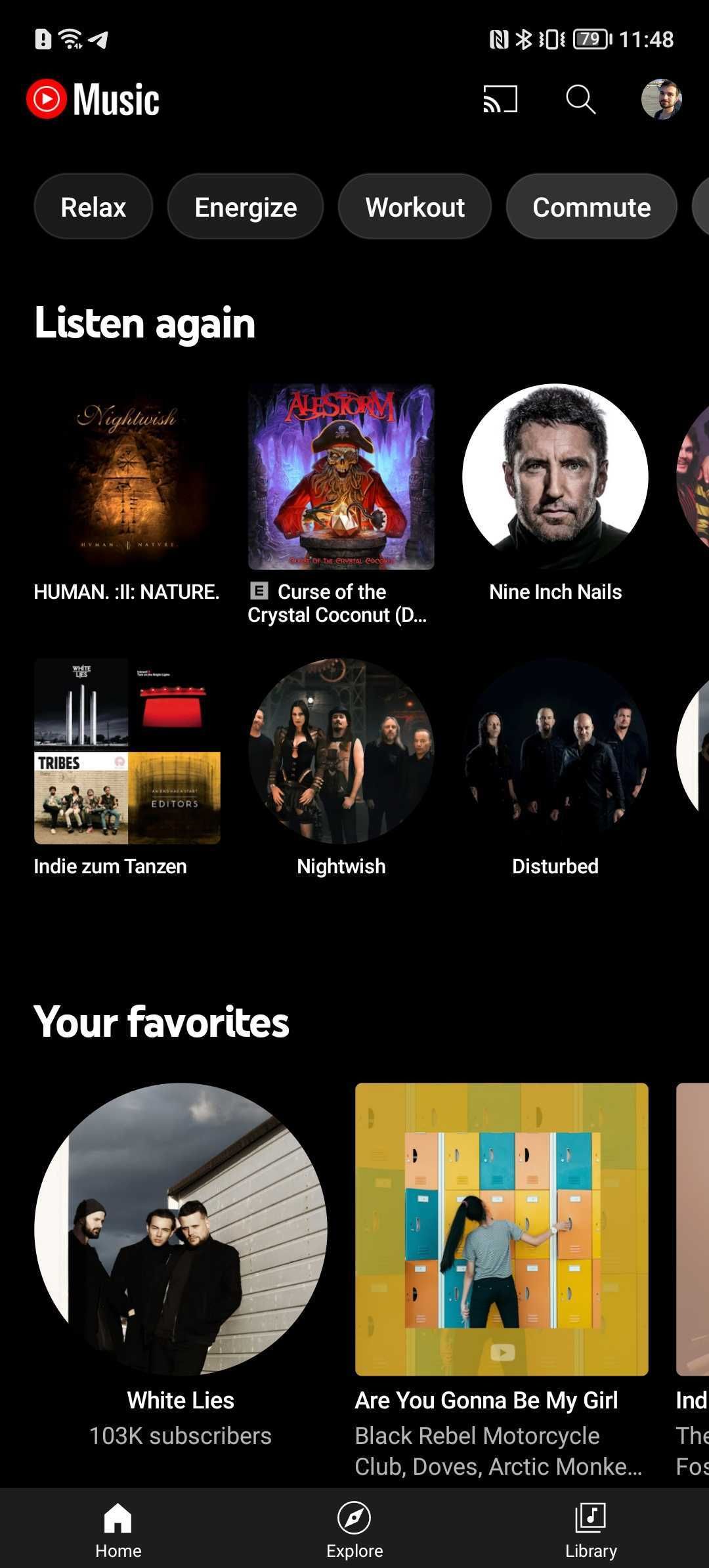
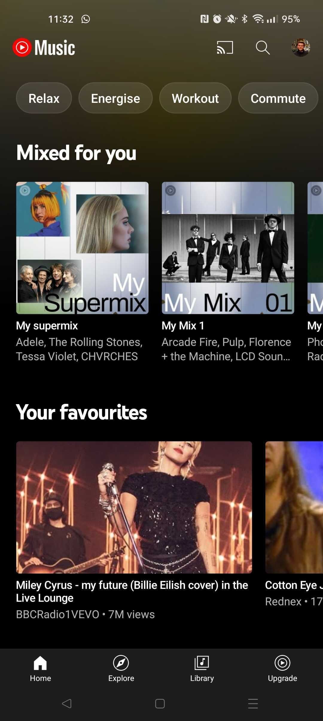
Spotify offers a similar feature that changes the shade on its homepage around the time of day that you’re using the app. That doesn’t seem to be the case here, and it seems much more randomized. Scrolling through the different Moods and playlists in the Android app of YouTube Music also drops the color and switches to an alternative design that the company introduced in 2020.

