Read update
- New Add to Playlist now rolling out along with new artwork for Mixed for you playlists
YouTube Music had a rocky start, to say the least, but a lot of problems have been fixed and things are vastly better than in the early days following the death of Google Play Music. The streaming service is currently testing another big improvement which should make the experience of adding your favorite tunes to your playlist a lot better.
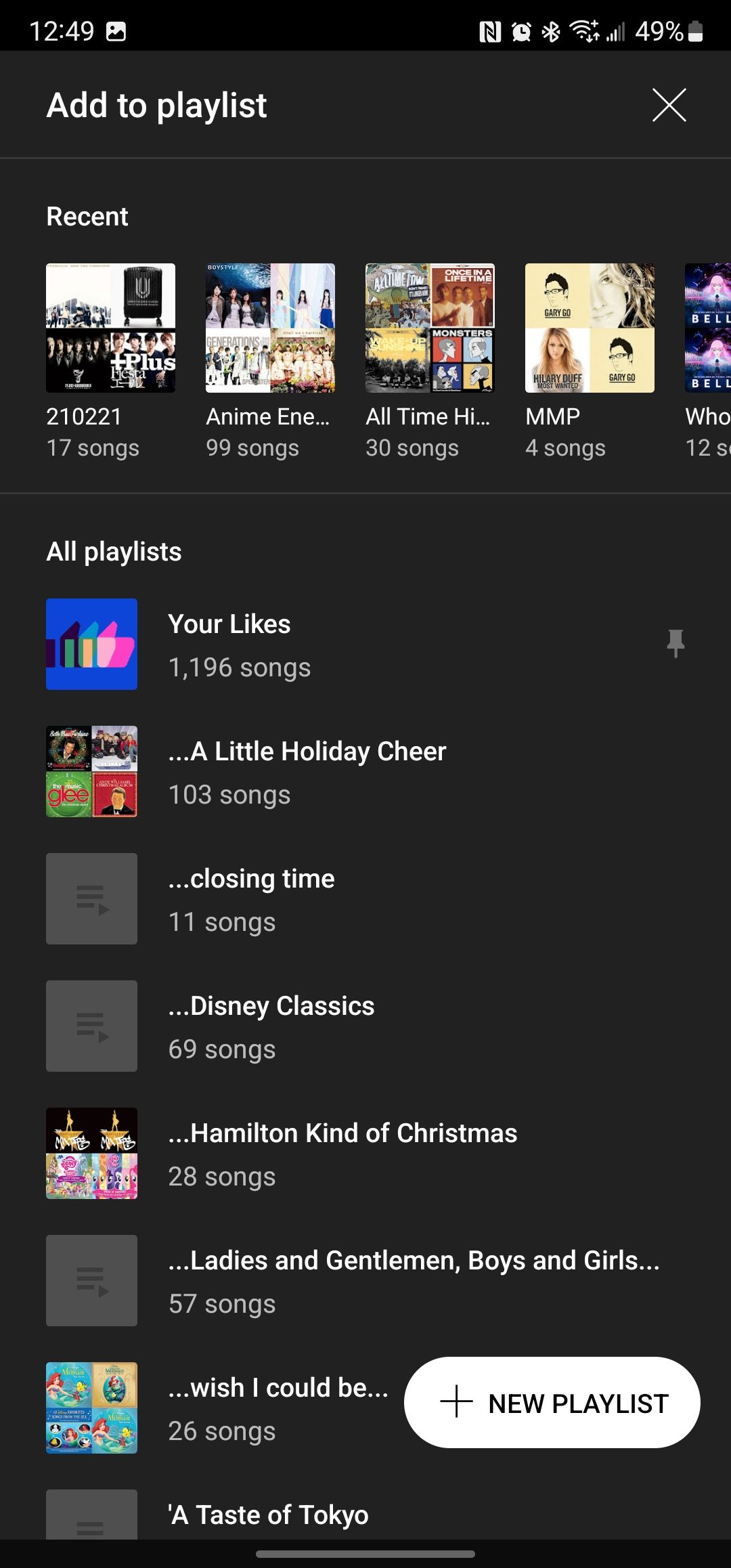
This new design was first reported by a user on Reddit (via 9to5Google). Currently, the "Add to playlist" menu shows a simple list view of all your playlists, with the recent ones highlighted up top. While it's certainly useful, it looks boring. Come on, you got to spice things up a little. The new design shows you your recent playlists in a carousel up top, while the rest is still organized in a regular list view, but at least you can now see the playlist artwork and the number of songs in each. The "new playlist" shortcut at the bottom is turned into a floating action button (FAB), while the interface itself is now a full-width view rather than a floating window.
Old vs. new
One thing we should note is that this new design, as beautiful as it is, actually seems to be rather buggy in the current state. One user is complaining that they have trouble scrolling down in the menu. This is likely because the redesign is part of an A/B test — it's basically an involuntary beta testing program users are randomly picked for, and stuff breaks often enough. Google is likely going to catch these errors and fix them before the change goes live for everyone.
YouTube Music has been carving a reputation for itself recently. A study reveals that the app is currently the fastest-growing music streaming service in the West, with a 50% year-over-year growth from 2020 to 2021, and it currently holds an 8% share of the market — still nothing compared to Spotify's 31% and Apple Music's 15%, but hey, empires are not built overnight. With more people using it than ever, it's good to see that Google is making it a priority to improve the user experience.
UPDATE: 2022/02/24 15:30 EST by Ara Wagoner
New Add to Playlist now rolling out along with new artwork for Mixed for you playlists
A month after A/B testing this new UI, YouTube Music has begun rolling out the new Add to Playlist screen. The screen's buggy scrolling has been fixed; it now actually scrolled faster and smoother than Your Library. The Your Likes playlist is pinned to the top of the A-Z Playlist list, with a pushpin symbol, but it appears you cannot unpin it or pin any other playlists to the top of the list. Hopefully, that can be added later.
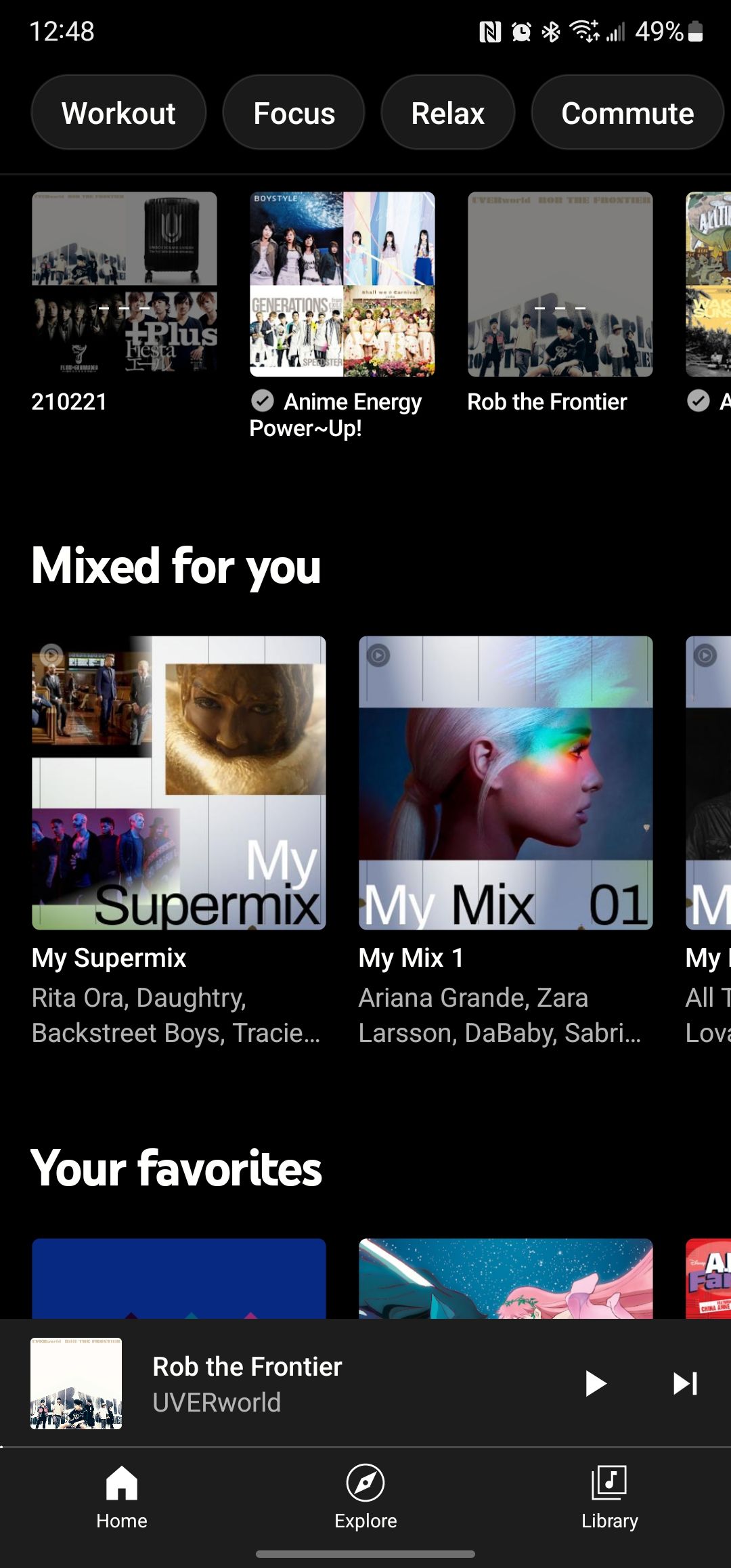
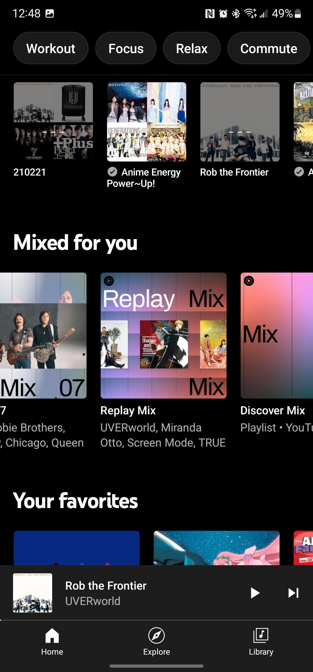
Another small but welcome upgrade comes to almost every Mixed for you playlist, further standardizing the look. The new album layout for My Supermix leaves something to be desired, but the Replay Mix looks great.


