Android 12L is one of many baby steps Google is taking to bring the OS's functionality on tablets up to par with Apple and iPadOS. You could consider the company's mission to update its own apps for tablet-friendliness as another 20 or so steps it'll need to take. Progress has been gradual, but persistent, and it looks like YouTube Music is the latest step with a few small, but meaningful interface tweaks.
As spotted by 9to5Google, tapping the account icon in the top-right corner of the app's home page now triggers a smaller pop-up instead of a full-screen page. This tweak increases that sense of cohesiveness — pop-ups for the Account interface are also seen on the likes of the Google Play Store — and it's cool to see YTM now looking a tiny bit more like its Google brethren.


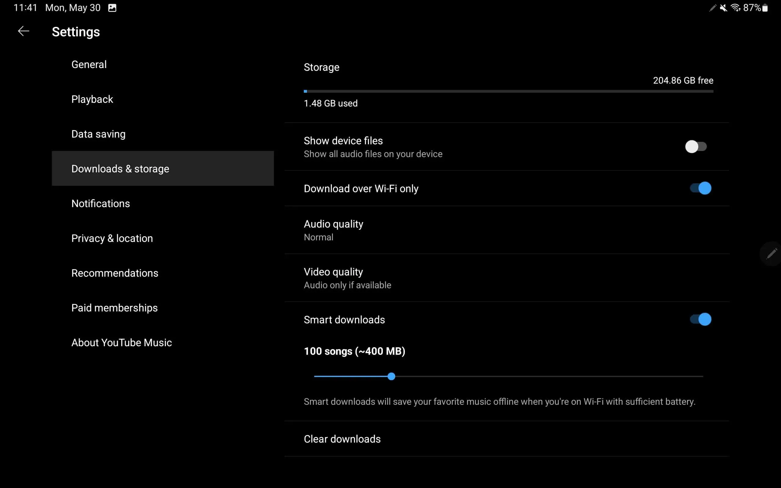
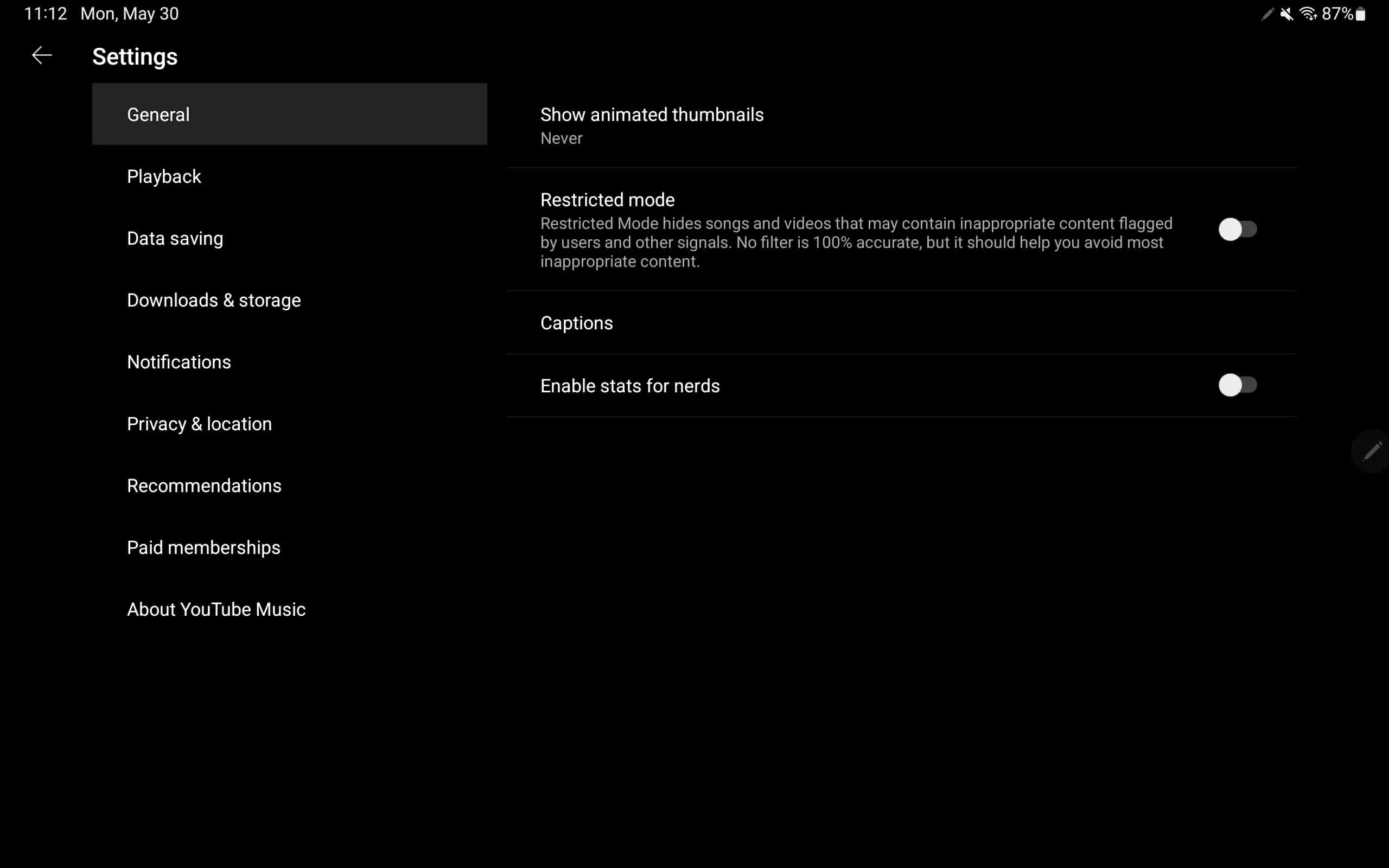
Head over to the Settings page, and you'll see changes there as well. Like other first-party Google apps, the UI has been split into two — on the left, you get a list view comprising various settings categories, while the corresponding controls are kept on the right. Also notice that there's no longer a single list stuffed with every control there is — instead, you get categories for better accessibility: General, Playback, Data saving, and so on.
We are yet to see this categorization on Android phones, though, meaning the Settings UI is just as cluttered as ever, but that will hopefully be changing soon. Earlier this year, YouTube Music had brought some improvements to its home screen on tablets with a promise for more of these changes based on user feedback. The tweak to its Settings page looks to be a part of that.

