YouTube Music has spent the past several months swapping the look of many parts of its interface for a more unified design. Early last year, the service slowly pushed a UI redesign to playlists, making this song collection appear more spruced up than before, with a larger cover art in the top center and a row of useful action buttons beneath it. The same visual makeover made its way to the album view on tablets in June 2022 as part of Google's renewed focus on large-screen devices. Now, the new interface is hopping over to albums on smartphones.
The latest change brings YouTube Music's albums in line with the app's playlist view, which shows the album art in the top center of the screen. Additionally, the artist's name and release year sit at the top of the cover art, with the album's name and a Wikipedia-sourced description appearing beneath it. In a single row directly below the album name, you'll also see the five action buttons for download, add to playlist, play, share, and the overflow (three-dot) menu.
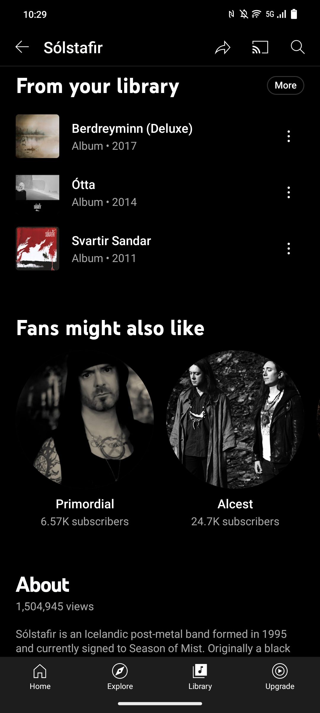
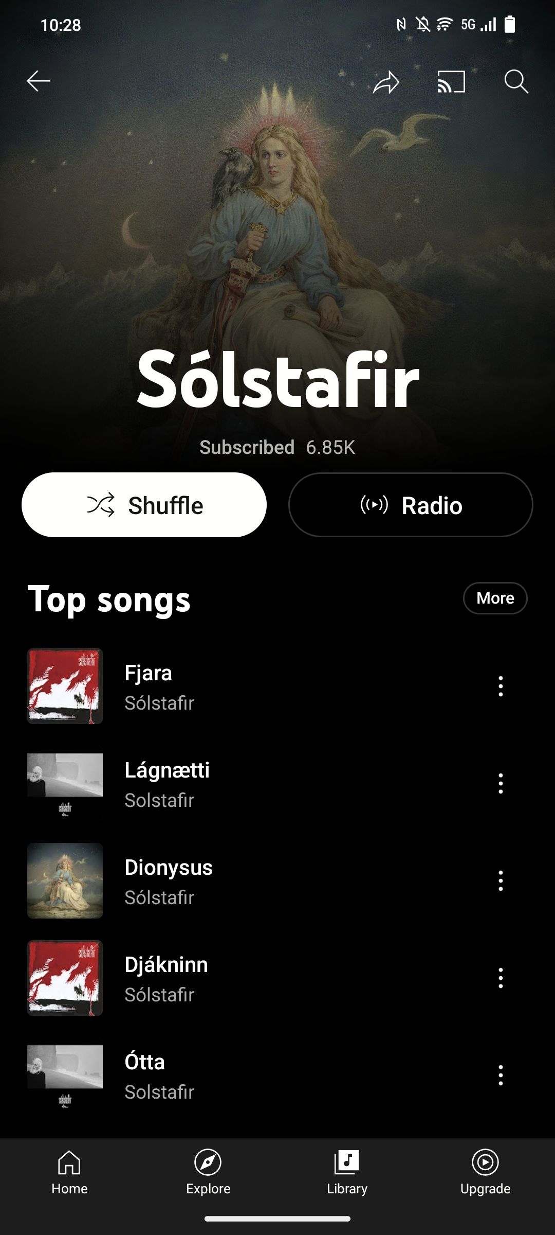
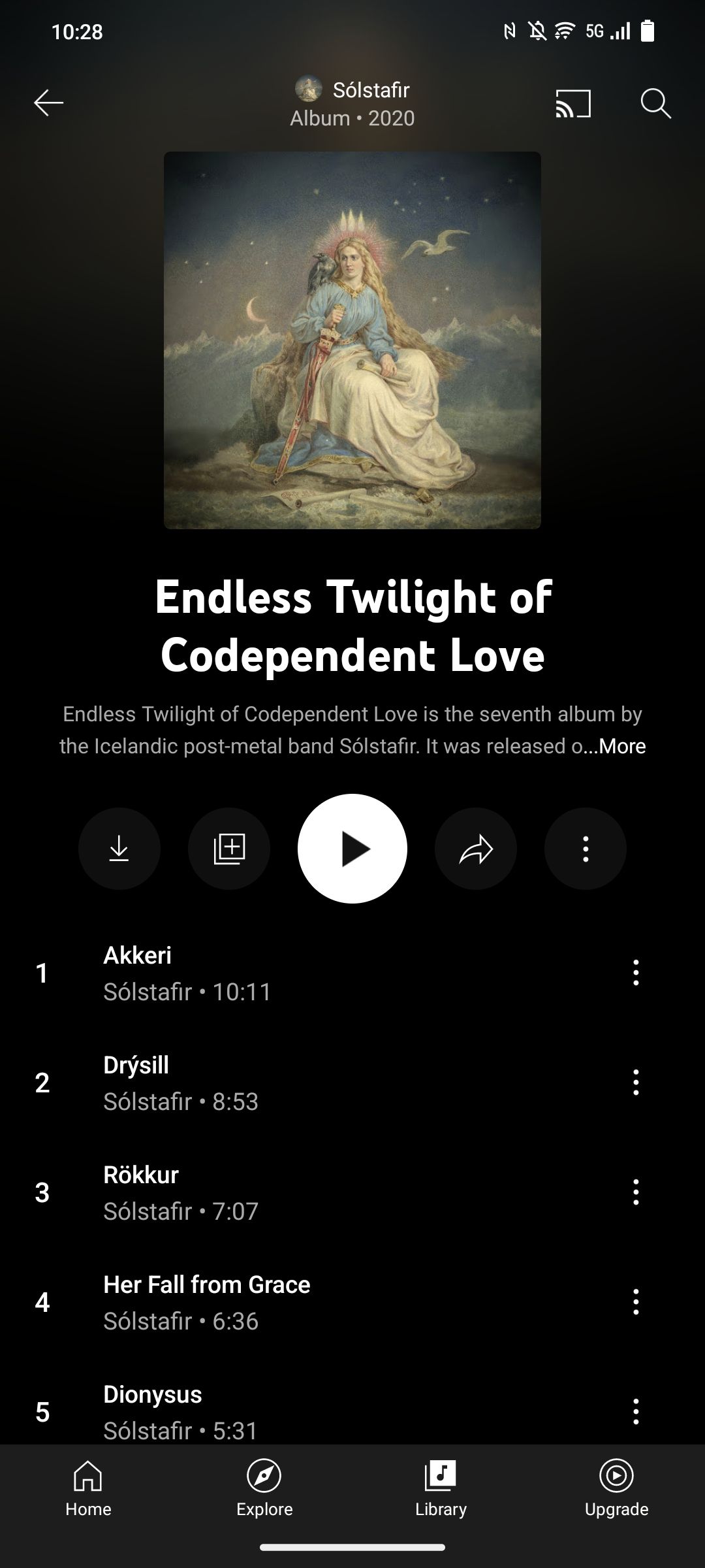
Prior to the redesign, the cover art was flush left, with the album title, artist, release year, and the usual action buttons next to it. Meanwhile, the share button used to appear in the top right corner alongside the Chromecast button.
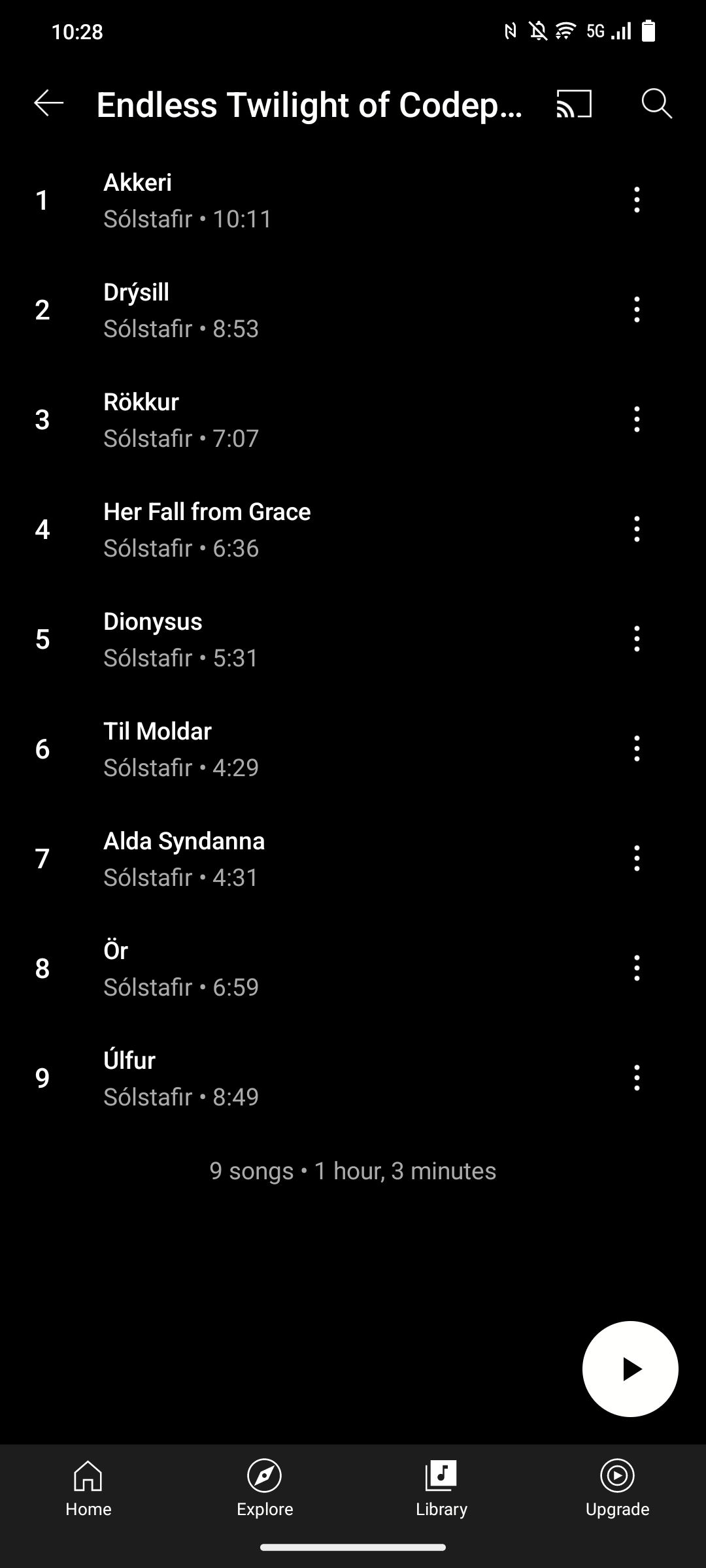
With the updated UI, you'll find the number of songs in the album and the total duration of all listed songs at the bottom of the track list. There's also a play FAB that shows up as you scroll down the list.
Meanwhile, the shuffle button, which was previously located next to the play button, has vanished from the row beneath the cover art and has been relocated to the overflow menu. Of course, you can also immediately tap that same button on the playback screen, making its presence on the album screen somewhat redundant. So, it makes sense to tuck it away within the three-dot menu.
According to 9to5Google, the redesign is being rolled out as a server-side update to YouTube Music on Android and iOS, so it may not show up on your device right away.

