Google has been tweaking the YouTube Music app's design over the last few months to deliver a better user experience. In July, the company rolled out an improved playlist design on Android tablets that eventually made its way to phones. Then, the Library tab got a massive visual overhaul in August this year, followed by the addition of Material You buttons the following month. Now, YouTube Music's Now Playing screen is getting some notable design changes.
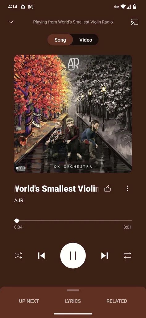
The changes begin right at the top: YouTube Music will display the source of the current playing song. So, if you are playing a song from a playlist or an album, it will appear as "Playing from [album or playlist name]." This is a handy way of knowing the source of the current song. The Cast button has moved to the top-right corner, letting you quickly play content on other Cast-enabled devices.


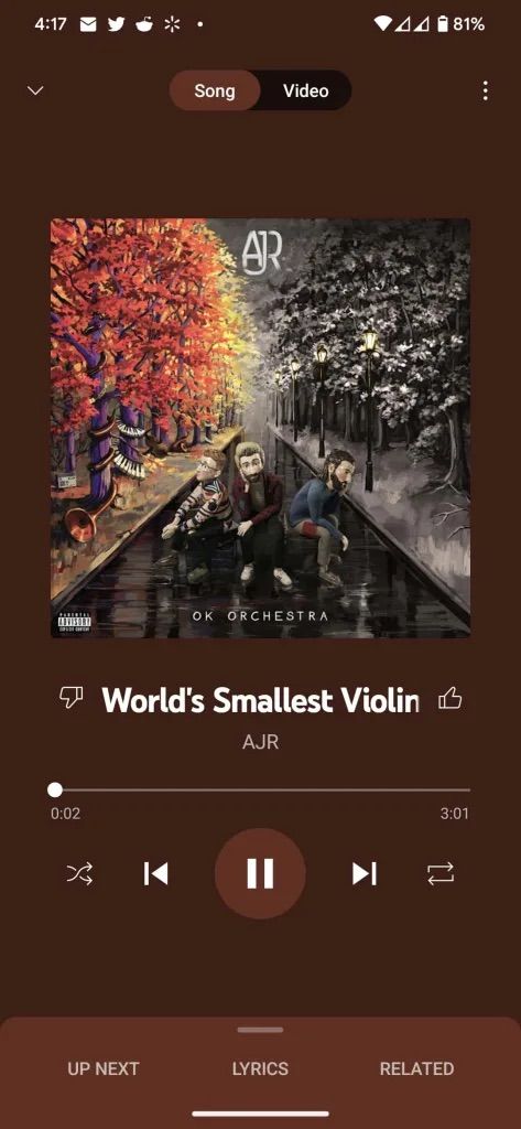
Left: Old Now Playing design; Right: New design
The artwork itself seemingly looks slightly bigger and features more aggressively rounded corners. You will find the song name below it, which is now left-aligned, along with the thumbs up and the three-dot menu buttons. As a part of the redesign, Google has moved the dislike button to the overflow menu. YouTube started hiding the dislike counter from videos in late 2021, which could have inspired this change. The like button remains easily accessible, so you can quickly add new songs to your Liked playlist.
Lastly, the Play/Pause button no longer pulls colors from the artwork. Instead, it features a white background, making it stand out for easy accessibility.
9to5Google reports seeing the redesigned Now Playing screen go live on some of their devices running the latest build of the YouTube Music app, indicating that this is a server-side rollout from Google and could take time to show up on your device. For now, if you are on YouTube Music v5.32 or newer, you can try force-closing and re-launching the app to see if it triggers the new design.

