Flourish is a data visualization tool that lets users import and view data in various formats. Anyone can use it for personal use, such as viewing health data collected by any Android smartwatch, but larger organizations can also use it to manage large data sets.
Many people use Google Sheets to visualize data, a viable option for simple data sets. However, Flourish is more powerful and offers more ways to explore data. This guide walks you through Flourish and how to get started.
What is Flourish?
Flourish is a powerful data visualization tool that helps users quickly create high-end data visualizations and stories using any data that can be placed in a spreadsheet. This data can represent anything: time, population, location, or whatever else you wish to display.
Although Flourish officially launched in 2018, the company had been working with major news and humanitarian organizations like the BBC and World Health Organization since 2016. In 2017, Flourish partnered with Google News Lab to provide free team accounts to all newsrooms worldwide. The Google News Initiative training center also provided free training for newsrooms. Canva, a popular graphic design platform, acquired Flourish in 2022.
Since those early beginnings, Flourish has been regularly updated with new templates and capabilities, letting businesses, publishers, and newsrooms illustrate data and trends in new and engaging ways. Anyone can use Flourish for free, though there are paid tiers that unlock powerful data visualization options.
What can Flourish do?
Flourish's data visualization tools provide users with a large amount of flexibility when visualizing data. The results are easily embeddable within most websites, automatically resizing based on the user's screen size and device.
For example, the Flourish chart embedded below shows multiple countries' urban populations, animated over time. It also contains a legend indicating which continent the nation is part of and a counter at the bottom tallying the world's total urban population. Once the data was imported into Flourish, all that was required was to fill in some fields before adjusting the output.
Flourish isn't limited to showing one visualization at a time. Multiple visualizations can be combined to create an interactive slide show called a "story." Stories allow you to create narratives with your data, seamlessly connecting each slide with animations. An example of a Flourish story can be seen below.
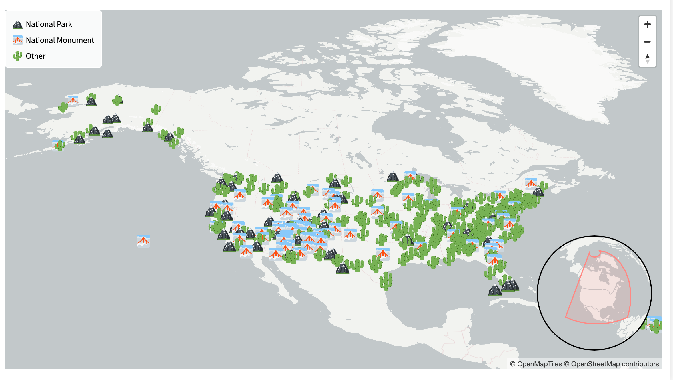
Flourish also lets you show data on a map, and you can use stories to change and animate the map to illustrate the data. You can also upload voice-overs to explain the data being shown. Adding voice-overs can make a visualization seem like a video file, with the added benefit of allowing users to interact with the illustration as it animates. Click the play button below for an example of a Flourish story that uses these features.
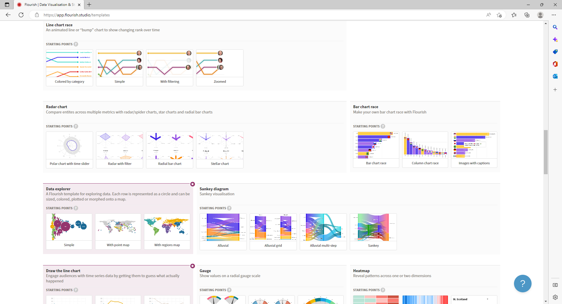
Flourish has dozens of templates for you to choose from and combine. It also allows you to upload custom maps and design your own templates. However, creating custom templates requires Flourish's software development kit and some coding knowledge.
What can you do with the free version of Flourish
Even if you're not part of a newsroom, you can sign up for a free account and take advantage of some of Flourish's features. You can choose from more than 150 free templates, and there's no limit to the number of projects you can create. These projects can be published and embedded on your website.
The free templates include animated bar chart races, line chart races, gauge charts, scatter charts, and other graphs, maps, and tables.
There is one major limitation to the free version of the product: Every project must be hosted on Flourish's site.
What do the paid versions of Flourish let you do?
If you want to create a data visualization for a large business, it's probably worth looking into the paid versions of Flourish.
Be advised: the paid versions of Flourish are pricey and designed with businesses in mind rather than individual users. The Publisher tier, which costs $999 per month for 10 users, gives you access to additional premium templates, lets you host embeds on your servers, and gives you access to "scrollytelling." Scrollytelling is a feature that lets you show different slides as you scroll down the screen.
The Publisher tier also lets you access live data from Google Sheets, create custom themes, and create password-protected visualizations that aren't accessible by the general public.
Flourish also offers an Enterprise plan, though it doesn't list its cost publicly. This plan lets you host fonts and additional design elements to use in your visualizations, along with an analytics connector that syncs with a company's existing analytics system. It also gives access to priority account and project support, security features, and the developer SDK.
How to use data with Google
Before you get started with Flourish, you'll need to know how to collate data. While small sets can be gathered by hand, you'll need to know how to use Google Sheets to scrape data to avoid wasting time with large data sets.


