Not long ago, Google announced a bunch of changes to the Google Home app that made it easier to adjust various features on your smart home devices. It replaced the large device icons on the home screen with more convenient interactive tiles and tweaked the app settings to allow greater control. As part of that announcement, several additional changes involving the home feed were revealed to be on the way — and they're now being rolled out on Android and iOS widely.
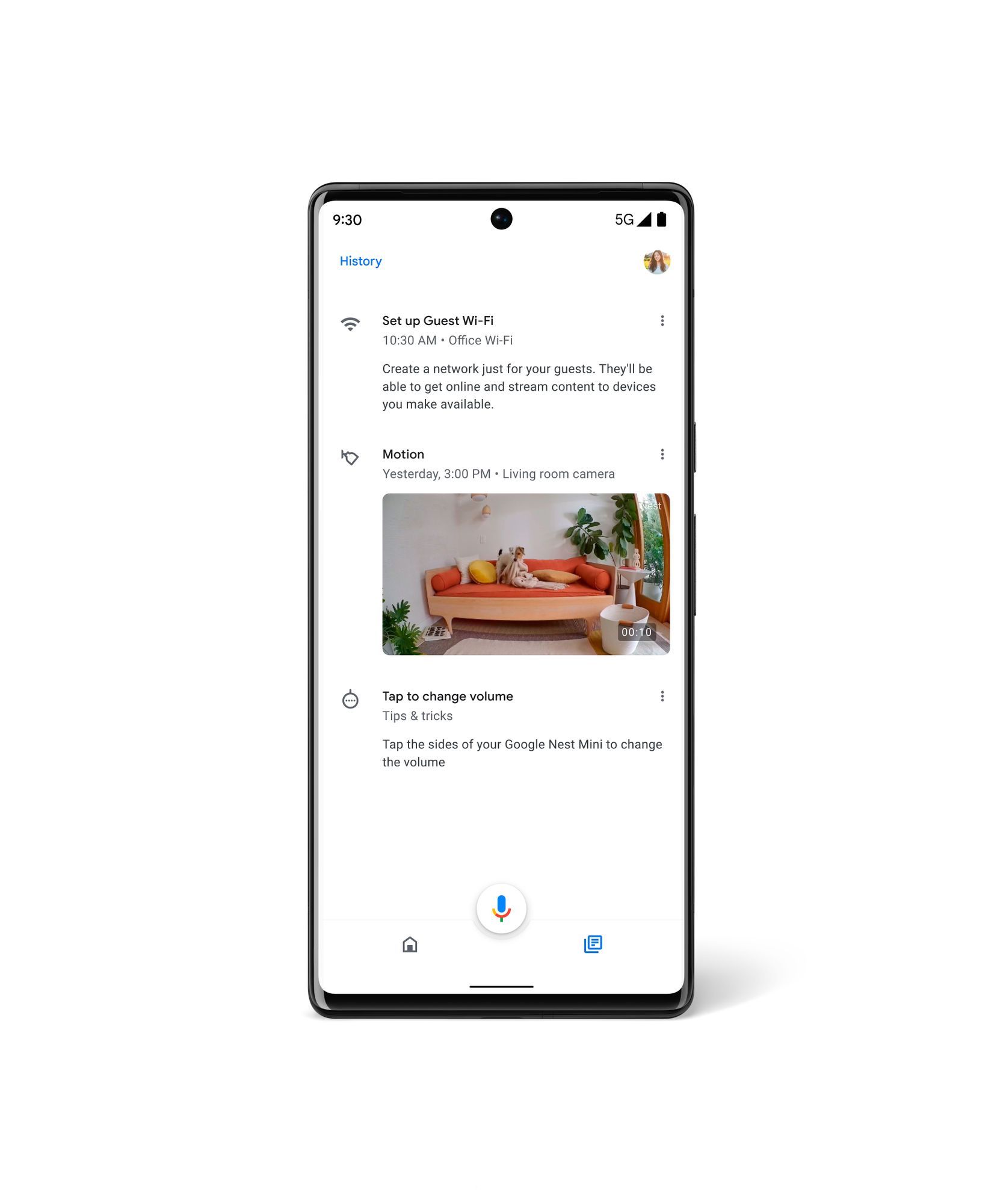
The older feed UI typically showed a series of cards, prompting you to check for important events from your supported Nest and Home products (via 9to5Google). Although the updated interface performs the same tasks, the UI has become much more intuitive, with the cards being replaced by a compact list that provides a single-line summary of an event. Events actually look like they're a part of a timeline now, and that timeline is a lot less cluttered thanks to a new feature that groups repetitive events, meaning less scrolling while offering more information.
In terms of interaction, you can tap a list item to open the alert, while the three-dot menu lets you dismiss the event or customize the feed. Activity detected by your Nest products is still shown, and image previews will accompany camera events. Meanwhile, "History" has been moved to the top-right corner, which is much more noticeable.
This rollout kicked off a few weeks back, so if you're one of the lucky few to have already received it, you're probably not seeing anything new. But if the updated feed has only popped up right now, then you will be greeted with an introductory message.


