latest
Chrome for desktop's latest interface tweak will make it easier to hop between search results
Available as an experiment in Chrome Canary for now

Chrome for Android recently added an experiment that allows you to move Google search results right below the address bar, making it easy to switch between found websites without having to return to the results overview itself. The company has now shared that it’s testing a similar option in Chrome for desktop, where it’s putting search results in a sidebar.
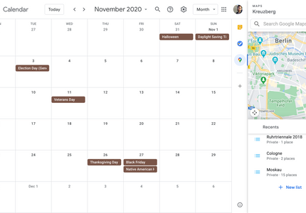
Google Workspace users are finally getting the handy Maps shortcut in Calendar
Don't worry, you can get rid of it if you don't want it
Read update
About two years ago, Google added sidebars to its web apps, enhancing its services with miniature versions of Calendar, Tasks, or Keep, and you can even integrate third-party applets. For the first time in ages, a web app has now received a new standard integration — you can now access an almost full-blown version of Maps right inside Google Calendar.

Google web search is getting a handy UI revamp
New sidebar is only available for certain searches and differs significantly by region

Barely a day goes by without Google running some new UI test or another in one of its core products, and today's example is a nifty new sidebar that's appearing in Google Search on desktop. The first example of this was pointed out to us as far back as September, but only now is it starting to roll out more widely.

YouTube Music migration from Google Play Music is breaking the YouTube sidebar for some
There is a solution, but it's not particularly desirable

Last month, Google began rolling out a transfer tool to help users migrate seamlessly from Google Play Music to YouTube Music. It's a one-click process that syncs your library, recommendations, playlists, likes and dislikes, and more. However, as is often the case with new tech like this, many users are experiencing a glitch, reporting that the migration of their data is causing their YouTube side panel to disappear on both desktop and mobile.


Google has given a bunch of its apps the Material Design treatment. Thus far, YouTube isn't one of them, even if you're running Android 5.0. But a few users have noticed a UI change that nudges things in that direction. They've fired up the app and slid out the sidebar, only to see that it's now white. With their avatar in the top left atop a colorful background, YouTube is starting to look ever-so-slightly more like what Lollipop users would expect.


The latest trend in Android user interface modifications is the gesture-based meta-launcher, a way of quickly launching and switching between huge numbers of apps. My personal favorite is still SwipePad, but the current fashion is for Holo-style, scrollable sidebars. Appsi is the latest among these, but differentiates itself with a ton of customization and plugins.

Finally, Google Has Come Up With A Predictable, Intuitive Sidebar Navigation Design - Now Please Add It To Everything [Update: Confirmed By Googlers!]
What exactly is the deal with slide-out sidebar navigation? Is it a standard Holo thing? Is it not? 3rd-party developers aren't really sure what to do

What exactly is the deal with slide-out sidebar navigation? Is it a standard Holo thing? Is it not? 3rd-party developers aren't really sure what to do with it, and even Google-made apps are all over the place. Some apps have sidebar navigation, some don't. The ones that do have it all function a little differently and none of the implementations were actually any good - until now.


While Android continues to get better about making its UI look gorgeous, there are still plenty of trends that have yet to be standardized in any meaningful way. Of course, part of that may be because they don't need to be. After all, Google doesn't want every app in the world to use the Google Now-style card view (though, so far, Google+, Search, and Currents are already among those that find inspiration from them). This leaves implementation up to developers, like those featured over at AndroidViews. Here are just a few samples of their work:

To call Rdio's latest beta a complete overhaul might be a bit of a misnomer. The feature set is largely the same, even if the design has gotten a facelift. However, seeing as the music streaming wars are heating up, it seems like a perfect time to take a second look at the service that always seems to play second fiddle to the behemoth that is Spotify.

When it comes to streaming subscription services, Spotify has stolen the spotlight in the US, where companies like Rdio have struggled to get the attention and acclaim they used to enjoy back before the Swedish invasion. With Xbox Music looming on the horizon, promising to install 30 million free, ad-supported tracks into every computer running Windows 8, the market has never been more competitive. Which makes Rdio's newly announced overhaul to its Android app all the more timely. It's even better that it looks fantastic.