latest
Chrome’s finally getting rid of its awful custom share sheet
Not that Android’s system share sheet is much better

Android’s share menu used to be one of its biggest strengths when compared to iOS — but then Apple spent years refining the iPhone’s while Google basically forgot Android had one. Recently, code changes have pointed to Android’s share sheet becoming a Project Mainline module, which would make it easier to update the feature and add basic functionality like the ability to choose which apps show up as targets. But even if Google fixes Android’s system share menu, there’s still a nasty problem plaguing the ecosystem: app-specific share sheets.

Google Chrome's getting very emotional with this latest share menu tweak
Emotion lovers, now's your time

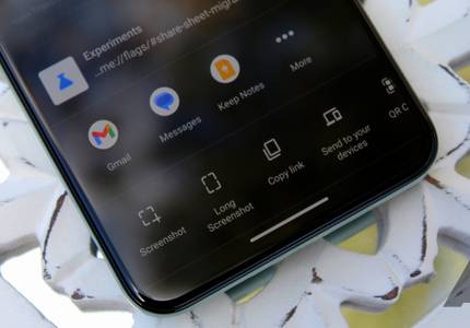
The Android share UI has come a long way — starting as a laggy, bloated interface in earlier versions before evolving into something a little better in Android 10, and only improving since then. The same can be said of Google's apps, like Chrome, where the company has introduced useful features like long screenshots, "send to your devices," and a QR code generator for the share menu. The latest inclusion to that growing list is the option to add animated emoji reactions (emotions) when sharing a web page.
Late last year, I decided it was time to move from my Huawei MediaPad tablet and get a new iPad. That wasn't my first foray into iOS/iPadOS — I'd previously had an iPod Touch and an iPad Mini — but it had been a few years since I'd last used Apple's mobile operating system. I was excited to discover what it offers and to explore all the big and small differences between it and Android. My journey uncovered some frustrating truths, but over the months, I've also come away with a newfound appreciation for features I'd taken for granted on Android, but that are either missing or aren't as good on iOS/iPad OS. Below is a list of eight of these.


Read update
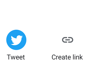
Twitter recently brought a custom share sheet to its iOS client that replaced the operating system's native solution, causing some disgruntled reactions. Now the social network's Android app is in for a similar treatment, though the two variations of a new UI are just replacing the application's already existing custom share sheet — and the new ones are definitely an improvement.

YouTube Music is forcing Instagram and Snapchat stories icons into its share sheet for some users
Even if you don't have either of the apps installed

YouTube Music is one of many Google apps that use their own share sheet on Android. Instead of adopting the default one, they have a custom design (Photos, News, Maps, YouTube, Twitter) and can include whatever targets they want. That's why you can see your contacts in Photos, for example. But YouTube Music is taking this privilege a little far now by adding icons for Snapchat Stories and Instagram Stories among your apps.


Even as Samsung is busy adding new features to its phones with the One UI 3 beta, it is still finding time to improve Good Lock. A new update to Home Up allows you to customize your sharesheet and fixes all of the gripes I've had with it since the beginning.
The new Google Photos share menu is a much-needed improvement
The eternal horizontal scrolling is finally gone

Google has been rolling out a new share menu to Photos over the past few weeks, and it seems to have reached most people by now. For those of you who share media through Photos often, this change is a godsend.

Adobe tests inserting intrusive ads in Android's share sheet and ‘Open with’ popup
It’s likely testing the waters right now with a small user group

When you’re a developer with a massive portfolio of apps, you’re definitely going to want to encourage your users to try out as many as possible. About a year back we spotted Microsoft trying something along those lines by shadily sneaking app advertisements into Android’s share menu if the user had installed even one of its other apps. Following in Microsoft’s footsteps, Adobe has now started testing similar install suggestions for its own range of apps.

Pixels on Android 10 can now pin apps to the share menu, thanks to the March update
The share sheet has come a long way
Another Android 11 feature appears to have trickled down to Android 10. In addition to all the named features Google rolled out with the March update as part of its second Pixel Feature Drop, Pixels are also picking up the ability to pin apps and specific recipients to the share sheet/share menu.

You can pin apps again in Android's share menu (Updated)
It was gone in Android 10, now it's back with the March 2020 security patch
Read update
With every new version of Android, you can bet on a few aspects of the OS being altered if not completely overhauled: DND, notification handling, permissions, and the share menu. There's no way Google could leave these alone, but at least the change it has introduced in the latest March 2020 security patch / Feature Drop is one we've all wanted: app pinning.

Android's story with the share menu is long, messy, and complicated. Things have gotten relatively better in Android 10, but that hasn't stopped some app developers from implementing a non-native share sheet. This is especially true for Google's own apps, like Photos, YouTube, Maps, and News. Chrome might soon join the fray with its own sharing hub.
Sharing on Android has seen its ups and downs. Once one of the most powerful features of the platform, it became sluggish, inconsistent, and riddled with issues. Android Q was supposed to fix the speed problem, and even if it did (which I honestly can't tell anymore), it implemented a few other unwanted changes. Pinning apps on top is no longer possible, which means you're at the mercy of the algorithm for your direct share targets. And when the algorithm messes up, it messes up badly. One case I ran across lately is Messages taking over all eight direct share spots and not letting go of them, under any circumstance. I fumed and fumed over it, until I found a (rather simple) solution.

Ever since Microsoft's Windows Phone plans failed, the company has doubled down on bringing its services to Android and making them feel right at home there. In an effort to promote the usage of its apps over ones from competitors, Microsoft has decided to use the share sheet as a sneaky spot for advertising. People who have already installed the company's Your Phone Companion or other Microsoft apps get helpful install suggestions in share and open menus, depending on the type of file they want to send or load.

Hold your collective breath, people... Google is using some sort of logic to order the Share menu on Android Q Beta 4! I kid not. After the many messes we've seen the Share menu go through, I'm just really incredibly happy that there's a sense to the madness now. Whether you agree that an alphabetical list is the best way to order the menu or not, it doesn't matter. At least there's a clear order now.

Read update
We've been very vocal about our irritation with Android's slow, buggy, and inconsistent Share menu. Prior to Android Q's release, we learned that Google was working on fixing it, and we started seeing the fruits of that change in Beta 1 and 2 thanks to a new push system that lets apps show their targets in the menu vs the pull system that was used before. In Q Beta 3, there are two changes to the native Share menu, one of which is a welcome comeback and the second a sad removal.


Read update
Android's share menu has been a bit messy for years, mostly thanks to the slow-loading app-specific targets that appear at the top of the list. In fact, many apps opt to create their own interfaces for sharing, so users don't have to deal with the janky native UI. In Android Q, the default share menu is receiving a facelift, just like Google promised last year.

We've been nothing if not critical of Android's slow and wildly inconsistent share interface, and Google has promised that fixing it is "a priority." In what is likely to be related, updated versions of the UI have started rolling out to a handful of apps in the last month, and the latest to see a taste of something new is Google Photos. Calm your excitement, though, as it's still in limited testing.

We'll be honest, we think Android as a whole is pretty swell, but that doesn't mean it couldn't be better. One of our bigger gripes with the platform has been the super slow and laggy share UI, which takes ages to populate even on the latest flagship hardware. Thankfully, according to a recent tweet by Android engineering VP Dave Burke, Google is working on a redesign.

It's no secret that we're not the biggest fans of Android's Share menu. A couple of months ago, I wrote an exposé detailing everything that's wrong with it, including its slowness, inconsistency, and the mess that is Direct Share. With Android P Developer Preview 4, which was released yesterday, Google decided to do one thing about it, but it's not what you think: Direct Share targets have been reduced to four.
Sharing from one app to another has been a mainstay of Android for years and years. It was one of the features that first drew me to Android: no more copying and pasting, no more having to open Twitter or WhatsApp to send a picture I just saw in my Gallery. Apps could talk to each other and the experience felt cohesive and seamless.