latest
There's nowhere Google Lens won't follow you — it's coming to the Pixel Launcher search bar next
Every move you make, every breath you take ...

Google Lens is an incredibly powerful tool that probably gets used way too little — you need to know how to access it in the first place, and even though Google isn't shy about adding it almost anywhere you could think of, it might still not be as discoverable as the company would like it to be. That's probably why it's experimenting with adding it to the homescreen search bar on Pixel phones.
YouTube is testing a bunch of comment section design tweaks
Keep going, Google, you'll get there in the end
The YouTube app introduced an easily accessible comment section revamp in April 2020, but it looks like the company isn't happy with the current design anymore. YouTube is testing a few new looks for the collapsed comment section in the Android app, and some variations even allow you to post your thoughts without having to enter the comment section first.

Scheduling texts in Google Messages is officially rolling out for everyone
In case you don't want to wake friends with the latest meme in the middle of the night
Read update
You can already schedule messages in Gmail and Telegram (among others), and now Google Messages is joining the club. The functionality showed up for a few people as part of an a/b test back in November 2020, and today, Google has announced that the feature will come to everyone using Messages on Android 7 and higher. The option replaces the long-press shortcut for sending an MMS with a subject.
Google is working on a minor Play Store redesign that does away with the hamburger menu, moving its contents to the account switcher instead. But as a tipster shared with us, that might not be the only change coming at us once that new interface rolls out widely. We've received screenshots of a redesigned settings page that separates and orders options better.

Netflix might not be playing nicely with Google TV for some reason, but the company is pouring tons of resources into its Android app. The service got variable playback speeds and a screen lock feature this year, and now it looks like we're in for audio-only background playback. It could help you save some precious mobile data or leave your phone in your pocket while you're keeping up with your favorite series.

Google is always tweaking its Discover feed ever so slightly to fit your taste even better, but sometimes, the company is also willing to make big changes. It looks like it's currently testing a brand-new look for Discover that does away with the signature card interface, and it's adding a share button while it's at it.
Read update
Twitter recently brought a custom share sheet to its iOS client that replaced the operating system's native solution, causing some disgruntled reactions. Now the social network's Android app is in for a similar treatment, though the two variations of a new UI are just replacing the application's already existing custom share sheet — and the new ones are definitely an improvement.
Facebook announces it's publicly testing dark mode after months of publicly testing dark mode
A step closer to a dark theme for everyone
Facebook long introduced dark themes for Instagram, WhatsApp, the Messenger, even Facebook Lite and its website, but so far, its main mobile app hasn't received an official gray-and-black coat of paint. After a year of appearing and disappearing a/b tests, it seems like the company is now almost ready to fully launch the theme. In cooperation with renowned app sleuth Jane Manchun Wong, Facebook has announced that it's now publicly testing dark mode.
Google Photos only recently got an improved custom share sheet, and Twitter is testing a better implementation of its solution as well. YouTube apparently didn't want to be left out as some people report that they're seeing a new share sheet in the app, too. In contrast to the other two, the video service's solution is a drastic regression in function, making me wonder if it's a bug that passed testing.

Netflix officially brings variable speed playback to Android devices
Creator vision makes way for accessibility

After months of testing, Netflix is joining myriad streaming services in adopting variable speed playback. Subscribers with Android phones will be able to watch programs at 0.5x, 0.75x, 1x, 1.25x, and 1.5x speeds. Creators have been dismayed with the feature since its testing, but advocates for those with hearing or vision loss say it's a win.

Google Search's custom in-app browser is rolling out to more people
What's wrong with Chrome custom tabs?
Read update
Google introduced Chrome custom tabs five years ago, and most apps use them these days. Instead of creating their own custom browsers, developers can just hand over websites to a Chrome tab without the added bulk of a regular browser interface. The advantage is that devs don't have to spend resources on creating their own webview implementations and that users can quickly open these custom tabs in proper Chrome without reloading or losing their scroll position. It's a great system. But Google wouldn't be Google if it stuck with a great system (looking at you, YouTube Music). The company began experimenting with a custom browser for its Google Search app around six weeks ago, and it's now rolling out to more people. While it looks snazzy, it comes with more downsides than upsides.

Read update
Google is always trying new things with the Maps app's interface, moving items from the side menu to the floating layers button, implementing different designs of the bottom bar in various regions, and lately just dabbling with more and more changes that fall in line with the new Material Design looks. And now we have a new change: a scrolling floating bar of category searches is showing up on the top of the screen.

During I/O 2019, Google announced changes to the Assistant that would see significant speed improvements thanks to on-device transcription and operation. These changes were said to come "later this year," which likely meant around the same time as the Pixel 4 launch. In the meantime, Google has been testing changes to the Assistant interface, including a Holo-esque design and now, a compact look.
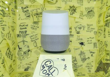

You've been able to ask the Google Home for all kinds of information since its launch, but historically, it hasn't offered much of anything without a specific request. According to some users, though, it's been divulging additional relevant tidbits on its own during some responses.

It was only a few weeks ago that we spotted a small change in the Play Store's tab layout that would completely separate apps and games. The modification we are seeing today takes a page out of that book, but feels more like a regression than an improvement.

The Google Play Store seems to be in a perpetual state of server-side tests. No sooner do we discover one new interface element being changed or added than there is another one to look into. Two tests have made their way to our inbox today. One shows a small, but telling, change in the tabs order and names; the other sees the overflow button disappear from all app "cards" and be replaced by a new tap-and-hold gesture and pop-up menu.

Read update
You know those beautiful bold colors that were supposed to make out Material Design? Yup, we've been kissing them goodbye for a long time now and it looks like they might be stripped away from one more app on your phone: the Play Store.

On days like this, I start wondering whether Instagram is actively trying to sabotage itself. Or, more accurately, if Facebook is actively trying to sabotage Instagram. The photo and video sharing service has been "experimenting" with varied feed content for a long time, sprinkling in sponsored posts and stories and IGTV videos, but the latest server-side test takes the proverbial cake (and smashes it on the face of a puppy — yes, that's how infuriating this is).

During its F8 2018 conference in May, Facebook previewed a major redesign to Messenger that it had teased earlier in the year, saying it would simplify the experience, remove some of the unnecessary interface elements, and put emphasis on the features most users want to get to quickly. Oh, and it should have a dark mode too. While the company said the new look would come soon, it took a bit over four months for us to see the first sign of it.

In today's episode of "Google can't leave well enough alone," we have a small peek at what might be the next rebrand of the Google Feed. First, it was Google Now, then it started slowly changing to a news feed with a newspaper-like icon, which was redesigned to a home button when the Feed we all know now launched last year. There might be another change in tow though, as some users are starting to see a new asterisk-shaped icon instead, with the name "Discover" linked to it.