latest
Android 12 Developer Preview 3 literally cuts corners
App previews, app drawer, volume slider, folders, and more

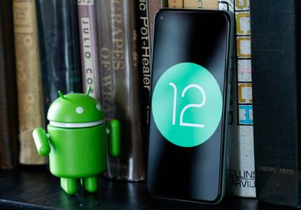
Android is in for a huge design overhaul with version 12, and while many changes are still hidden, things are starting to come together in Android 12 Developer Preview 3, released yesterday. It enables the new thumb-friendly "silky home" by default for settings and adds smoother overflow animations across the OS, but there are also a few smaller design tweaks rounding everything out.


The design language in Google's apps is constantly evolving, and lately the company has started to introduce more rounded elements in popular apps, like Chrome for Android and mobile web search. The next app to be round-ified might be Maps, as some users are seeing a slightly-tweaked interface during navigation.


Ten days have passed since we started digging into the Android P developer preview release, and while we've enjoyed many of the new changes and shared with you our five favorites, there are other modifications that left us scratching our heads a little. This is a developer preview, so things are expected to be buggy, some features could be experimental and could change with the next releases, but there are others that might be here to stay.

Joaquim Vergès, best known for his work on the Falcon Pro Twitter client, joined Twitter in 2015 to help improve the company's Android app. He left Twitter in March to work for Twitch, and it seems like the company has taken that opportunity to change the app's design again. A new user interface is being tested in the app's alpha testing branch, and everything is round for some reason.


Google is rolling out the red carpet for the upcoming Pixel phones, ensuring that its core lineup of apps are dressed the part. An update to the Play Store began rolling out yesterday with a new round launcher icon for the Pixel Launcher and an app shortcut (formerly known as launcher shortcuts) for Android 7.1. Also joining the list of upcoming features will be support for purchasing 4K movies and TV shows, a marker to indicate if a device is certified, and a new icon for promotions and gifts.


I think everyone knows by now that Motorola had to make a few sacrifices with the Moto 360, one of which I personally still notice every time I wear it - the flat tire look. The small blacked out area on the bottom of the watch contains the ambient sensor and a few other components that didn't fit elsewhere in this design, at least in the amount of time the company had to deliver the first iteration to consumers.


With the obvious exception of watch faces themselves, there aren't many parts of Android Wear that actually benefit from the round screens of the Moto 360 and the upcoming G Watch R - not even Google's official apps. A new and relatively humble tip calculator is the first Wear app I've seen that makes really excellent use of the extra radial space. It's called (appropriately) Wear Tip Calculator.


LG says it has been working on the G Watch R for two years. Whether this is true or not, the manufacturer now positions the original G Watch as a "reference device," which makes sense given their partnership with Google on the product and its speedy release after Google I/O. At any rate, the G Watch R is positioned as a product more in keeping with LG's design philosophy and the key elements the company (and more specifically its designers) believe make a good, compelling smart watch.