latest
Android 12's new Material You UI is partly live in the first beta
Not everything is, but many of the "hidden" visual changes are finally here
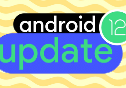
Many of the new Material You UI changes that Google announced at I/O today are live in the first Android 12 Beta, which started rolling out just a short while ago. Not all of the new features are live just yet, but many of the "hidden" UI changes previously spotted in development are now public-facing.
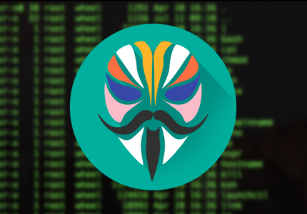
Magisk, the popular root solution, is testing an updated interface for its Magisk Manager app's latest Canary release. It's a pretty drastic redesign, and developer John Wu is clear that this isn't the final look, but we can expect a focus on "functionality over aesthetics." John Wu has also announced that the developer who did the new redesign will be the "main" maintainer for the app (but presumably not Magisk itself) in the future.


Google has toyed with Assistant's interface on Android countless times so far, adding a keyboard input method, Google Lens, then the Explore section, and finally the Now-like interface of upcoming cards (aka "visual snapshot"). But two things have puzzled me about it: one is that Explore and Visual Snapshot were almost invisible to people and I always had to explain where the icons were and what the did, and two is that getting to your Assistant's settings was an even more obscure process, and it was almost easier to just do it from the Google Home app than Assistant. Well, it seems that Google is working on solving at least the first of these problems.


Back in December of 2017 we learned that Niantic would be rebooting its aging augmented reality mobile game Ingress into something called Ingress Prime. After a lot of fan feedback and a delayed release, Ingress Prime is finally heading out to users. This major update basically replaces the old game and attempts to deliver plenty of quality-of-life upgrades and a flashy new UI. Sadly, it would seem that these changes also introduce some new problems, and the player base isn't very pleased.

During its F8 2018 conference in May, Facebook previewed a major redesign to Messenger that it had teased earlier in the year, saying it would simplify the experience, remove some of the unnecessary interface elements, and put emphasis on the features most users want to get to quickly. Oh, and it should have a dark mode too. While the company said the new look would come soon, it took a bit over four months for us to see the first sign of it.


With the release of the Fire TV Cube in June, Amazon also debuted a more minimalistic interface for Alexa. The new UI has been exclusive to the Cube up to now, but the version 5.2.6.6 update for Fire TV and Fire TV Stick devices brings them in line with their square-sided sibling.

Google Keep for Android Wear has made a significant jump from version 2.0.08 to 4.1.091. Along with this jump comes a new design that makes note actions easier to get to, though it does remove one neat feature that I often used.

Today the MediaFire Android app is turning 2.0, an age that resembles 20 but generally brings along more change in the life of an app. Software seemingly goes through digital puberty overnight and finds itself tucked inside a new body that looks different and similar at the same time. The latest version of MediaFire won't look unfamiliar to people who have known the app for a while, but most would probably say it has aged for the better.

BBC has just pushed the Go button on its big iPlayer redesign. Now an updated version of the app is available in the Play Store that introduces tweaks to the way users stumble across new things to watch. The changes are apparent on the home screen, where the refined focus on discovering content is apparent right from the go. There are also new pages for browsing channels and perusing through categories.

Listening to the radio has been a social experience since families first gathered around them in their living rooms, and now TuneIn Radio is ready to fully embrace this aspect. The Android app has received an update that injects a fresh dose of social features. Some of these build upon the way the software previously functioned, while other aspects are entirely new.

NBC is finally taking the time to give its Android apps some tender loving care. The company has finally brought its mainline news app out of the Froyo era, but wisely choosing not to stop there, it has updated its Breaking News app as well.

CBS Sports Updated To Version 7 With A UI That May Just Be The Cleanest Of Any Android Sports App
CBS Sports Updated To Version 7 With A UI That May Just Be The Cleanest Of Any Android Sports App

Sports apps typically aren't the most attractive pieces of software tucked away on Google Play, because let's be honest, why bother? Your average user will just be happy to pull up scores and stats in the palm of their hand, and whether the app adheres to Android's design guidelines occupies about as much thought as that thing they're supposed to be doing instead of watching the game. But if you're as likely to cry foul on a hideous app as you are a bad play, then the latest CBS Sports update may just make you smile.

Samsung devices are selling like gangbusters, and while this could be taken as a sign that many people are fine with TouchWiz as it is, that hasn't stopped a flood of critics (including us, on occasion) from lambasting the company's sense of design. Either the icons are too childish, the interface is overly cluttered, or it just feels bloated. The interface hasn't had a makeover in quite some time, but the latest image shared by @evleaks suggests that things may be about to change.

It's one thing to release an app for Android, but if a developer doesn't keep it up with the times, its usefulness is limited. So Diigo has now updated its Android app to version 2.0, bringing in a desperately needed makeover. The social bookmarking app can now handle notes, pictures, messages, and bookmarks in an interface that won't make anyone whose two-year contract hasn't expired cringe.

We've received an early look at an upcoming version of Facebook that introduces a brand new, flat UI. This is a change that competing social networks like Twitter and Pinterest made a long time ago, and given the direction Android, iOS, and Windows Phone have all moved in, it only makes sense. When considering Facebook Messenger's recent redesign, it's even less surprising. Yet this is pre-release software, so there's a decent chance none of these changes will make it into the stable version. Nevertheless, it's still worth taking a look. Let's dive in.

There are many ways to move files between your computers and your Android devices, but most of them feel like a hassle. PushBullet makes things far more simple. This combination web browser plugin/mobile app can send files and links from your computer directly to your notification tray, where you can access them without having to dig around, and its Android app just received a substantial update to version 11.1 that makes it both more attractive and accessible than before.

YouTube For Android Update, Brings Improved UI for 2.2 And 2.3 Devices And More
YouTube For Android Update, Brings Improved UI for 2.2

The official YouTube app just got a small bump that brings a fancy new UI for older versions of Android, as well as a handful of other goodies for everyone to enjoy: