latest
Google Lens is getting a new icon, less than two years after the last redesign
Looking more like a camera now

Google Lens may be an incredibly handy tool that could as well have been science fiction just a few years back, but it looks like Google is having trouble sticking with one branding for its image analysis service. A new icon has popped up in one of our tipster's Google search bar that's more closely resembling a camera than the previous version, suggesting that many folks might find the old icon hard to understand.
Google's been rolling out updated logos and icons for many of its services in the last month or so, and Google Voice just started picking up its own awaited change. The new icon is starting to roll out on the desktop site, though it doesn't appear to be live for everyone just yet.
Read update
Google rolled out a whole new set of (uggo) icons for Gmail, Calendar, Drive, Docs, and Meet last month, and now it's Keep's turn. As teased at the beginning of October, the much-loved and Google app-integrated notes service just picked up a new icon at the desktop site, and we have to assume the app will follow.
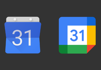
You have a meeting with Google's new Calendar icon (APK Download)
And you can only reschedule it for so long, so might as well get it out of the way now

When Google revamped G Suite with a new name earlier this month, it gave makeovers to a number of existing logos as well. Not everyone is a fan of the new look, but like it or not, the new icons have started to show up on a phone near you. It started with the Drive icon, then a wild Gmail icon appeared last week. Now Google Calendar is joining the fray, and you can get the update containing the new logo right now.
Get the new multicolored Gmail icon with this update (APK Download)
Now all your Google icons will look even more similar

Earlier this month, Google announced the rebranding of G Suite to Workspace and gave us a sneak peek at new — and indistinguishable — icon designs for some of its apps. The first app to get the new icon was Google Drive a few days ago, and now Gmail is following suit. Say goodbye to the red and white envelope, and hello to a multicolored M that partly retains the letter shape.
Get the new Google Drive icon on your phone right now (APK download)
The redesigned logo is rolling out as part of an app update
Not too long ago, Google announced that it would roll out redesigned icons for its core productivity tools like Gmail, Calendar, Docs, Meet, and Drive. It turns out that the latter is the service to make the transition first, as the company has just started rolling out a Drive app update complete with the new icon. We've got it available for download over at APK Mirror.
If you were hoping that Google Lens's latest update would bring all the new features that were promised at I/O, you will need to hold your breath a little longer. It's true that a new version of the app began rolling out yesterday, but it brings nothing of substance beside a new icon. And we've been getting enough tips about it that we just had to write this up.


The Google Voice Android app received an update this week that not only changes the icon and accent colors to match what you'll find in the new Hangouts and Chat, but it also adds a new Contacts tab for quickly accessing your address book.


Icons can either make an operating system look very modern or very dated. You could have the most state-of-the-art OS, but the wrong icon will make that OS seem like it's straight out of 1995. Google knows this, and so it's updated all of its system apps and iconless apps to show a new, contemporary-looking icon.

Pandora, the internet radio app, has gone through a few changes this past year. First, there was a full redesign of the Android app that brought it into the modern age, then there was the Pandora Plus monthly subscription with unlimited skips and repeats and offline listening.
After launching quasi-worldwide and implementing lots of small usability improvements for data usage, Netflix is ready to take another big leap forward. Or NNNNNNot. The service is introducing a small branding change in its app icon and across its various social media presences.


Todoist gave its Android app a complete material makeover early this summer, providing users with the most changes they've seen in years. But it seems the company left one thing off the list at the time, and today it's rectifying that. The to-do list and note syncing service has come out with a new brand identity, one that does away with its old TD logo.

Motorola ships a mostly stock-looking build of Android on its devices, but it does pack in a few exclusive software tweaks. Exhibit A: Moto devices can load up the camera with a flick-to-launch gesture. Motorola ships its own app to make this possible, which until now came with the stock KitKat icon. Today Motorola has updated the app with a unique look of its own.