latest
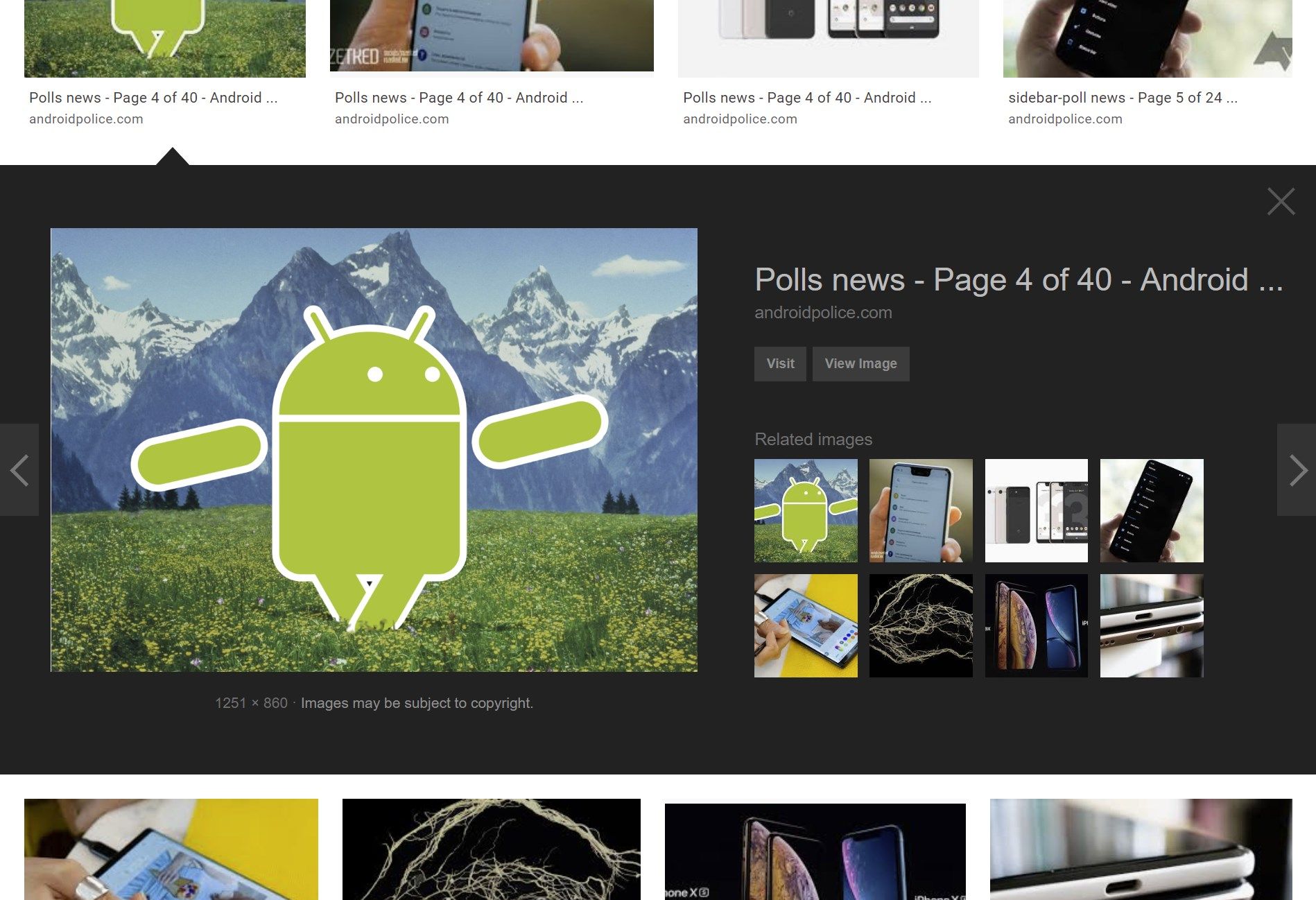
Google Images recently tweaked how its results were displayed, replacing the old in-list expanding layout for viewing a given image with a new pop-out sidebar. If accommodating this change is too much for you to bear, there is a way to revert to the old layout, via an open source "Google Images Restored" extension/add-on for Chrome and Firefox.
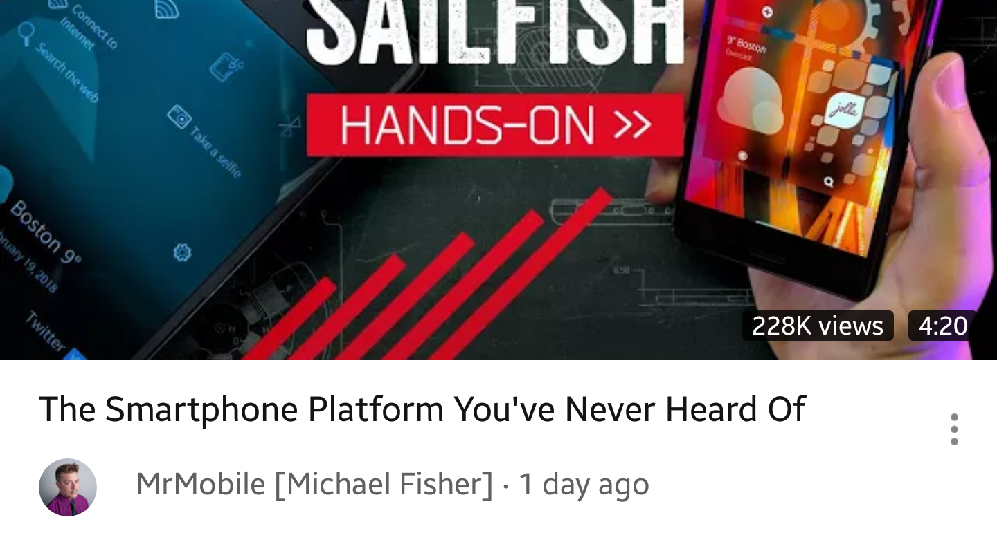
Sometimes it seems like YouTube is perpetually testing different interfaces for its Android app. Based on reports we've received recently, yet another set of modifications is being tested. The latest round of tweaks is on the subtle side: some are seeing the thumbnails for individual videos in the Home tab show view counts, with more space for video titles and the channel logo repositioned below.
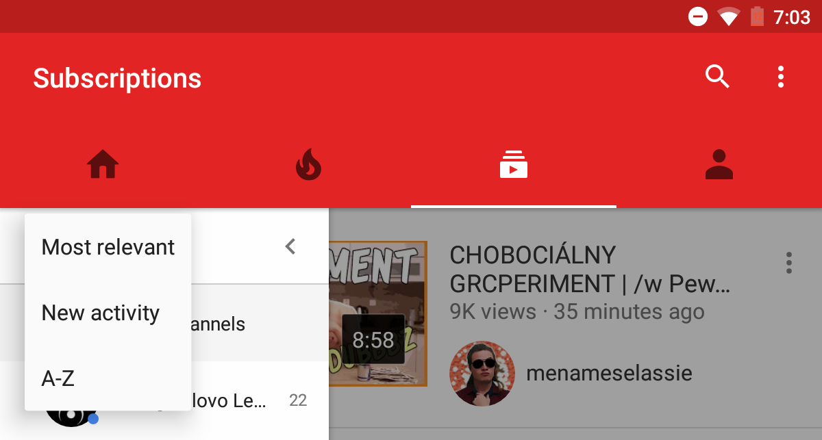
Back in December, we reported on a new "pseudo-drawer" for the YouTube app on Android - replacing the horizontal list of avatars and activity indicators found on phones, the drawer gave users a scrollable vertical list of subscriptions - avatars and names - along with actual numbers.
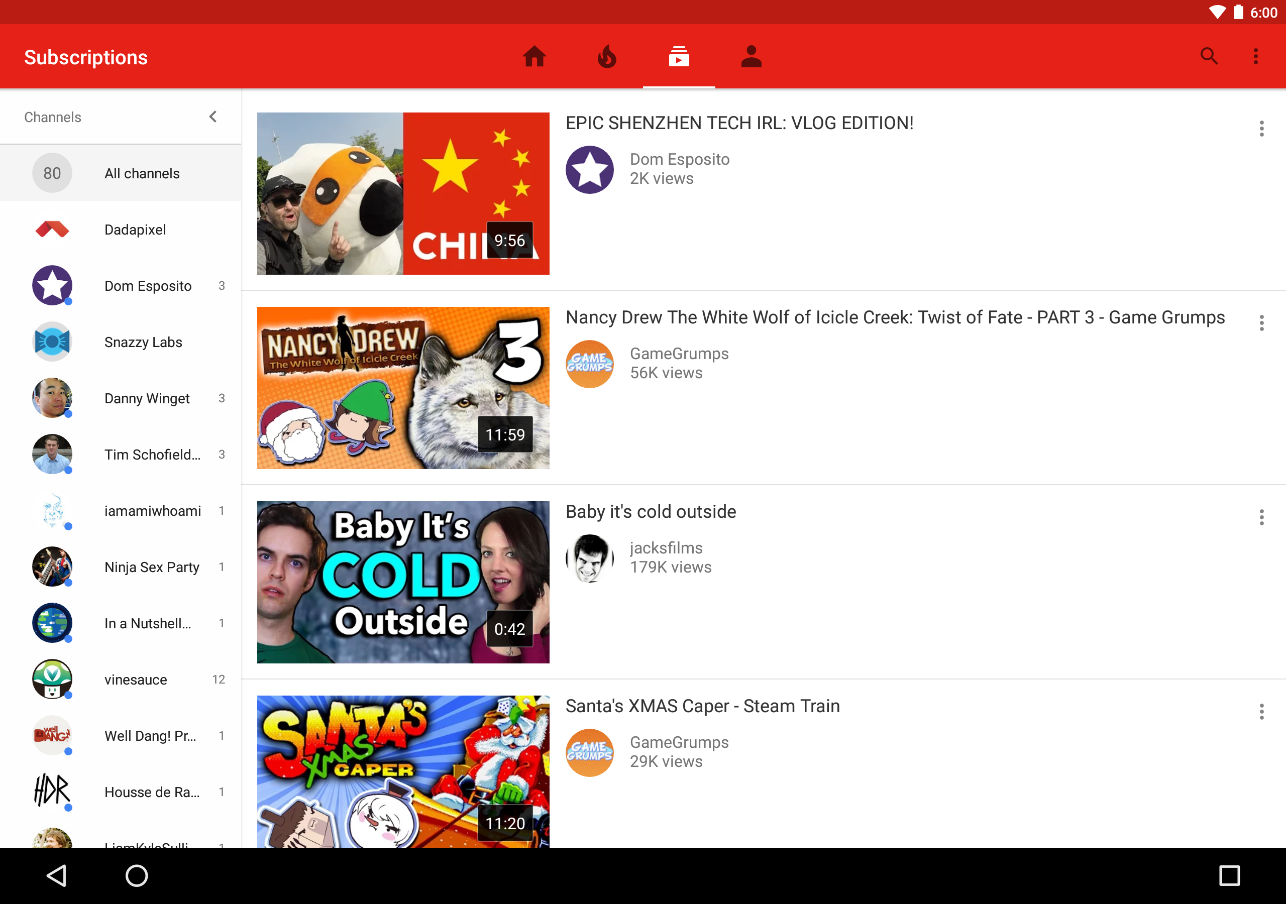
The YouTube app's hamburgerless layout has been with us for a while now, and while it's gotten a mixed bag of reactions, Google is still iterating on it slowly but surely. It seems like the latest development is a new layout on tablets for the subscription tab.
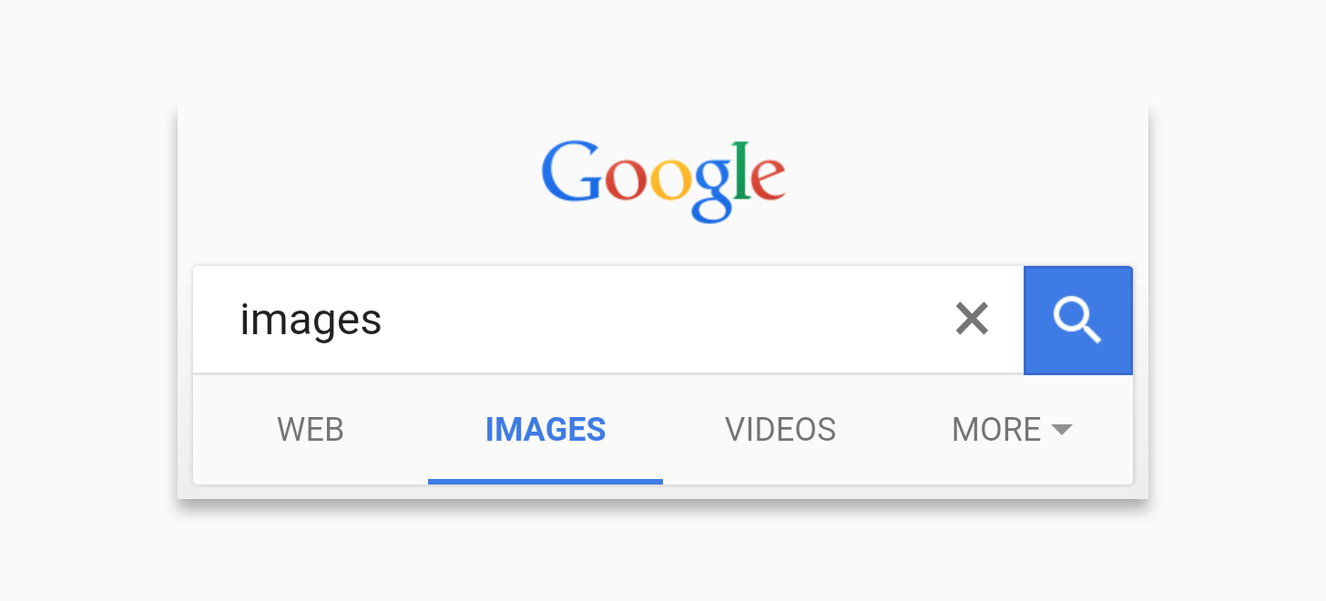
Another long design test appears to be drawing to a close for Google. After apparently beginning a wider rollout for the new mobile search UI (in testing since April), it seems that Google is making the revised image results UI final too.
Google's remote application for controlling Android TV with your smartphone is... OK. It's adequate. It beats inputting passwords letter-by-letter with a physical remote, and that's about all you can say in praise of the app. While it lets you perform a voice search, it won't launch TV apps without going back to the home screen, and its trackpad isn't a cursor (as some apps might benefit from), it's just a gesture pad. But that doesn't mean there isn't room for improvement, specifically on Android tablets. Here's what version 1.0 looked like on a tablet:
For mobile photographers, collage apps are second only to filters in their ability to take low-res images and make them look somewhat interesting. Rather than continue to cede this area to competing apps, Instagram has decided to create its own dedicated piece of software. It's called Layout.
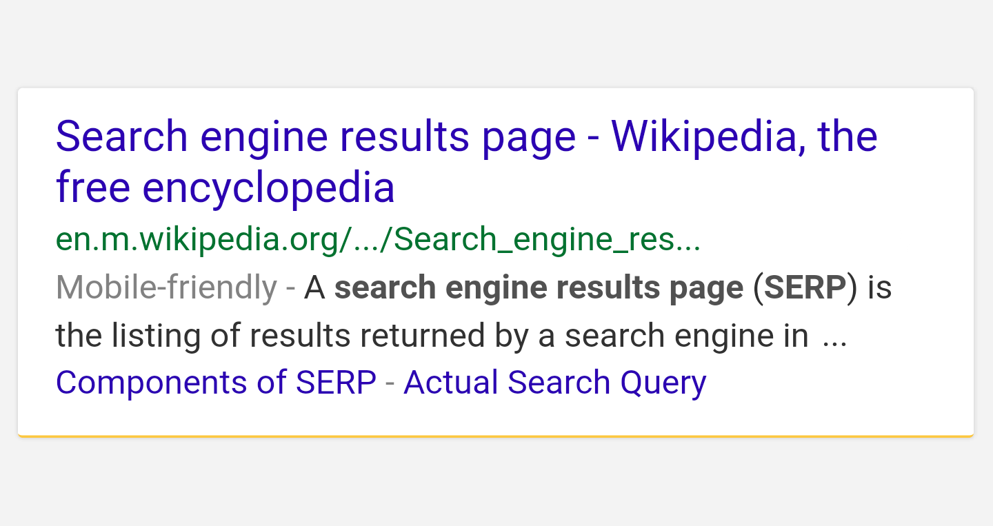
Search, as the foundational product Google is known for, is obviously something the company is very thoughtful of when it comes to design. Even small changes can cause a big impact on user experience and engagements, so Google is careful about how design tweaks are implemented.

If you've noticed a few changes around the Play Store on a desktop browser, you're not alone. Some Chrome users spotted a new layout for app pages on Google Play starting this yesterday evening. It isn't universal, and it seems to be a minority for the moment - only one Android Police staff member saw the updated layout, and even then, only in the latest beta for Chrome (40.0.2214.45).
Swype may have just gained new split and mini keyboard options, but the SwiftKey folks have been sitting on something even more visionary for quite a while now. Their "Layouts for Living" program adds many layout options - split keyboards, movable pop-up keyboards, etc. - to what is already one of the most popular Android keyboards out there.
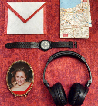
Forget skeuomorphism. Why do we need things that look like objects if we can just use actual objects? That's what reddit user and notable George Bruns ballad davy_crockett thought. Using a combination of Apex launcher's ability to resize the icon grid and MultiPicture Live Wallpaper to use multiple photos for different homescreens, he created a layout that's made up entirely of real-world things. Want to play music? Tap the headphones. Need the clock? Hit the watch! It's that simple.
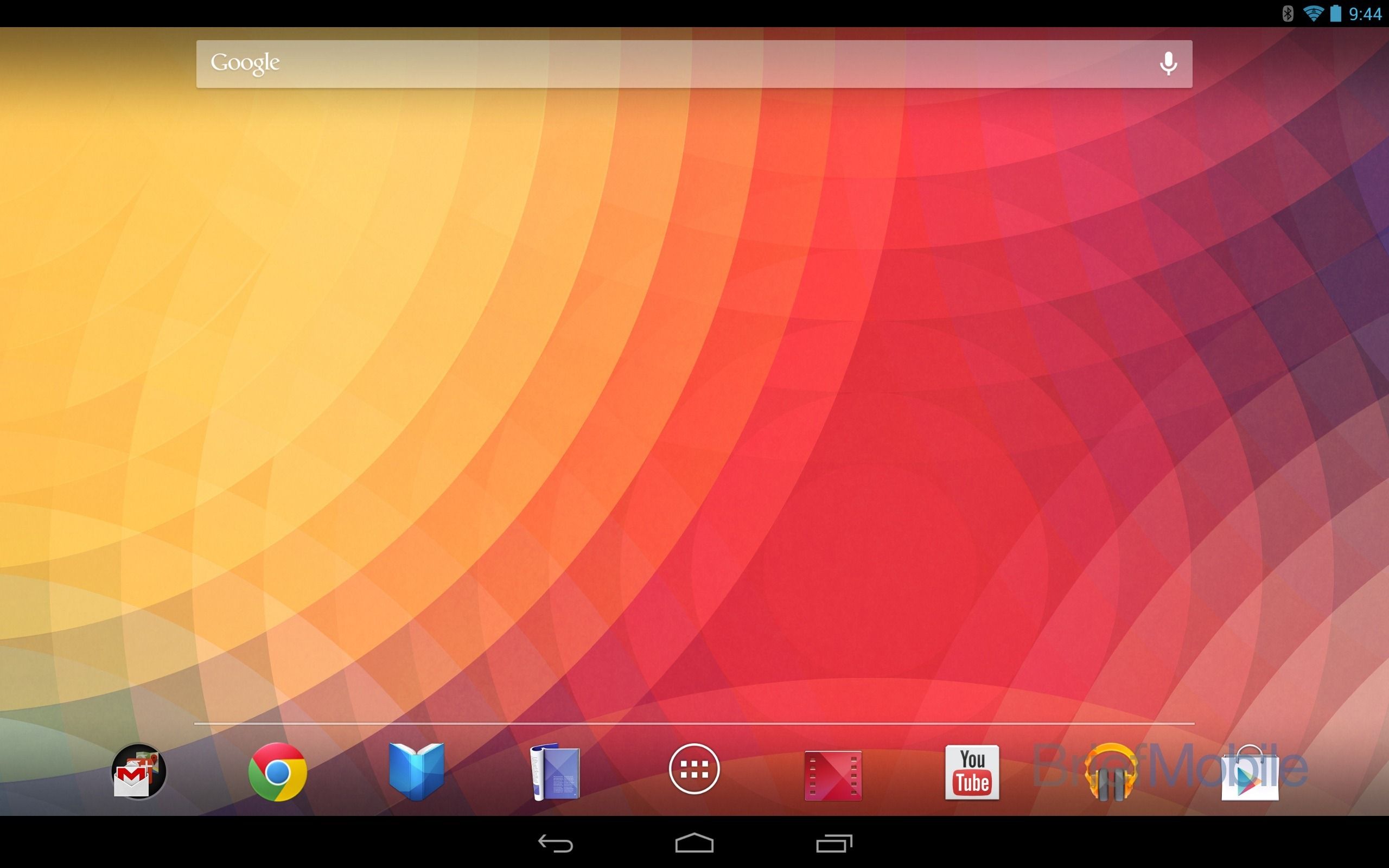

Movies by Flixster has a very interesting design history. The developers behind this app are usually among the first to adopt new Android design guidelines—they had a Honeycomb-style action bar back when the Xoom was the only Android tablet around—and today it got another new refresh. The good news is that now it looks better on the Nexus 7, as opposed to the broken mess it was before. Now, for the bad news.

As an Android developer, I like to keep tabs on the tools I use every day, especially ones as important as ADT for Eclipse and SDK Tools. As was the case several times before, the Android team in charge of both of them posted previews of upcoming releases of ADT 20 and SDK Tools r20, available for manual download ahead of the final releases.


