latest
Google is updating app guidelines for smartwatches just in time for Wear OS 3
Developers have just over a month to meet these new standards

Google is recommitting itself to making Wear OS better than it's ever been, all powered by a new partnership with Samsung. Of course, without some quality third-party apps and services, it doesn't matter how capable the operating system is — it's doomed to fail from the start. With that in mind, Google has released some new quality requirements for apps on Wear OS 3.
Google will start enforcing its new anti-spam Play Store policies in September
Your Play Store search results should start to look a whole lot cleaner

Read update
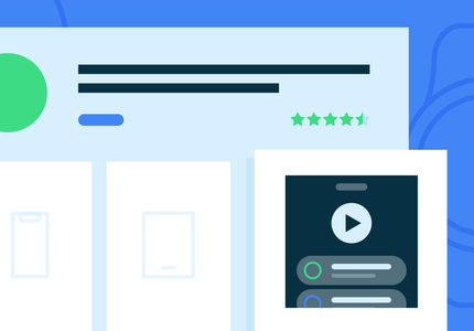
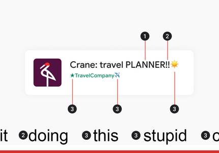
As a blogger focused on Android, I see a lot of spammy app names in the Play Store. Apps with extraneous descriptors trying to pop up in more searches, apps that include the name of other, more popular apps, or even (shudder) emoji in the names. Someone at Google is as tired of all that as I am, because there's a new set of guidelines for developers publishing apps in the Play Store.


Since Google introduced material design in 2014, the questions of whether and how to use the design language on other platforms like iOS has lingered. But Google hasn't been a stranger to material on iOS. Inbox users for instance should feel right at home moving between iOS and Android, as many of the interface's core components are shared.

Bottom nav bars. Between the time of Gingerbread and Marshmallow, they seemed to become significantly less prevalent on Android (or maybe I was just able to avoid more of them), with many developers and designers going for other navigation models. But those other nav models - specifically the hamburger menu - aren't always ideal. Often, teams worry that items in the drawer are "hidden" from users. Sometimes immediate visibility and total obscurity seem like the only two realistic options.

Google, following through on its promise that the material design spec is a "living document," has updated its design guidelines and suggestions again, this time adding more guidance on motion design, along with new sections for growth & communications and expanding panels.

Last year when material design was introduced to the world, Google emphasized that its specs were a living document. Indeed we've seen several updates to the spec itself since it launched, but Google's also paying attention to its overall design presence, as evidenced by today's major update to google.com/design.

Back in November, Google updated its new design guidelines for the first time, adding guidance on the navigation drawer and launcher icons, and - happily - a "what's new" section, which it said would serve as a place to explain future updates to the guidelines.


Google doesn't want developers naming their apps in ways that could imply association with or endorsement from Android, so instead of the Android Music Player, it prefers Music Player for Android. The idea is that this distinction makes it clearer to users that the folks who make Android had nothing to do with the creation of this particular app.

Have you felt the draw to get into app development, but didn't really know how to get started? Google wants to make things a little easier with a brand new guidebook that's meant to get developers on the right path. The Secrets to App Success on Google Play is an 81-page eBook that outlines the process and best practices for developing and submitting your software to the Play Store, and hopefully make some money on it. You won't get anything in-depth about writing code or managing a software business, but there are some good tips and tricks.

In a rather exciting post to its Google Design Google+ page today, Google announced a big set of improvements to the material design guidelines. The design spec, which - since this summer - has been a "preview," has been updated with links to relevant Android developer documentation, a new section called "What is Material?" a "What's new" section (to stay up to date on any changes), and a couple of other exciting changes.

As with Holo before it, Material Design has triggered a deluge of app concepts, mockups, and fancy animations from various enthusiasts and designers in the community (myself included). A key factor that is often left out of these presentations, however, is a detailed and thoughtful explanation of design choices and UI considerations that went into the finished product.

Developer PSA: Play Store Policies Mandate Clean App Descriptions Free Of References To Other Apps, Even Your Own
Developer PSA: Play Store Policies Mandate Clean App Descriptions Free Of References To Other Apps, Even Your Own

While recently re-examining the Google Play Store policies, we took another look at the rules against keyword spam and what the company suggests for app descriptions. Developers are advised to stay away from classic spam techniques like repetitive keywords, exceedingly long descriptions, and unrelated keywords or references. Publishers will often use these tactics in an attempt to sneak their apps into unrelated search results. One of the most interesting of these recommendations comes at the tail end of the page where Google advises against referencing other apps you've published.

Google has really been on a roll this week with exciting news for developers, such as a pair of new game-related libraries and enhancements to Google+ Sign-in. This time around, Chromecast is getting its turn with a brand new User Experience Guide. Coming just 2 days after some new apps were added to the whitelist, this 4000-word document details the recommended design patterns developers should follow while implementing their own Android, iOS, and web applications.

If you can't get enough information about Android 4.4 KitKat but you're tired of reading and want something easier - say, a video - you're in luck. Today, new episodes of DevBytes and Android Design In Action were released specifically to give developers and designers alike a brief, informative, easy-to-digest look at what's new.

Google Updates Developer Guidelines For Tablet-Optimized Apps – Separate Screenshots And Verification Of Tablet UI
Google has been pushing developers to build tablet-optimized UIs for their apps since the Xoom was the hot new challenger to the iPad (haha). Okay, so

Google has been pushing developers to build tablet-optimized UIs for their apps since the Xoom was the hot new challenger to the iPad (haha). Okay, so that didn't work out very well, but with the release of devices like the Nexus 7 and Nexus 10, devs are finally starting to see the value of building a great tablet experience. Of course, it's not like you'd know. The Play Store is terrible at showing off tablet UIs, but that's about to change. Google is updating the developer console to verify tablet compatibility and break up screenshots for tablet/phone interfaces.

Titanium Backup, one of the most powerful – and popular – backup utilities available for Android, got an update to version 6.0 today. Don't get too excited though – the version bump consists primarily of bug fixes and optimizations, along with a few updated translations. Oh, and a redesigned menu. Yes, Titanium Backup's design is finally getting some attention, but not quite in the way we'd hoped – take a look at the before and after screens below.

Quora, the popular question-and-answer website, found its way to Android today, releasing an official app that not only brings to the table great features like voice search and a handy widget, but also a user interface specifically designed for Android "from the ground up." Indeed, the app follows Android's design guidelines to the proverbial "T," right down to the app's launcher icon with its ever so slight downward perspective.

BaconReader, one of the most popular Reddit-browsing clients available for Android, has just received a major update to version 2.1. Among other things, the update brings a new "Welcome Guide" for new users, access to subreddit sidebars, subscription functionality, support for spoiler alerts, a dark theme for the app's "large" widget, and a few minor fixes.

PayPal's official Android app received a big update recently, bringing it up to version 4.0.0.1. The update carries a much-needed interface redesign, bringing the web payment solution's mobile client more into line with Android's design language. Using a warm, espresso-and-orange color scheme with a few well-placed textures and conservative gradients, the app's new interface looks infinitely better than its previous iteration.


Movies by Flixster has a very interesting design history. The developers behind this app are usually among the first to adopt new Android design guidelines—they had a Honeycomb-style action bar back when the Xoom was the only Android tablet around—and today it got another new refresh. The good news is that now it looks better on the Nexus 7, as opposed to the broken mess it was before. Now, for the bad news.