latest


Google frequently marks holidays and anniversaries of major events with a striking animated Easter egg hidden within its iconic search page. Back at the start of January, we got a festive piece of “2021” candy bursting open to release “2022.” For the new Lunar Year — the Year of the Tiger — the celebratory Google animation is slightly less whimsical and a bit more mystical: Just search for “Chinese New Year” and wait for the fireworks to begin.
Android 12 picks up new screen on/off animations
Two similar ones that change based on how you wake (or sleep) your display
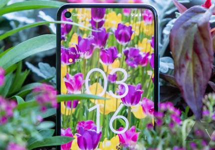
Starting for some in Beta 1 and with a wider rollout in Beta 2, Android 12 sports a fun new lockscreen on/off animation — or, depending on how you count, two slightly different animations. One expands out from the power button if you turn your phone on or off that way, and another expanding from the bottom of the display if you tap to wake or it times out on its own.
Google backtracks on Android 12's new ripple effect after users confuse it for a bug
It's intended behavior, but not everyone is happy about it

Wide-ranging visual changes are arriving with Android 12, all part of Google's brand-new Material You design system. Reactions to this have, on the whole, been pretty positive, but there are some aspects of it that aren't quite so popular. Animations are getting a lot of attention, since they've remained unchanged for so long, and the new ripple effect, in particular, isn't going down so well.
Android 12's got some jiggle
DP3 picks up a new overscroll animation, and we're not 100% sure if we like it yet

Android 12 Developer Preview 3 landed this week with many smaller design tweaks, but there's one thing you'll instantly notice when you start using the new release. Things have become considerably more bouncy. Whether it's the notification drawer or the overscroll animations, Google is working on making things feel much more physical and realistic.
Android 12 DP 2 has a sweet new textured ripple animation for taps
It's a bit scratchy, in a nice way

One of the most fun things about new versions of Android is seeing all the new visual bling Google builds into the operating system. One such example was spotted by developer @kdrag0n, who managed to get it working on Android 12, Developer Preview 2. It's a more busy, "noisy" animation for tapping a standard interface item.


Doodles are becoming one of the rare manifestations of Google's funky side. With the company becoming more serious and losing its witty approach to things, Doodles still remind us, from time to time, that there is still a playful child hiding inside that grown-up adult. But many Android users don't notice the genius behind the daily Doodle because they just use the search widget on their homescreen. Google has found a workaround for that.

Google's Camera application for the Pixels received an update a couple of days ago from version 6.1 to 6.2. A quick look at the app left us wondering whether anything was new at all, but upon closer inspection we noticed a few changes, some minor and one most of you will love: a dark mode.

Android P is packed with visual changes. Some of them are more popular than others, but Google has certainly been pushing out a ton of tweaks to the platform's design, especially when it comes to Android's animations. And the latest DP2 builds released just yesterday during I/O pack in a pretty slick new heads-up notification animation.


Easter eggs are always fun to check out on newly-named Android builds, and this one is no different. However, this may be the first one that actually might be a little hard to look at for long periods of time. Android P's first Easter egg features a P with a very colorful animation.


If you're familiar with the early days of Android and iOS, there was a really common pattern for deleting items from lists. Basically, you would swipe an item to the left or right, and in its place would be buttons to either undo whatever happened to the item or take more actions on it. Sometime in 2015, Google introduced a different approach in its Material Design guidelines in which swiped items were immediately removed from the list and a new control called a Snackbar popped up from the bottom of the screen with an undo button. Many of Google's apps adopted the new style, but it wasn't until this week that Gmail made the switch.


If you've been following our coverage of the many separate Play Store experiments, you'll know that Google has a tendency to test several interface changes at once. This time, at least three new video loading animations have been spotted in the YouTube app.

By now, you must know a lot about the new LG Style and Sport watches and all that they can and can't do. What you don't know is a little added functionality that's just handy to have, even if it won't have that much impact on your daily use.

Changing the animation speed is a little-known trick with Android, and can often make your device feel faster. But if you want to make animations faster than normal, you are left with two options - 0.5x the normal speed, or completely turned off.

Genius, which started out as Rap Genius, is a cool Android app for music lovers who want to not just discover the lyrics to their favorite songs, but also the stories and trivia behind them. With version 2.0, the app is getting a couple of nifty new features, none more important than the slick animation on the redesigned song page.


Google, following through on its promise that the material design spec is a "living document," has updated its design guidelines and suggestions again, this time adding more guidance on motion design, along with new sections for growth & communications and expanding panels.


There's a new little animation when setting an alarm in the clock app that moves the selector hand from the hour value to the minutes value. If that's not entirely clear, have a look at the gfycat below: after selecting the hour for an alarm, the hand now sweeps smoothly into the minutes position, whereas in Marshmallow, the hand would simply reappear in the minutes position without any visual transition or animation.

Read update
- This version also activates the previously discovered option to open links in Chrome Custom Tabs. Read about it here.


If you're on Android 6.0 and use the share menu regularly, you may have encountered a rather annoying issue with Android's Direct Share feature. The issue arises when the share dialog pops open and the direct share contacts don't load immediately. Instead, the UI loads, you go to tap what you want, and suddenly the direct share contacts appear and all the app share links get pushed down out of view. See the animations below for the Android 6.0 and 6.0.1 behaviors side by side - the broken version is on the left.

A few small extra touches in a user interface can really endear your app to end users. Case in point: local business recommendation app Yelp is hiding a little something in its slide-out menu that isn't exactly necessary in a technical sense, but it should put a smile on the face of anyone who happens to discover it by accident, like Google+ user J.J. Valenzuela did. To see what we're talking about, download Yelp from the Play Store, open the slide-out menu, and scroll down as far as you can. Or just scroll down in your web browser, because we've turned it into a handy GIF.

One of the greatest problems in stock Android since the debut of Lollipop last year has been the volume slider - putting aside Lollipop's initially confusing volume modes, the slider unceremoniously pops into place when the user hits the volume keys on their device. Of course I'm kidding, but nevertheless it looks like Google has enhanced the volume controls in the latest Marshmallow dev preview with some motion design love.