latest
The Google Search widget needs a redesign, so I did it myself
KWGT and some determination go a long way

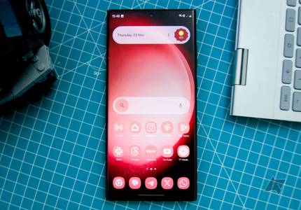
Google's redesign of the At a Glance widget for non-Pixel phones has been a love-or-hate affair, and I fall into the former camp. I think it looks great, but I have one criticism: the regular Google Search widget looks mismatched and awful by comparison. You'd imagine the Search widget would be one of the most used widgets on Android, so the fact it's gone this long without a Material You makeover boggles my mind. Google Drive, Chrome, Gmail, Keep, and more have all received new widgets, but this one hasn't. So I took matters into my own hands with the help of KWGT.

Your Chromebook’s interface now looks a lot more like Android
The big ChromeOS Material You redesign is here

Google has started rolling out ChromeOS 117 to Chromebooks widely, and along with a bunch of interesting new features, a big change to the interface is going live with it: Material You as you know it from Android is making its way to Google’s desktop operating system. This means that many interface elements like window title bars and backgrounds in system settings will take on the dominant colors from your wallpaper.

Google celebrates Chrome's 15th birthday with a fresh Material You makeover
Just what every 15-year-old wants — dynamic themes

Believe it or not, it's been fifteen years since Chrome exploded on the scene to begin its path towards total web dominance. Of course, in the wild world of broswers, innovation and evolution are keys to getting people to use your products. A couple of years after Material You first emerged as Google's prefered aesthetic, the company is announcing it's finally bringing dynamic themes to Chrome on desktop.
Google has been busy in recent months working Material You into all of its products, both on Android and on the web. First announced in 2021, Material You came out with the goal of introducing more personalization into Android and Google services. Its UI elements are marked by softer, rounded edges and more pronounced color palettes that are often user controlled. Google has just tweaked Maps for the web, rounding the previously harsh-cornered search bar.

Fitbit's redesign blends Material You aesthetics with personalized health tracking
The upcoming makeover is all about user-friendliness
There are plenty of great fitness apps with a wide range of features, but one way for an app to separate itself is to focus on user experience and design. Renowned for its commitment to thorough fitness tracking and health solutions, Fitbit is working on a visual transformation. The Google-owned brand plans to release an innovative, user-centered revamp of its app this autumn that incorporates key elements of the Material You design language. Fitbit enthusiasts can look forward to a sleek, streamlined interface that customizes their health journey with a variety of new features.

Fitbit gets the Material You treatment with updated Google account switcher
Fitbit joins other Google apps that have already gotten the MD3 treatment

Google is in the middle of a low-key UI refresh for it apps and services. Going back to last fall, we've been checking out the slow spread of a new interface for switching between multiple Google accounts, one that embraces modern Material You style. This week we're checking out what seems to be the latest app to make the change, as the new account switcher reaches the Fitbit app.

Google Calendar widgets finally embrace Material You
Calendar widgets get their long overdue facelift

Material You introduced a slew of design changes to how Android looks and feels and added a ton of customization options, too. While dynamic theming was a big part of this facelift that came with Android 12, various Google apps simultaneously picked up new interface elements to go with this major refresh. Google Calendar also followed suit, but its widgets had remained behind the curve for some reason. Not anymore, as Calendar widgets are finally receiving their long overdue Material You facelift.
The Pixel Launcher’s Discover page discovers the full power of Material You
Discover is doubling down on dynamic theming

Android 12 was the first version of the mobile OS to feature dynamic theming. It used the Monet engine to pull the primary color palette of your wallpaper, and used variations in hue and saturation to create a tasteful palette which extended across the UI. Until recently, the Discover feed only used dynamic theming for the upper region and the Google logo, but that's now starting to change.

Read update
Google tries hard to update its suite of apps to match the ever-evolving Material You design principles. Because of the sheer number of apps, some of them only receive updates sporadically, and that’s something we can say for the Google News app. However, the latest update to the app adds two new widgets, so you have three to choose from in total.
The playful new Google Play Books icon is rolling out widely
Google is finally helping the stragglers across the Material You finish line
Material You design has become a cornerstone of Android’s identity, and the app icons we interact with everyday play a massive role in helping the change feel significant. It may seem hard to believe, but Google isn’t done updating its Android apps with appropriate contemporary icons. We are now seeing the last of the stragglers, like Google Play Books, pick up a new app icon.

Google Weather is finally getting the Material You makeover it deserves
Internal testing seems to be underway
Google’s Weather app isn’t given much attention, even though many of us use it almost every day. People checking the weather received a pleasant surprise with support for dark mode earlier this year, but the interface has remained largely unchanged since the app's inception. Now, Google is giving the Weather app its first real makeover in years with a Material You redesign from the ground up.

Google News on smartphones finally picks up Material You makeover
Another step toward completing the rollout across Google's apps

While Google has increased its efforts to roll out the Material You aesthetic to a number of its very own apps including Gmail, Maps, and Photos, a number of others like the Google News app on smartphones have yet to receive the treatment. But after all this time, the company is now finally making due for News users as they get a new look that's been in the works for about a year, maybe even more.

Android 14 could jazz up Material You with bold new color palettes
A new theme style will more closely match your wallpaper's colors

Introduced in Android 12, Material You dynamic color theming has become a core part of Android's UI identity. But while automatically generated custom themes do make for a lot of potential variety, the themes Android kicks out are often more drab than the wallpapers they're based on. But 9to5Google reports that could change in Android 14, with a new Fidelity theme style that's currently in development.
A bevy of Google apps just got the Material You treatment with a new account switcher
Rounded corners everywhere
Google takes pride in its UI design, and with people slowly catching up to Android 13, many of us are familiar with Material You principles. However, Google has far too many apps to update them with all the latest changes at the same time. So updates come in bursts, and presently, Google seems focused on rolling out the new Material Design 3 (MD3) account switcher interface across its apps.

Android 14 DP2 fixes dynamic theming's conflict with high-contrast text
Dynamic theming will work even with the accessibility option switched on
Read update
Android offers several system-level accessibility features catering to people with various disabilities. Utilities like TalkBack, Live Transcribe, and color correction adjustments for the visually impaired often go unnoticed. High contrast text is another such tool, but Google is silently working to improve how the feature works with Material You dynamic theming. We saw evidence of this a week ago, and it is now in the latest version of Android 14.


Material You has been a cornerstone of our favorite OS since Android 12. Its dynamic theming features have since been adopted by hundreds of the best apps on Android, most prominent on Google's latest flagships, the Pixel 7 and Pixel 7 Pro.
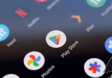
The Play Store is getting some fresh Material You love
The account switcher has a revamped look in Google’s app store

Google first updated the Play Store with a touch of Material You design back in 2021, but not all areas of Android’s main app store received the visual refresh. Meanwhile, several other Google apps and sites have recently seen a revamped account switcher interface, but one place where it’s been conspicuously absent until now has been the Play Store. Thankfully, that appears to be changing.
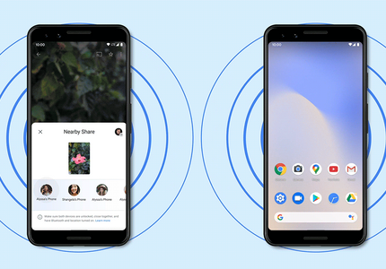
The Nearby Share screen is getting its Material You facelift
Google is rolling out the updated interface more widely
Nearby Share is Google’s answer to Apple's acclaimed AirDrop, allowing users to share files between two Android phones without any fuss. It has been a fantastic feature for Android users who previously had to rely either on sketchy third-party apps or snail-paced Bluetooth. But Nearby Share hasn’t received much in the way of a meaningful design refresh since it first came out. While most Google apps and services have embraced the new Material You styling, it’s now finally time for Nearby Share to get its long overdue facelift.
Material You and new Android version could be about to hit your Chromebook
Google is preparing its laptop OS for dynamic theming
Google may push monthly ChromeOS updates to all of our favorite Chromebooks, but that isn’t the case for all components within the operating system. New Android releases are much slower to come to ChromeOS, and Google usually only provides full system updates every two years. With ChromeOS currently offering 2021's Android 11, it’s high time for an update. Evidence has surfaced that an Android 13 release could be imminent.

Android 14 DP1 suggests Wear OS Material You theming is coming
How it would work is still anyone’s best guess
Android 12 was one of the biggest visual updates for compatible devices in years, partly thanks to Google’s new design philosophy called Material You. Dynamic theming changed the visual game unlike anything preceding it, and we are still watching first-party apps like Google Tasks switching to dynamic theming. With the first Android 14 Developer Preview here, we have our first indications of Google’s intention to bring dynamic theming to the best Wear OS watches.