The Google Play Store is still the go-to destination for apps, even while Android 14 is making third-party app stores a bigger focus. It has received visual updates through the years to keep the user interface in sync with the changing times and Google’s ever-evolving design guidelines like Material You. The latest aesthetic change lays emphasis on your notifications.
For a while, the search bar at the top of the Play Store app’s main menu has shared space with your profile icon, and tapping the latter opened a menu where you could select the Notifications and offers option to see what Google wants to inform you about. The redesigned UI rolling out now squeezes a little notification bell icon between the profile picture and the left-aligned search bar. Tapping this icon takes you straight to the Notifications and offers section, saving you one extra step.
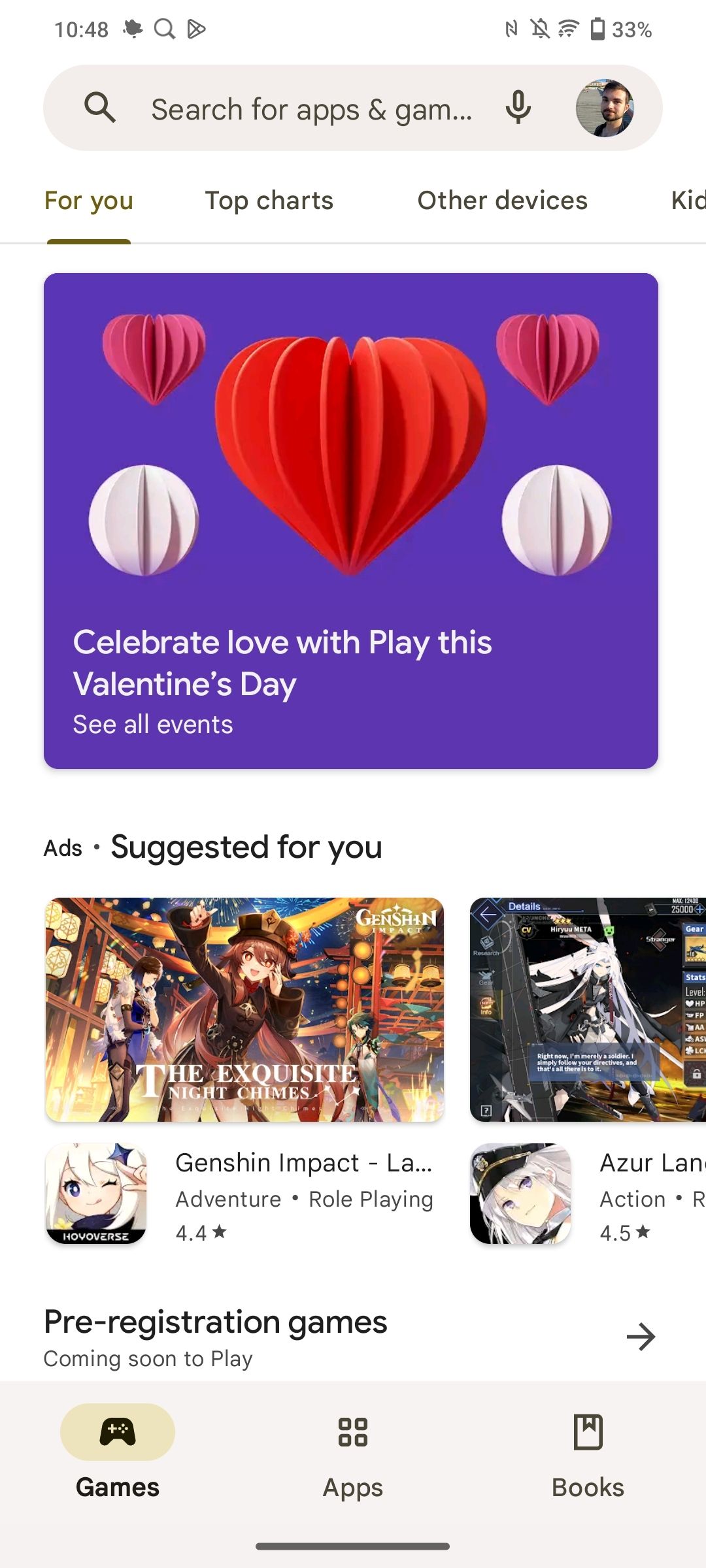
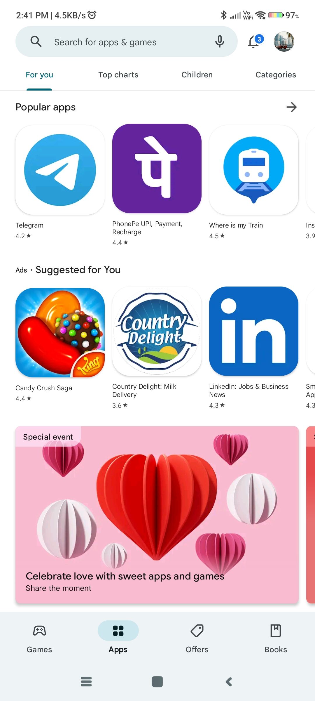
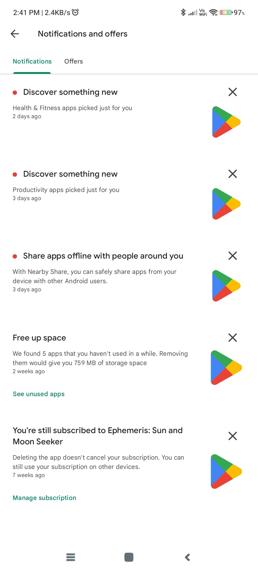
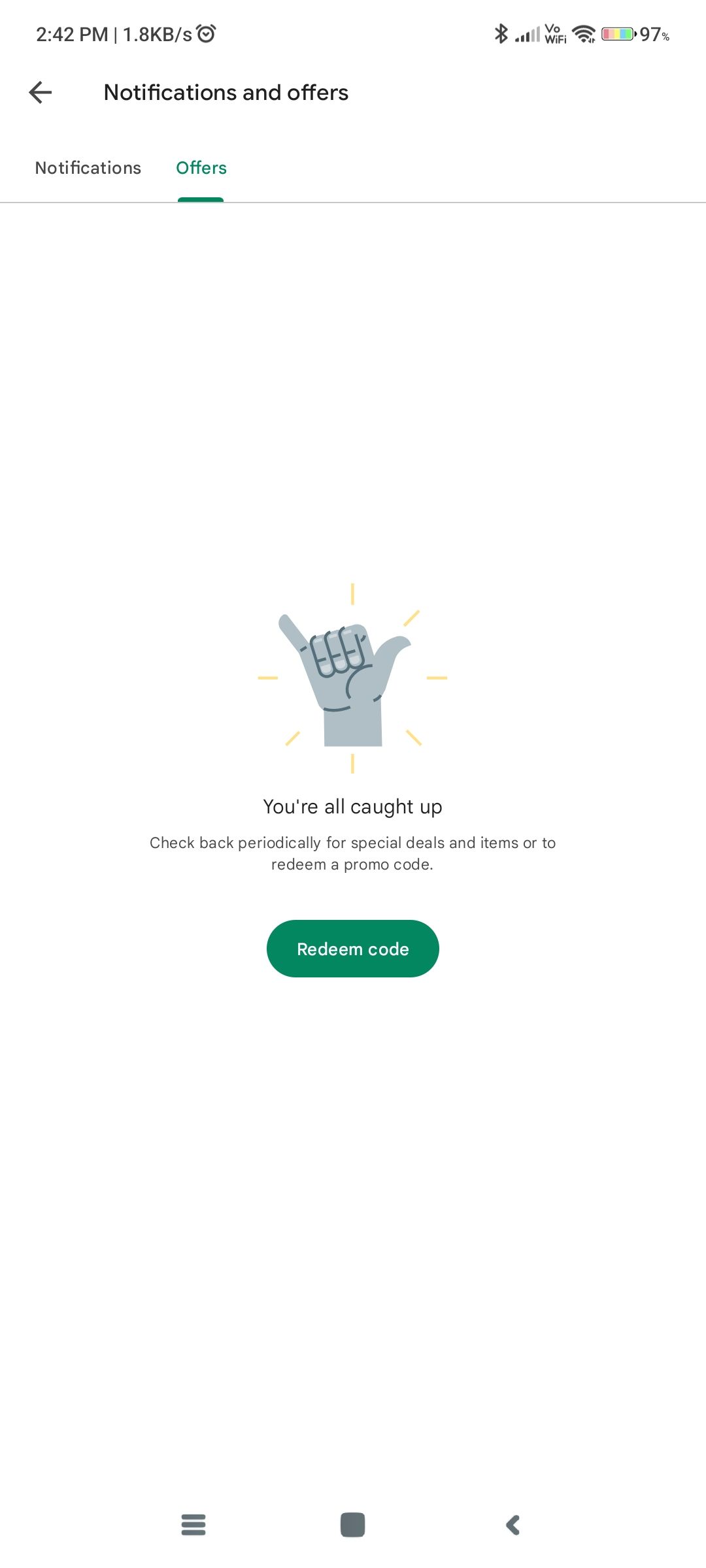
Old Play Store home screen; New home screen with bell icon beside search bar; Notifications section; Offers section
However, Google has kept the Notifications and offers option in the profile icon drop-down, so you can continue using that if you’re comfortable with the old way — the new design just lays greater emphasis on notifications and offers. The change makes it a little simpler to keep track of active subscriptions, games that are now live, orders, and other suggestions from the app store. It would be nice to have a dedicated button to view pending app updates, too — another section we frequent in the Play Store app.
We are seeing the new bell icon in version 34.4.16-21 [0] of the Play Store, and we didn’t have to update the app manually on any of our devices. The change appears to be rolling out worldwide, so if you aren’t seeing it, it may just be a matter of time before you do. If you want to try and skip the queue, you can install the latest version of the Google Play Store from APKMirror.
Thanks: Moshe

