The Oppo Find N isn’t just some fancy folding phone you can’t buy here in the US. It’s also probably the best example of a folding phone to date, and maybe even the most important folding phone released so far. That’s not because it’s a great phone — in my opinion, it isn’t. But it highlights the remaining shortcomings better than any that I’ve used. And, to Oppo’s credit, those are mostly software issues, some of which are entirely outside its control. But the Find N’s hardware is stellar, with a uniquely flat display and a much better landscape-first layout, easing my fears that Samsung’s early lead would lead to a monopoly. I’d go so far as to say that, in one fell swoop, Oppo’s folding hardware just leapfrogged the Galaxy Z Fold3 line.
Just as Oppo claimed, the Find N’s interior folding display is basically flat when you open it up, thanks to a more advanced hinge design than the Samsung Galaxy Z Fold3. Some have called it similar to Motorola’s hinge in the Razr, but I can’t tell you if that’s true. The folding display is not just stretched taut, either, it’s supported from behind by some kind of articulating mechanism. I’ve pushed against it a whole lot harder than I probably should have, dragging my finger across the seam with a concerning level of pressure, and apart from a few very small fluctuations you can feel but not see, it’s basically flat.
That pans out when it comes to viewing angles, too. I was never bothered by the seam on the Z Fold2 or Fold3, but there’s basically none here at all. Even with bright content, where that off-angle shift is more likely to be noticed, it’s almost perfectly uniform — at least, I can’t see any issues, and I’m very picky about that sort of thing. The same almost goes for the reflection, but it isn’t perfectly flat; there are a few slight ripples.
Find N display crease vs. Galaxy Z Fold3
There’s also no gap, as all of Samsung’s devices have had to date. Well, almost no gap — the two halves of the clamshell are meant to close together perfectly, but some small variations in the combination bezel/bumper mean you can see just a tiny bit of light at certain angles in certain spots, and there is a roughly 1mm square gap right at the hinge.
I’m literally paid to be critical about electronics, and I do have a few other minor issues to point out. For one, the display has that dreaded “jelly scroll” effect if you have particularly sharp eyes, as on the Z Fold3. The 120Hz refresh rate makes it much less obtrusive, but it’s absolutely still there (and caused by refreshing horizontally rather than vertically when held in landscape). The rubber that protects the edges of the display at the hinge is also not perfectly square, though the Z Fold3 has a similar issue.
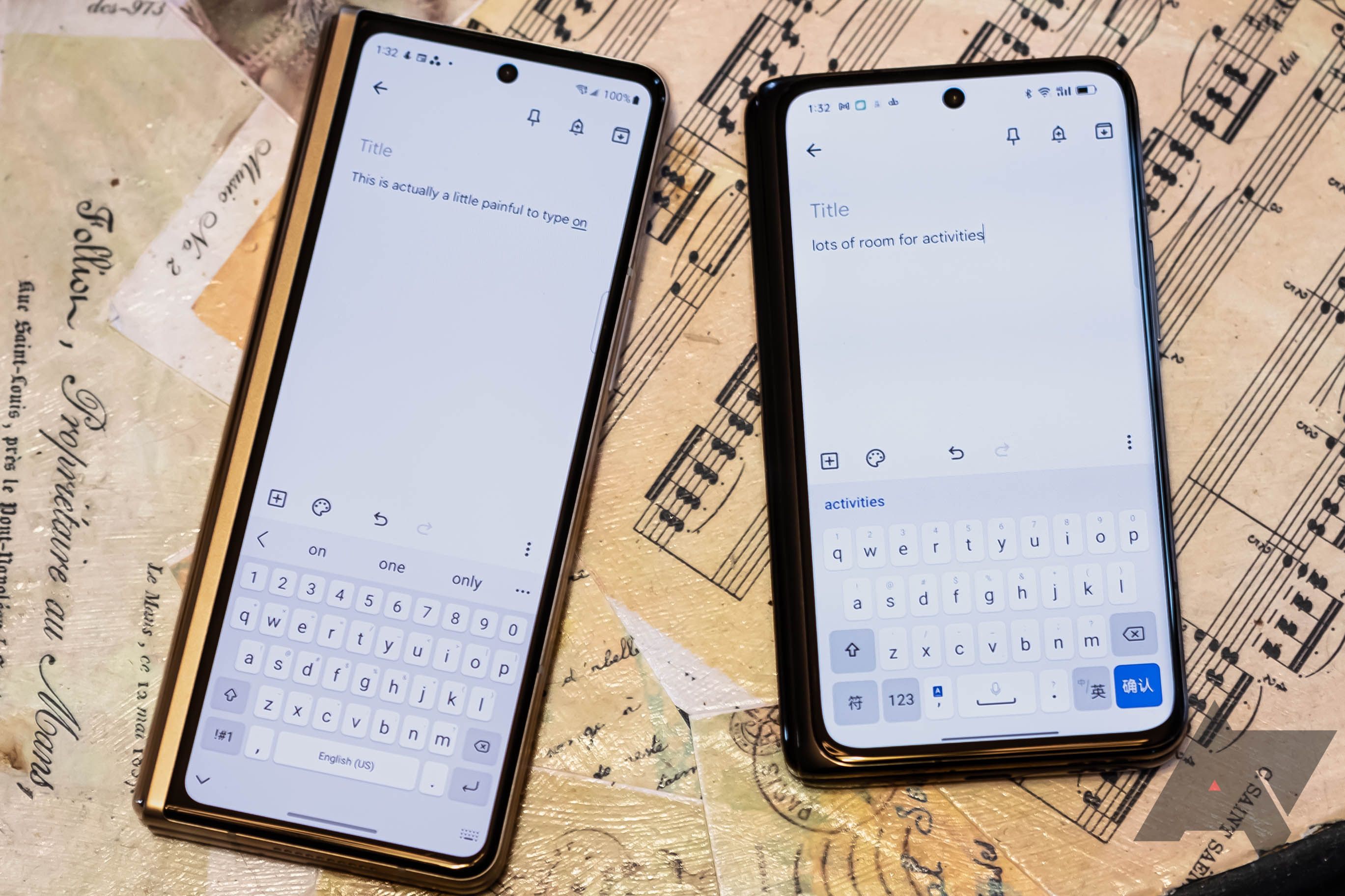
This isn’t just the best folding display I’ve used in any smartphone, Oppo’s overall physical design seems much more useful to me. The company’s equivalent of a “cover display” on the outside is wide enough that typing on it feels perfectly normal, and apps all format themselves normally without any weird issues. The Z Fold3 may beat it with a higher refresh rate on the cover display, but that tall, skinny window breaks app layouts, and my error rate tapping on a software keyboard is through the roof in that super-narrow portrait aspect ratio.
Oppo also has a couple of misguided ideas that make it harder to use. By default, the phone prompts you to continue using the exterior display after folding it with a spile on the outer display. I can’t tell you what the intention behind that was supposed to be, but I can tell you the mere act of closing the phone with both hands triggers the exterior display almost 100% of the time, and it’s very frustrating. That’s a setting you can disable, but honestly, it just should be off by default. The combination power button and fingerprint sensor is also far too sensitive by default, triggering a scan if you even brush it. It could just be the new-tech-fondling, but that’s better set to require a press of the button.
Oppo's multitasking and window management aren't quite as intuitive for me as Samsung's, though they work very similarly. Oppo even duplicates Samsungs admittedly-also-duplicated handle for apps in split-screen, and you can even ostensibly create App Pair-like combinations for fast launching. (That is, it offers to make these pairs and drop them on your home screen, but I can't actually find them wherever it's putting them.) But there are differences, like pulling an app from split-screen into floating mode where you can't just immediately put it back, as you can on Samsung's devices. These are tiny things, but it makes window management here just a little less fluid.
As an actual phone, it has some issues as well. Admittedly, I am using a model intended for the Chinese market in the US, and that’s always a bad idea, but band support is lacking, and I’ve already missed a few important calls, all while ostensibly connected. And that’s ignoring the other more typical Chinese market software issues. From the built-in software keyboard (and its weird special password entry mode that raises concerns rather than easing them) to the piles of Chinese market bloatware, and the near-constant permission-granting, Oppo’s software just doesn’t feel very nice to use. In fact, it’s kind of grating.
This isn’t a full review, as our format here implies. But this back and forth encapsulates the experience: Stellar hardware held back by its software. But I need to stress, some of that isn’t even Oppo’s fault. There’s blame here to spread around on other developers, which we’ll touch on soon enough. It’s all unfortunate, because the hardware is just so good. I hate to say that folding smartphone design has “peaked” — really, we’re just getting started — but I think the Find N is the best physical implementation of the idea I’ve seen so far. Open it up, though, and even excluding Oppo’s software, you run into a whole new set of issues that could explain why Samsung took the approach it did. The same as tablets, Android just isn’t ready for a big screen yet, and developers have yet to catch up — if they ever can.
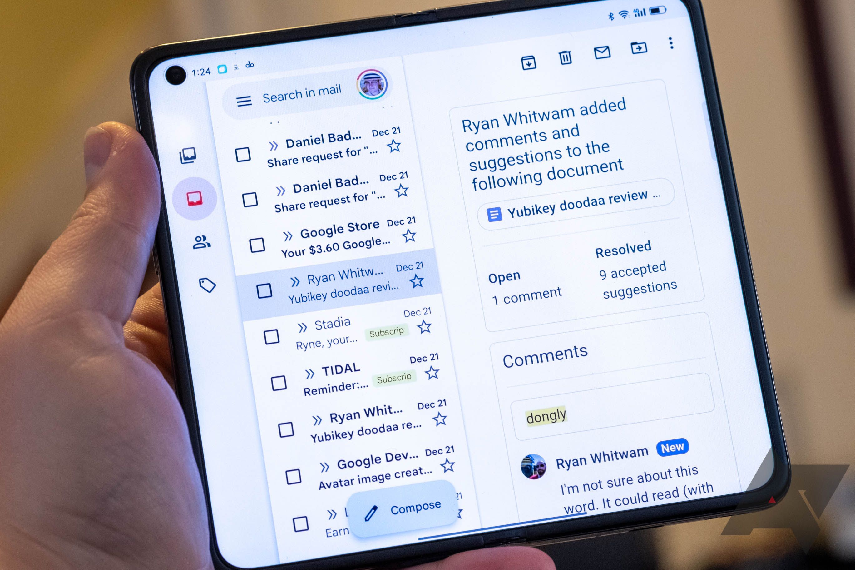
When unfolded, the Find N’s display takes a landscape-first approach compared to the Fold3’s portrait-first. We’re only a little bit off square at these aspect ratios, but Oppo is going for just-barely-wider-than-tall, while Samsung aims for the opposite. That means more apps will switch to a tablet-style layout on the Oppo Find N than on the Galaxy Z Fold3. And for some apps, like Spotify or Gmail, the tablet layout generally works well enough for that transition to bring genuine added value — outside some bugs that I’ll mention later. But not every app is ready for that layout.
A lot of apps scale like this — you can't see very much.
Until recently, the only big-screen devices app developers have had to target have been tablets. And, as long-time readers will likely remember, that touches on something we complain about a lot: Developers basically ignore that Android tablets are a thing because they’re such a small part of the market. As a result, a whole lot of apps just ignore the extra space and scale up and out with the same layout they do on a 5” portrait screen. Turns out that means they look like actual garbage on a big landscape display. And, well, the Oppo Find N has a big landscape display when unfolded, so a lot of apps look like garbage there, too.
Adding to that issue, Oppo’s ColorOS flavor of Android is not the most well-engineered piece of software out there, and display scaling for things like text and apps varies more drastically across apps on the Find N than it does for me on the Galaxy Z Fold3. I couldn’t tell you why that is, but it does mean that some of the apps that do support larger screens, like Gmail, don’t look great. Part of that seems to be because the default DPI and font sizes are just way too big, but even when you tweak those settings to compensate, there still isn’t as much uniformity as there is on Samsung’s foldables — you randomly run into things that are still way too big.
I expect that part of this issue will be resolved when Android 12L (nee Android 12.1) lands with better support for foldables. Though it ostensibly rolled out as part of Android 11, Oppo told me during my initial brief for the Find N that it wasn’t using the hinge angle detection API that landed with Android 11, and the snazzy system UI support for foldables and big-screen devices isn’t present, either. While I’d argue that the hardware is past this stage, foldables are still early adopter territory when it comes to software. Google, device manufacturers, and app developers will all have to do their part for the dream to come true. If history is any indicator, those last folk are the most likely to drop the ball.
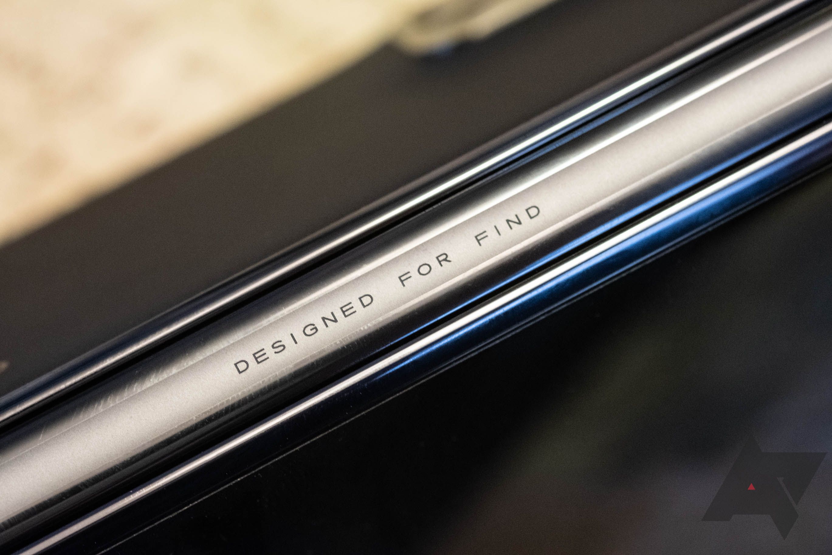
This inscription looks cool, but it's kind of gibberish.
The Oppo Find N is probably the most important phone that’s landed for me in the last few months — maybe even the last year. It’s not objectively an amazing device, but it almost perfectly encapsulates the state of folding phones right now, showing off the very best hardware while pointing out the current flaws in the software approach. None of our readers are likely to buy it — it’s only coming to China and you really, really shouldn’t import one — but it demonstrates how much work Google and developers have before them.
It also eases one of the biggest fears I had in the back of my mind, and that was that Samsung had a three-generation head start when it came to folding phones, leaving every other company in the dust. Huawei was almost destroyed by the US sanctions, stalling their plans, and even TCL abandoned its concept devices before bringing them to market. I was legitimately worried that Samsung might be too far ahead for anyone else to catch up, but with a single device, Oppo just proved that wrong. If and when OnePlus can get its new Oppo-derived software situation under control, I’d be really excited to see what it can do with this sort of hardware possible from its parent company.

.JPG)

.JPG)

