Material You has been around for a few years now, and with Android 14 right around the corner, it's easy to take this fantastic feature for granted. However, despite the improvements made in Android 13, I am still resigned to sending apps to my screen of shame two years after the feature debuted. It's a problem I expect to persist on everything from Pixel phones to budget Android tablets.
Here it is, my screen of shame
Meet my screen of shame. This is where all my apps that don't support Material You's themed icons live. It's an ugly, uninspiring place that doesn't need to exist.


The release of Android 12 was a godsend to people like me, who always wanted to have a beautiful customized phone but got bored negotiating with icon packs and even the best Android launchers. A unified, dynamic theme that would automatically bring (almost) all of my apps into visual symmetry? Yes, please! However, the lack of dynamic icon theme support for third-party apps has highlighted the glaring issue with Material You.
However, the future could hold the solution. A feature spotted earlier this year in Android 13 QPR2 Beta 2 would automatically create a monochrome version of every app icon on your phone, which could then be used for dynamic icon theming. However, it's still an experimental feature, and there's no guarantee we'll see a stable release. Until then, the screen of shame remains.
What went wrong with Material You
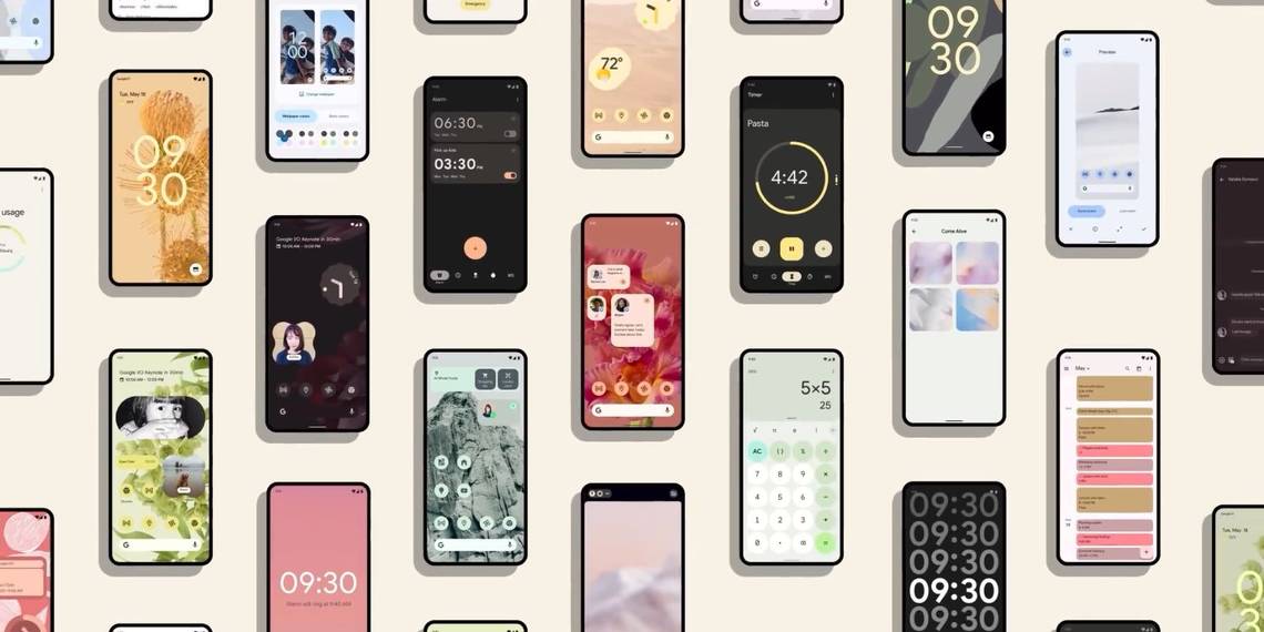
The goal of Material You was to unify your Android phone, bringing everything together into a harmonious whole. Dynamic theming means you'll never look at the same combination of colors twice while fonts and shapes meld together into a seamless digital tapestry. But once you exit the carefully controlled environments of Google's apps, a muddle of discordant colors comes to the fore.
While there's nothing Google can do about the apps besides encouraging developers to use Material You, Android 13 brings dynamic icon theming to all apps, which could theoretically solve this problem for your homescreen. But it won't.
Android 13's dynamic icon theming partially solves this problem, but unless Google finds a way to force it on icons seamlessly, the problem won't go away. This is because it relies on app developers, and while many hip and fresh apps are willing to make the changes, many more won't.
You may notice in the above screenshots that Sync, a third-party Reddit app, has a themed icon. Sync has fully embraced the Material You style, comfortably existing alongside official Google apps.


Still, Sync's adherence to Google's design merely highlights the issue. Trendy apps like Sync and Inware might be all-in on Google's design language, but who will follow? Some of my apps are ancient. The day National Rail adds Material You support is when Google doesn't leak everything ahead of an official reveal date. Developers need to provide a monochromatic version of their app icon to join in the theming fun. It's extra work that underfunded development teams may not have the time for.
Third-party icon packs vs. themed icons
The solution might be installing one of the top third-party icon packs. Many options are available, which essentially do the same thing as the Material You themed icons but with more app support.
The critical difference between third-party icon packs and themed icons is how the work is distributed. Creating a unified experience is a priority for third-party launchers, not an optional extra. But this comes with a couple of disadvantages. First, if you're a fan of Material You, you won't experience the harmonious themes that are its key selling point. Second, developers have no say in how their app icons will look.

It's easy to see what app icons have Material You potential and which don't.
By putting the work in the hands of the developers, Google ensures developers can create an app that fits the Material You theme while retaining control over how their app icon looks. Still, not every development team will view this as a priority. And while the current style is for minimalistic icons, what about games that rely on busy icons or companies that don't want to lose their brand colors?
The future of app icon theming
Google's attempt at encouraging app icon uniformity has also vastly reduced the customization available to the user. For instance, font and icon customization were dropped for Android 12. If you have too many apps on your homescreen, the themed icons become an incongruent blur of bold lines and pastel shades. It's a neat idea if you think an IKEA showroom is the peak of design. However, for those who prefer to have their phone feel like it's entirely theirs, Material You doesn't deliver. At least not yet.
The Google Pixel Fold, which was revealed alongside the Google PIxel 7a and lots of other products at Google I/O 2023. The new foldable shows off a big display with Material You front and center. But I can't help but think that with a screen that big, Google needs to take a step beyond monochrome icons to create a truly innovative design language.