Material You might be coming up on its first birthday in a few months, but that doesn't mean every Google app is done adopting the latest design trends. We've known for a few months now that the Play Store was set to receive a revamped UI on Android, complete with pill-shaped buttons now commonplace in many of the company's apps. It's taken a while, but it seems like Google is finally ready to roll out these changes to more users.
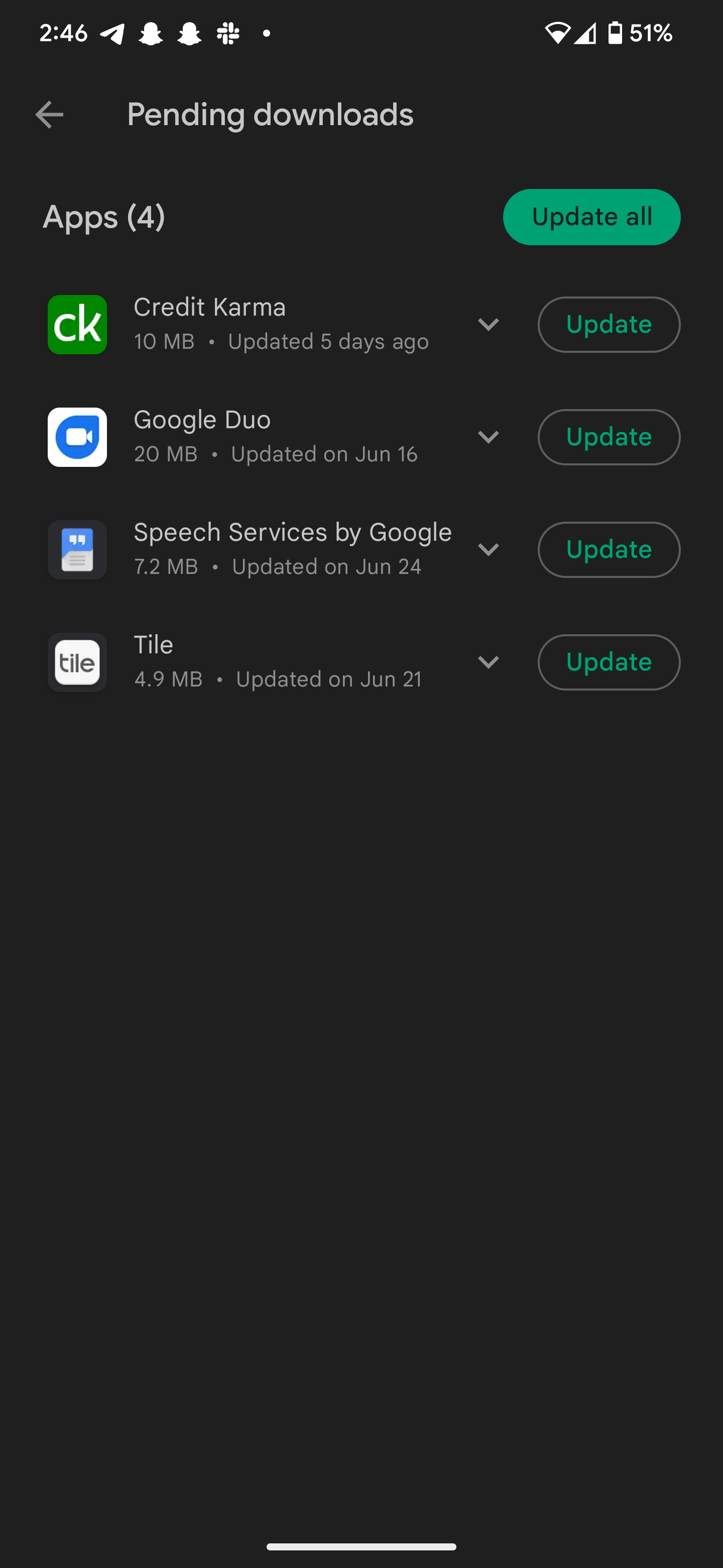
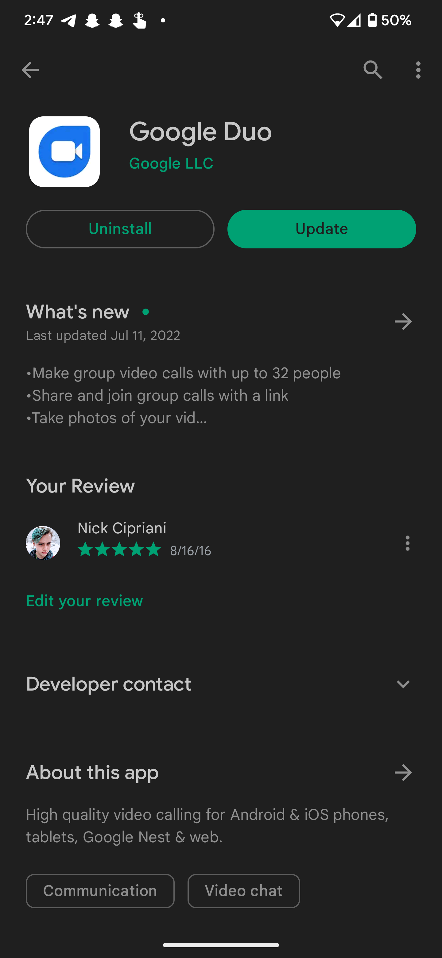
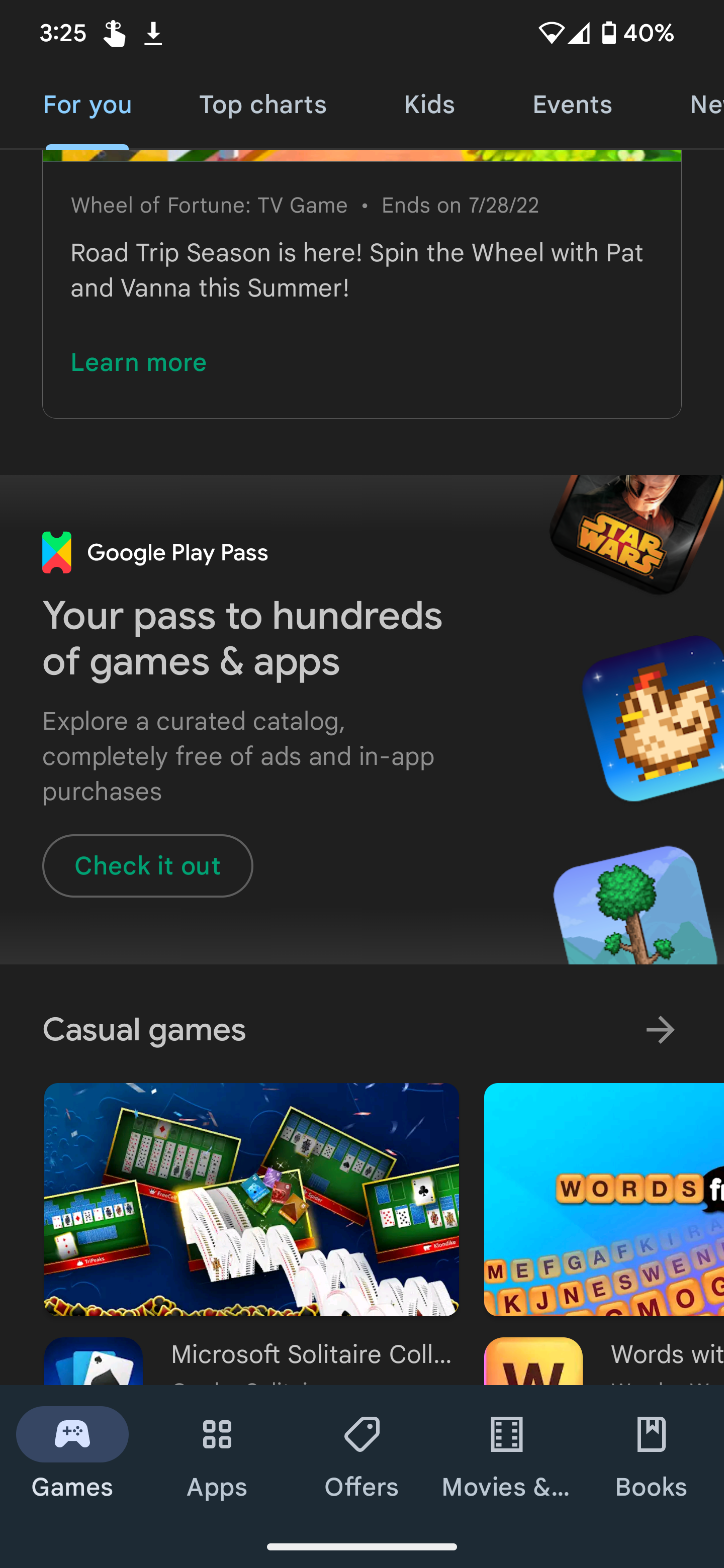
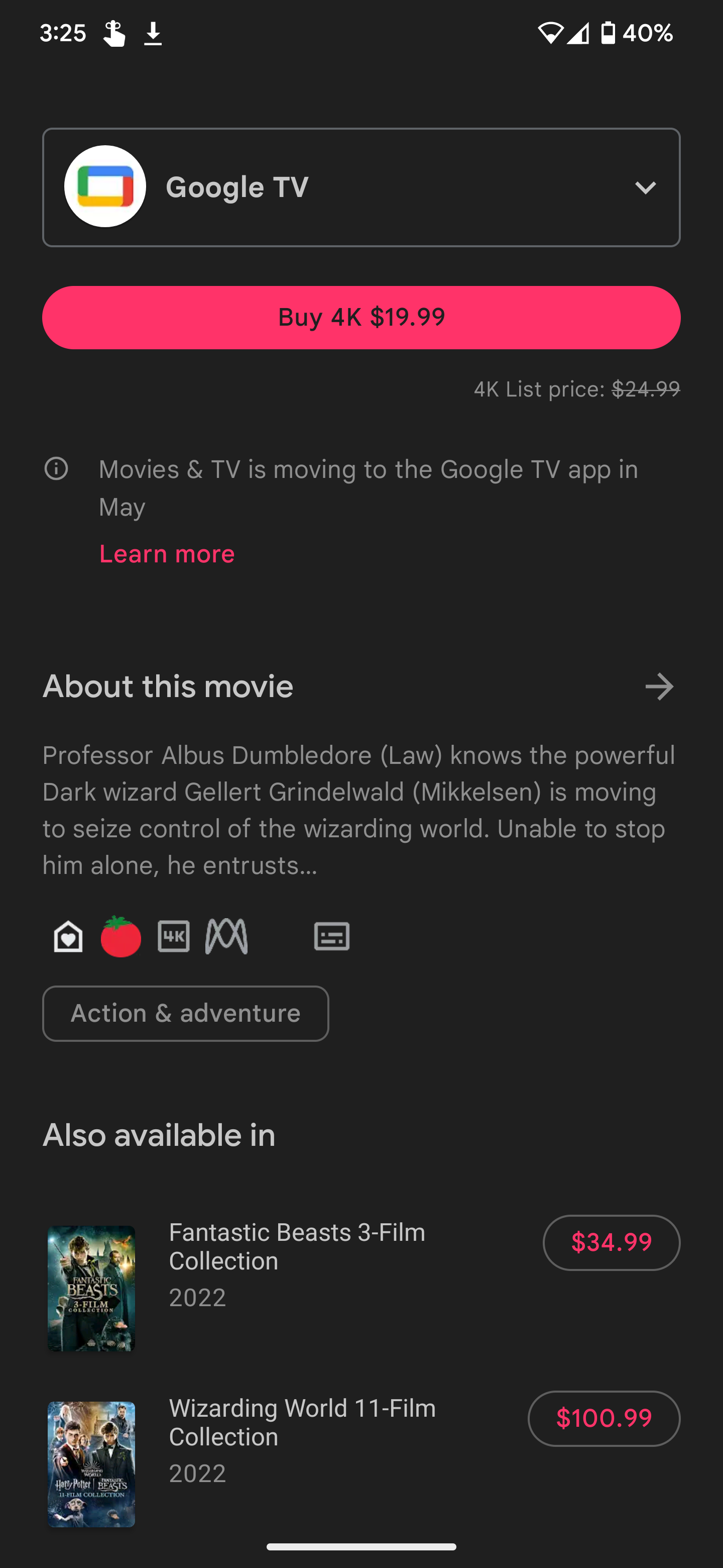
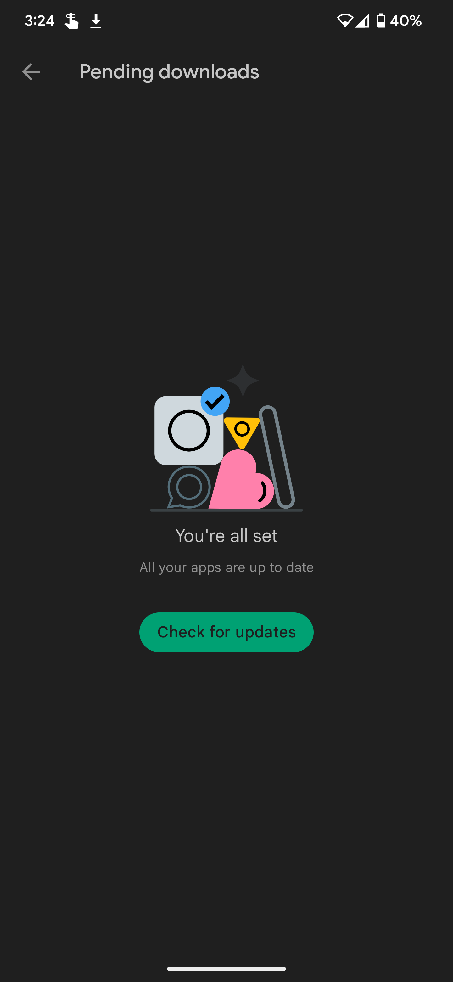
New, rounded buttons.
As spotted by one of our tipsters, the Play Store on Android is now rocking some brand-new circular buttons that make the current rectangles — even with their rounded corners — look out of date by comparison. Pending updates, developer links, movie purchase links, and much more now sport those pill-shaped icons we've seen in other Google applications, unifying the company's overall design language and setting the trend for third-party developers to follow. It also brings the app in line with the redesigned web interface, which previously implemented these new buttons when it launched a few weeks ago.
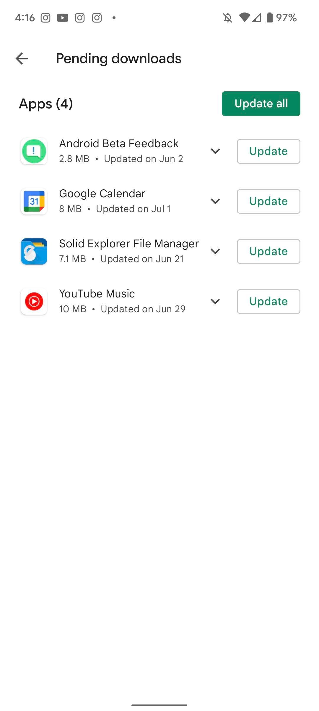

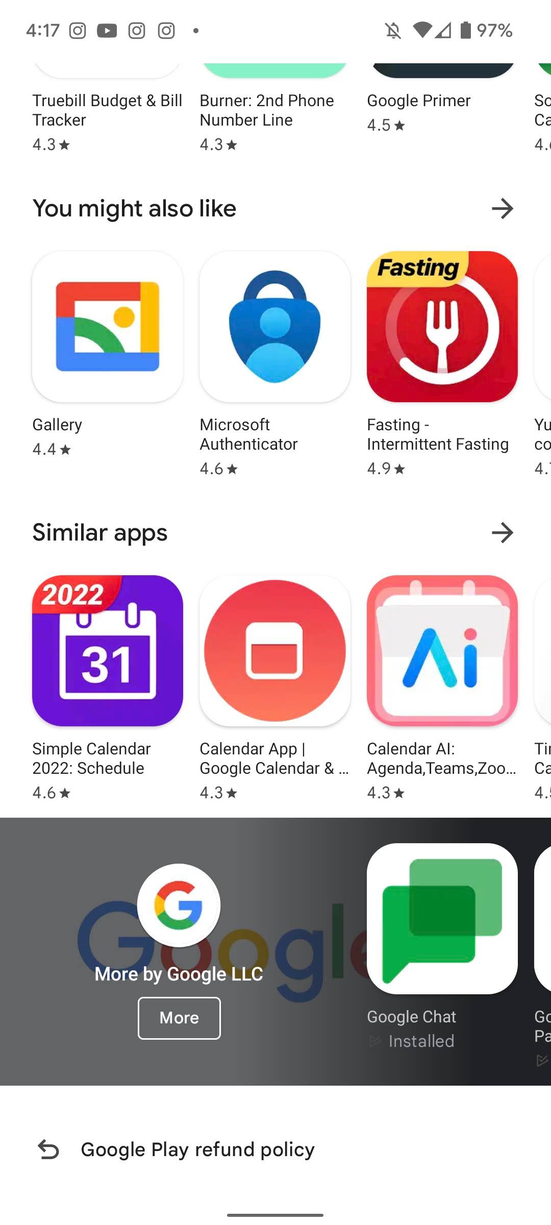
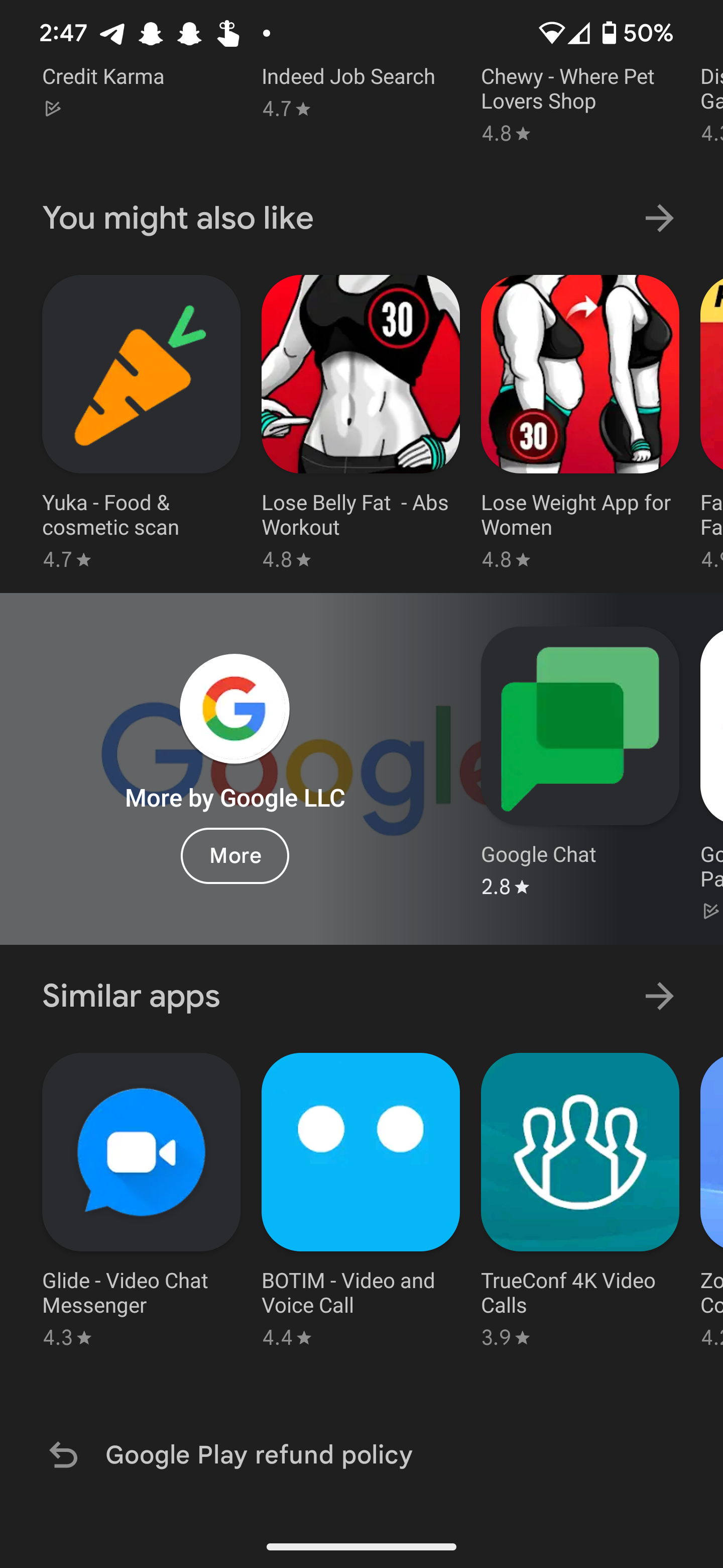
Old, squared-off buttons.
It's definitely a small change in the grand scheme of things, but it does a great job of making all of the company's Android apps feel a little more cohesive. Even within the Play Store itself, certain UI elements have looked off since the transition to Material You. For example, the search bar has used the same rounded look for months now, though it's only with this latest update that app buttons received the same attention. It also matches the tablet-friendly UI that started rolling out to big-screen devices earlier today.
It seems like this update is going wide for most users, though it does seem linked to a server-side patch that could take some time to reach everyone. In the meantime, you can always ensure your phone is up-to-date by installing the latest APK from APK Mirror.
Thanks: Nick

