When it comes to making spreadsheets, there are different tiers of users. At the bottom is data entry. This is having enough knowledge to organize your information in a table for record keeping. One step up from this are the users that can perform basic manipulations on that data, such as finding sums and averages.
But sometimes, the data in a spreadsheet can be so extensive that it's impossible to extract any meaningful information. To overcome this hurdle, take the next step and harness the power of pivot tables. And if you're trying to harness the power of the best Chromebooks on the market, we've got you covered.
What is a pivot table?
A pivot table is a semi-automated tool that presents custom summarizations of large sets of data to make sense of it. Before pivot tables, even if you knew how to crunch your data, you still had to input the formulas and format the output manually so that it made sense to the VPs.
Pivot tables take that work out of your hands and let your computer handle the heavy lifting. To understand what pivot tables are capable of, let's play with a data set.
How to make your first pivot table
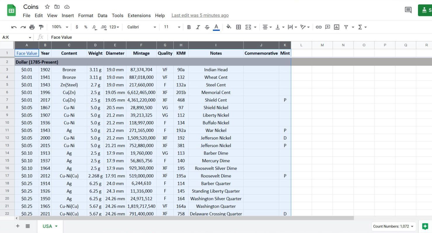
To start, navigate to Google Sheets and open the spreadsheet you want to work on. This example uses a coin collection because that's more interesting than looking at monthly revenues and expenses.
There are two ways to generate pivot tables in Sheets. You can either use the Explore button in the lower-right corner of the browser window or the Insert menu from the ribbon menu at the top of the page.
Make a pivot table using the Explore button
-
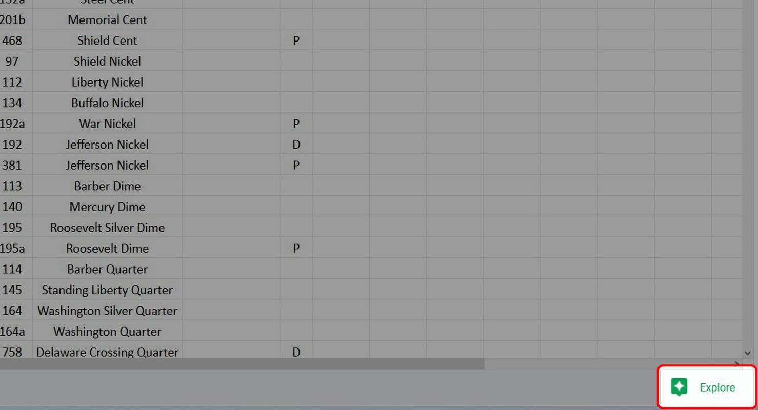
Click the Explore button in the lower-right corner of the window to open the Explore pane.
-
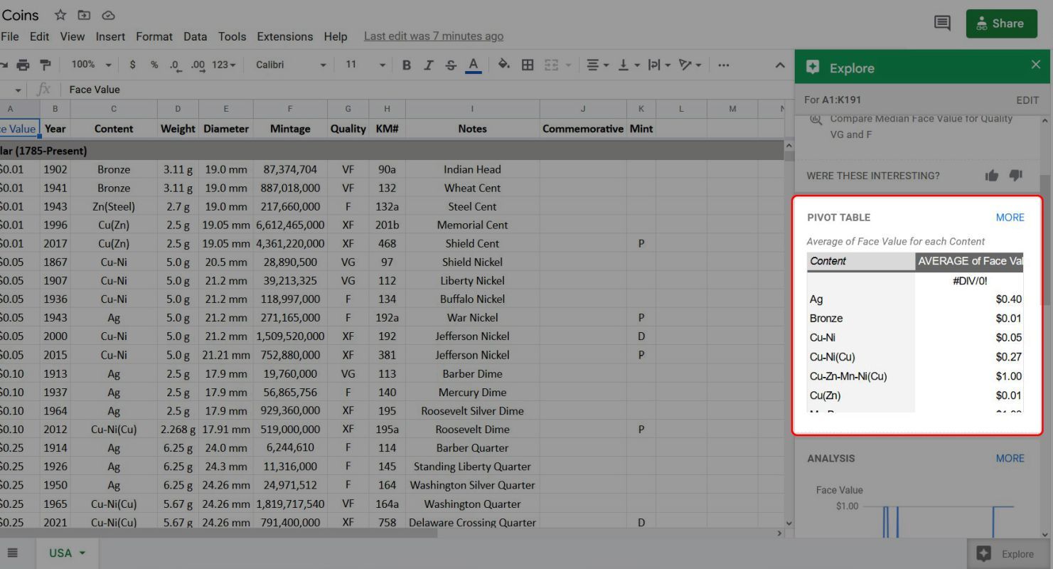
Click Pivot Table to see a preview of the table.
-
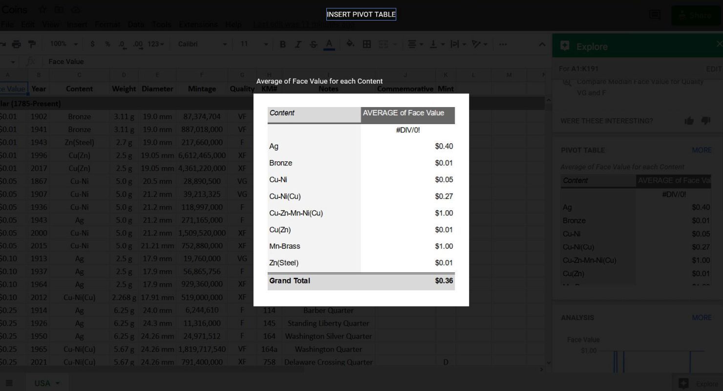
Click Insert Pivot Table.
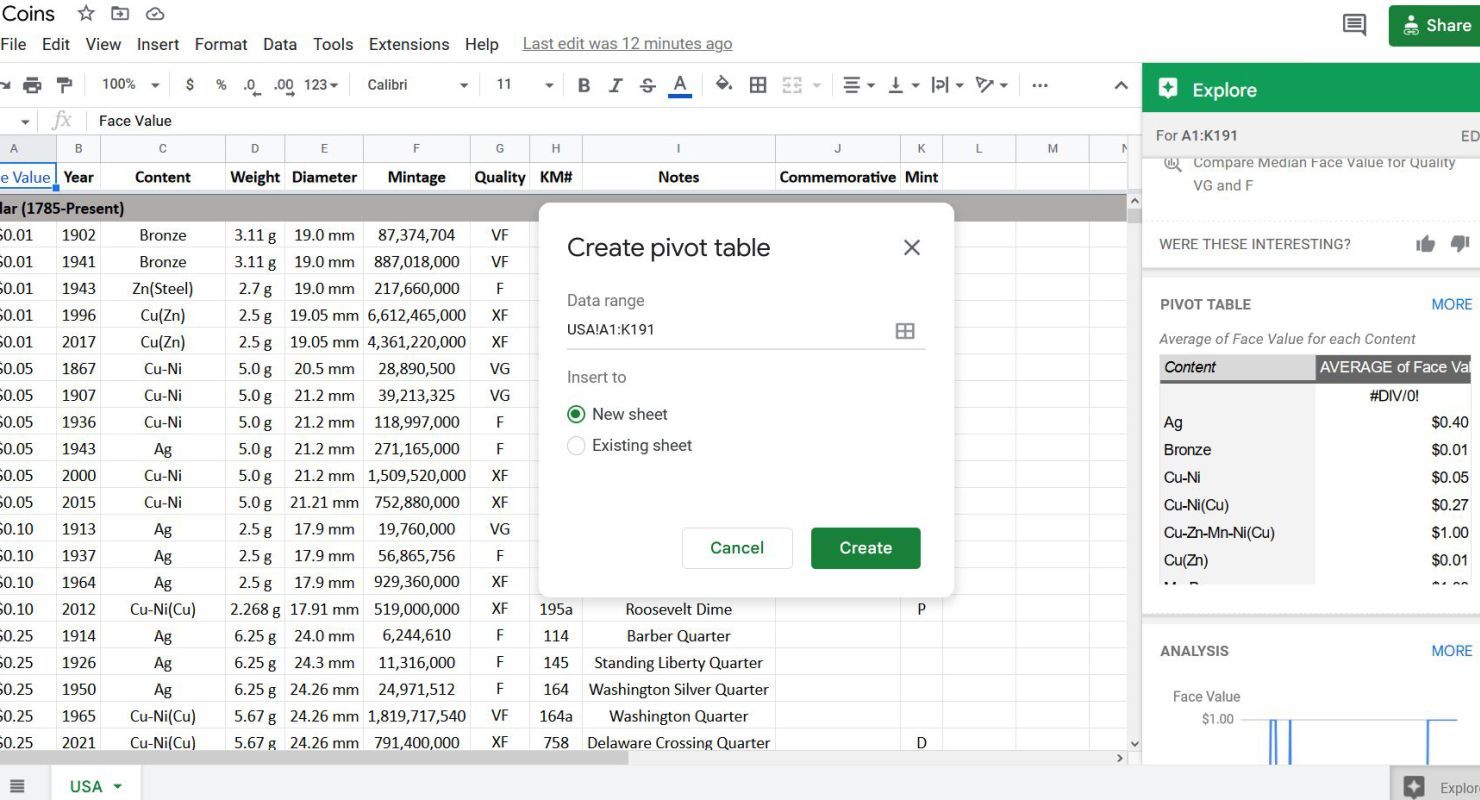
- Confirm the range encompasses the data you want to use in your pivot table.
-
Choose whether to insert the table on a new sheet or in the current one. Select New sheet to make a cleaner presentation.
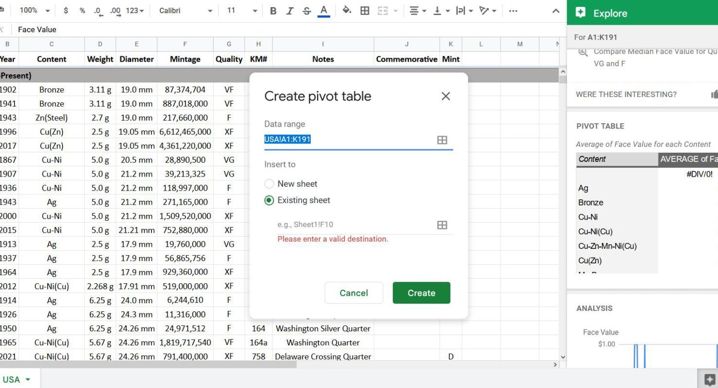
- When you select Existing Sheet, specify the cell you want to be the upper-left cell of your pivot table.
-
Click Create.


Congratulations, you just made your first pivot table! Time to update your resume. The sheet where you inserted your pivot table looks different from the sheet with the source data. The difference is the Pivot table editor panel on the right.

Make a pivot table using the Insert menu
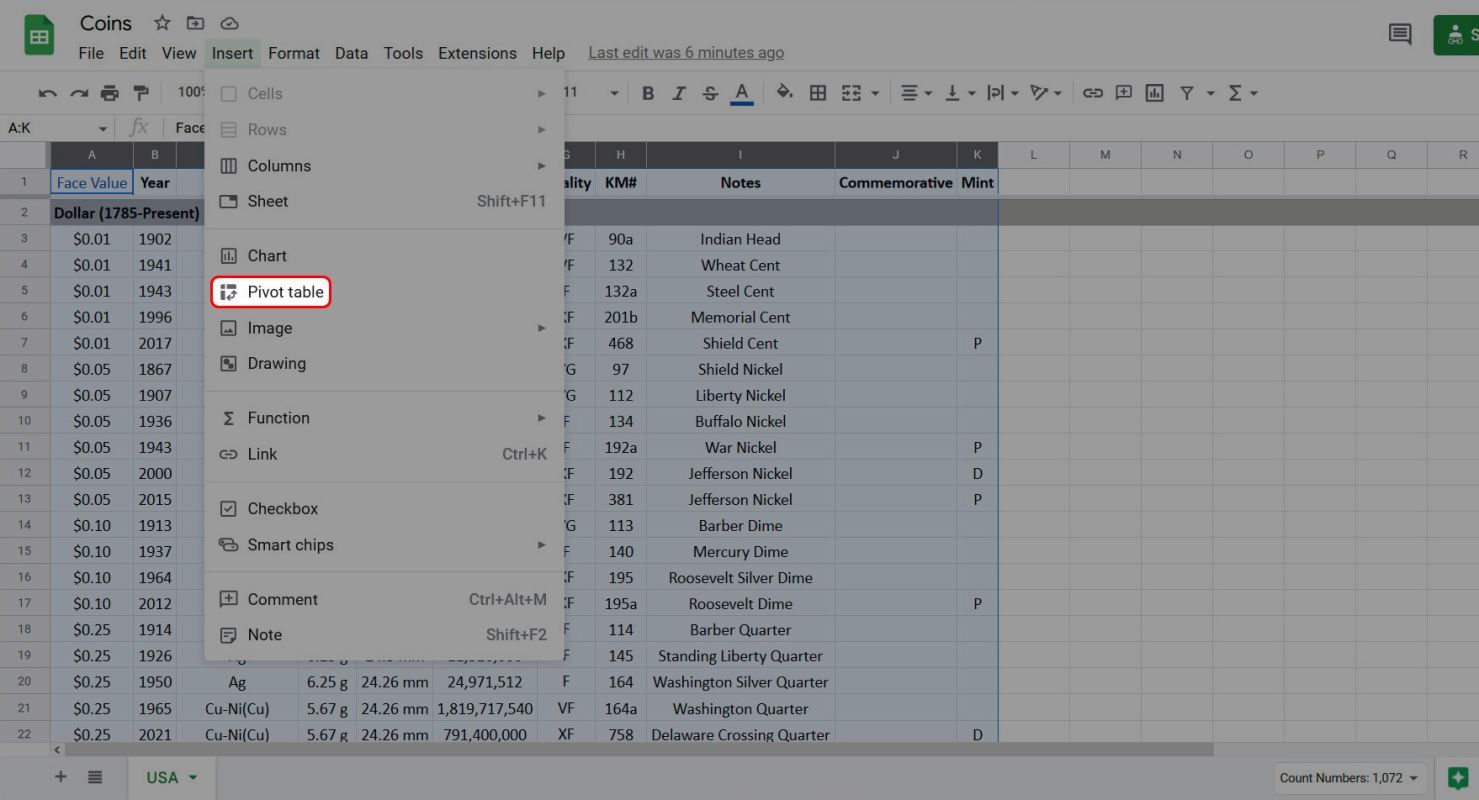
- Return to the sheet with the original data.
-
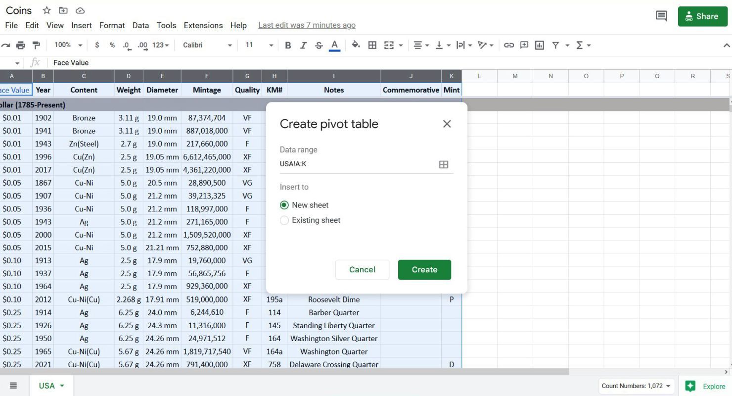
Select the data you want available to the pivot table. In this example, we want everything in columns A through K, so click and drag the column heads to select their data.
-
Click Insert in the top menu, then select Pivot table from the drop-down menu to open the Create pivot table window.
- Confirm the range of data you selected.
-
Choose whether to insert the pivot table into a new sheet or the current sheet. Select New sheet and then click Create.


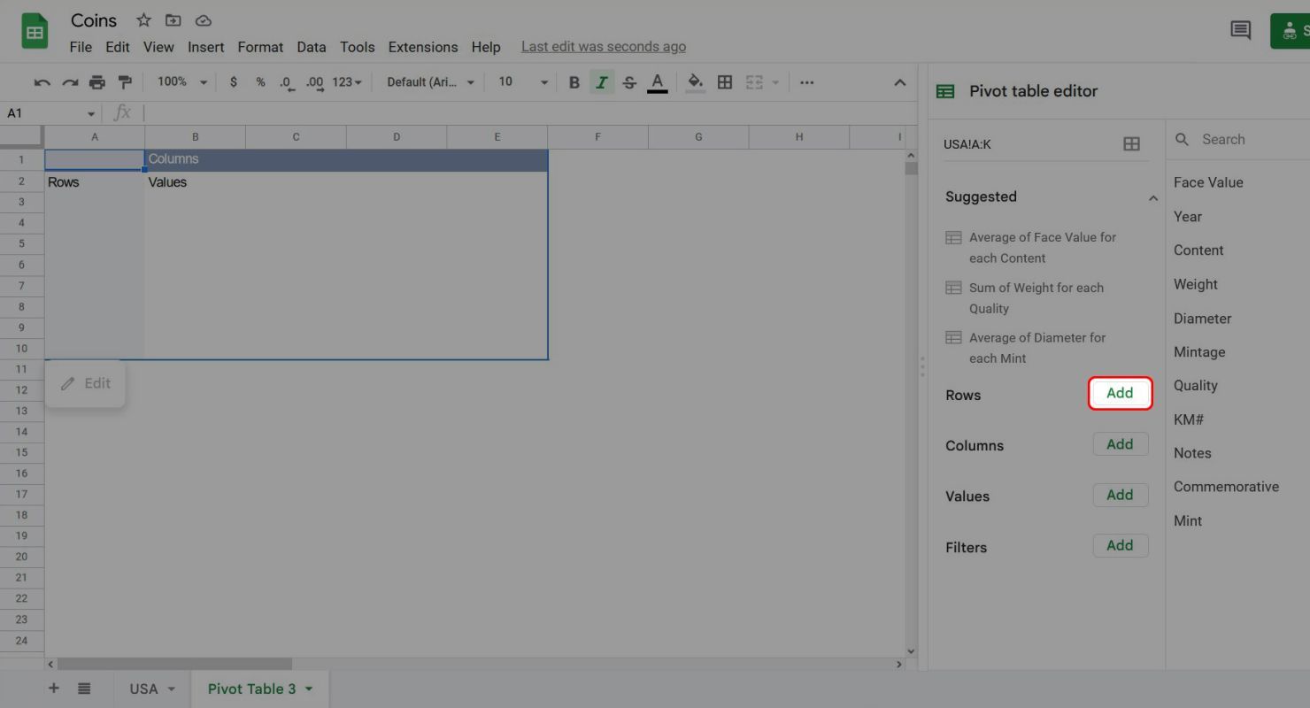
You'll see a new pivot table that's similar to the one made using the Explore button, only it's empty. That's because the first method we used made some guesses about the kind of information we wanted to extract from our data set. Using the second method doesn't make any assumptions, so we have to tell Sheets which data we want to summarize and how we want it summarized.

How to manipulate pivot tables in Google Sheets
The insight discovered by Pito Salas, the inventor of pivot tables, was that spreadsheets were made up of three parts: input, output, and formulas. Pivot tables make managing these three elements easier by taking the grunt work of integrating them and hiding them under a layer of abstraction.
At the right of the window is the Pivot table editor. This is where you manage which inputs, or groups of cells, you want to use in your table and which formulas you want to use to manipulate that data. On the left is your spreadsheet with your pivot table. Unlike a regular spreadsheet, you won't directly put any information in the cells. That process is handled automatically based on how you use the Pivot table editor.
-
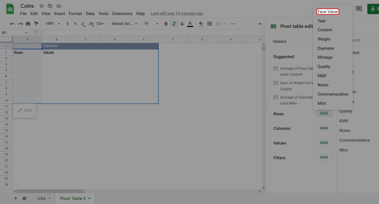
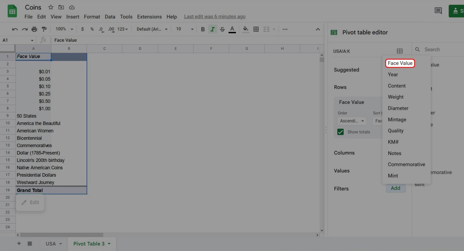
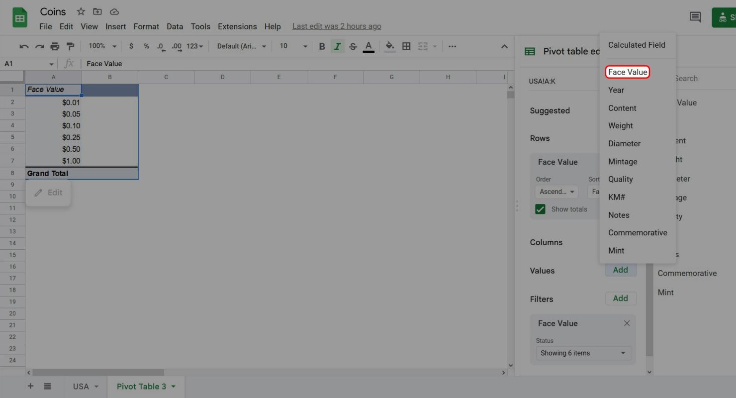
Click the Add button next to Rows to display a drop-down menu where you can choose the column of data you want to use.
-
Select Face Value.


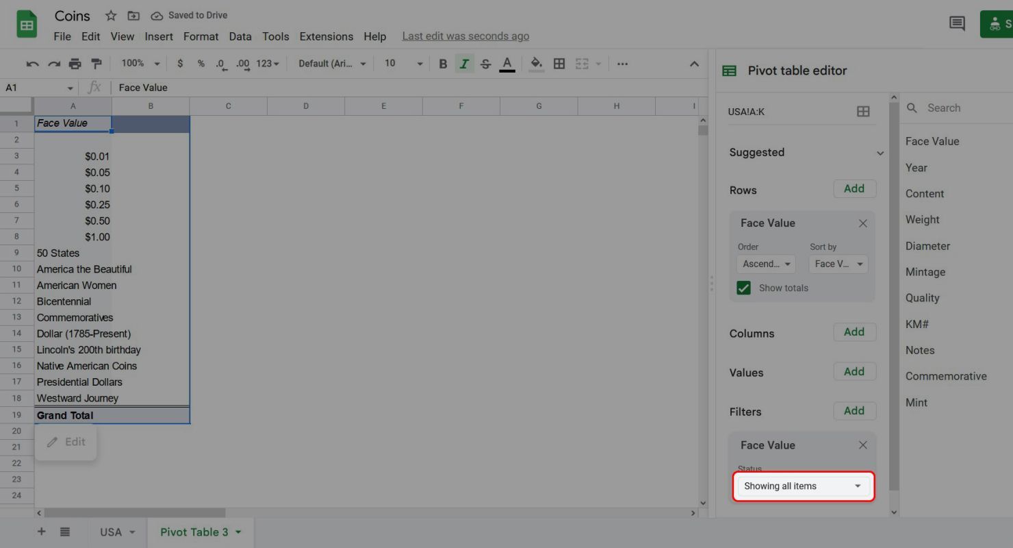
You'll see the cells in the first column of the pivot table filled with the unique values of the Face Value column from the original data set. There's also a new box under Rows in the Pivot table editor.

This is a good start, but we need to do something about the categories of coins mixed in with the face values.
-
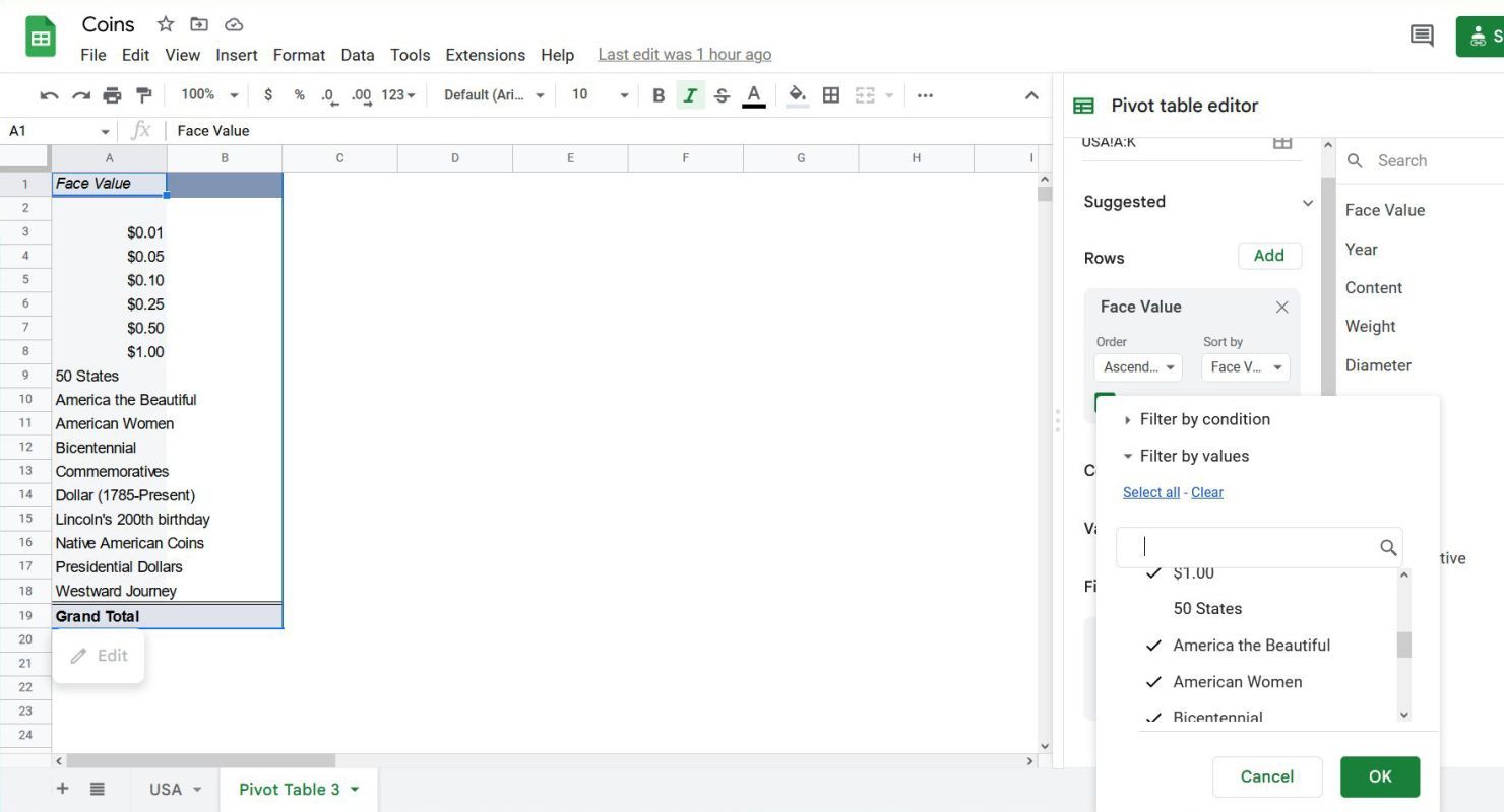
In the Pivot table editor, click Add next to Filters.
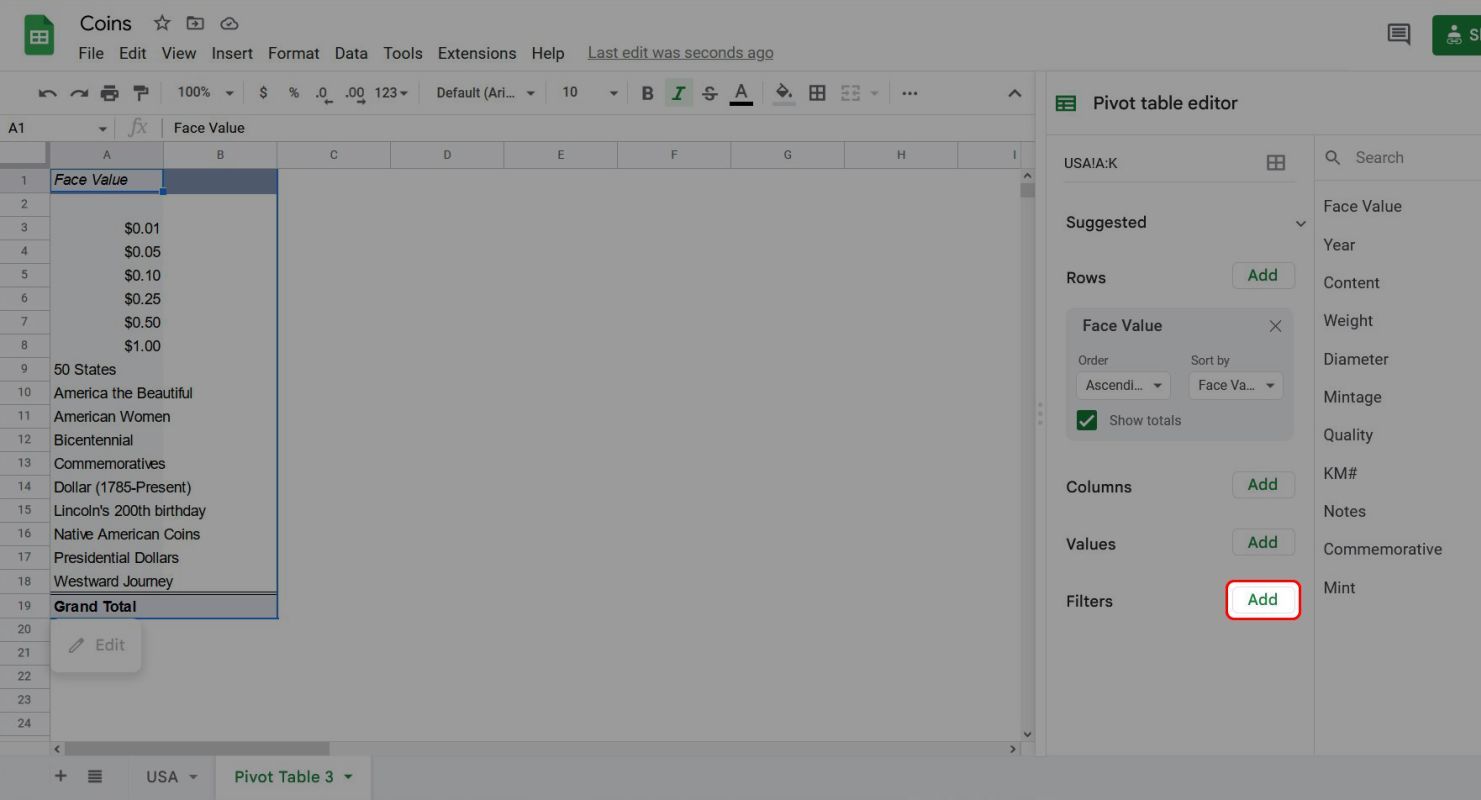
-
Select Face Value since that's the column with the data that needs to be filtered out.
-
In the box under Filters, click Showing all items in the Face Value box.
- Scroll through the list and uncheck anything that isn't a face value.
-
When you're done, click OK.


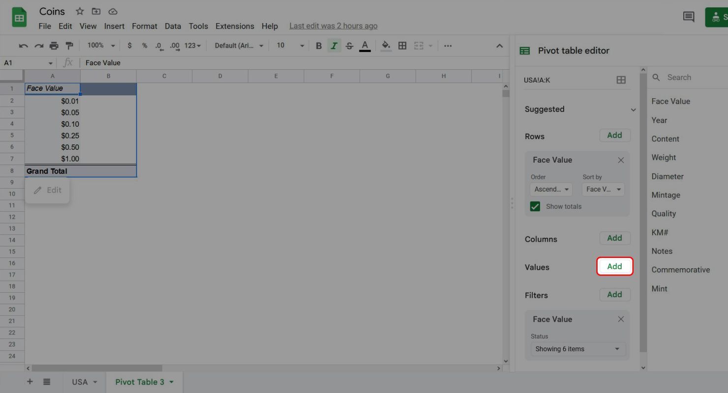
This leaves a list of the unique face values in the collection, which isn't very interesting and doesn't reveal anything that was hidden in the original data.

To uncover some of the power of pivot tables, you'll need to add some values.
-
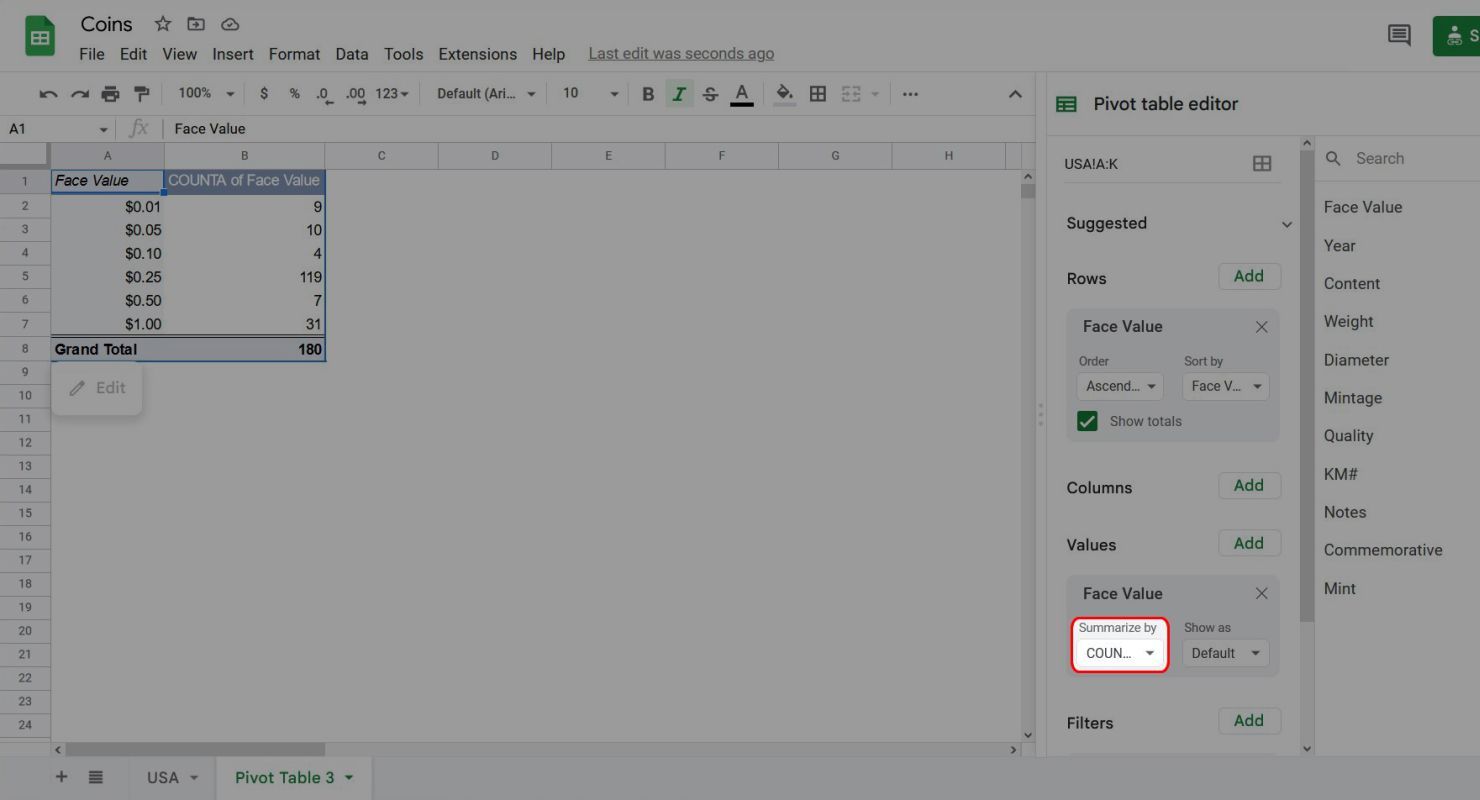
In the Pivot table editor, click Add next to Values.
-
Select Face Value and click OK. This may seem redundant, but selecting the same column of data illustrates how Values differ from Rows and Columns.


At first glance, what you're looking at might not be obvious. So, widen column B to see what it says.

COUNTA is a Sheets function that looks at a range of cells and outputs how many cells in that range have anything in them. In this case, the pivot table displays the number of cells in the Face Value column of the original data that have those corresponding values. In other words, there are nine pennies in this collection, 10 nickels, four dimes, 117 quarters, seven half dollars, and 31 dollars.

This is pretty neat, but part of the power of pivot tables is how easy it is to refactor data.
-
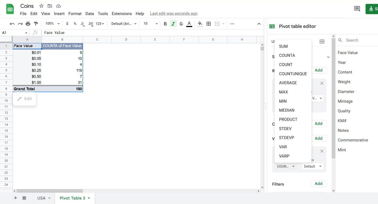
In the Face Values box under Values in the Pivot table editor, click the Summarize by box.
-
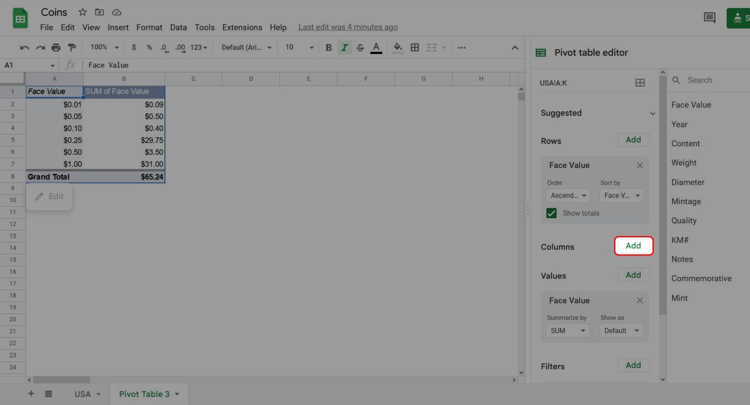
The pop-up menu displays a list of Google Sheets functions you can apply to your data. Not every function is appropriate for every set of data. For now, select SUM.


With just a few clicks, we've gone from counting the coins in the collection to getting the total face value. Let's add one more field to see how much information can be squeezed out of the original data.
-
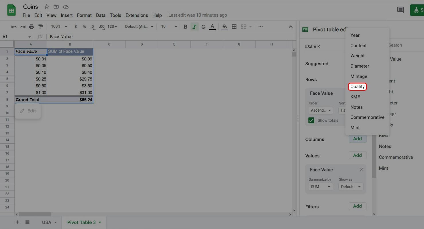
In the Pivot table editor, click Add next to Columns.
-
Select Quality from the pop-up menu.
-
Change the Summarize by function in Values from SUM to COUNT to make the data more readable.
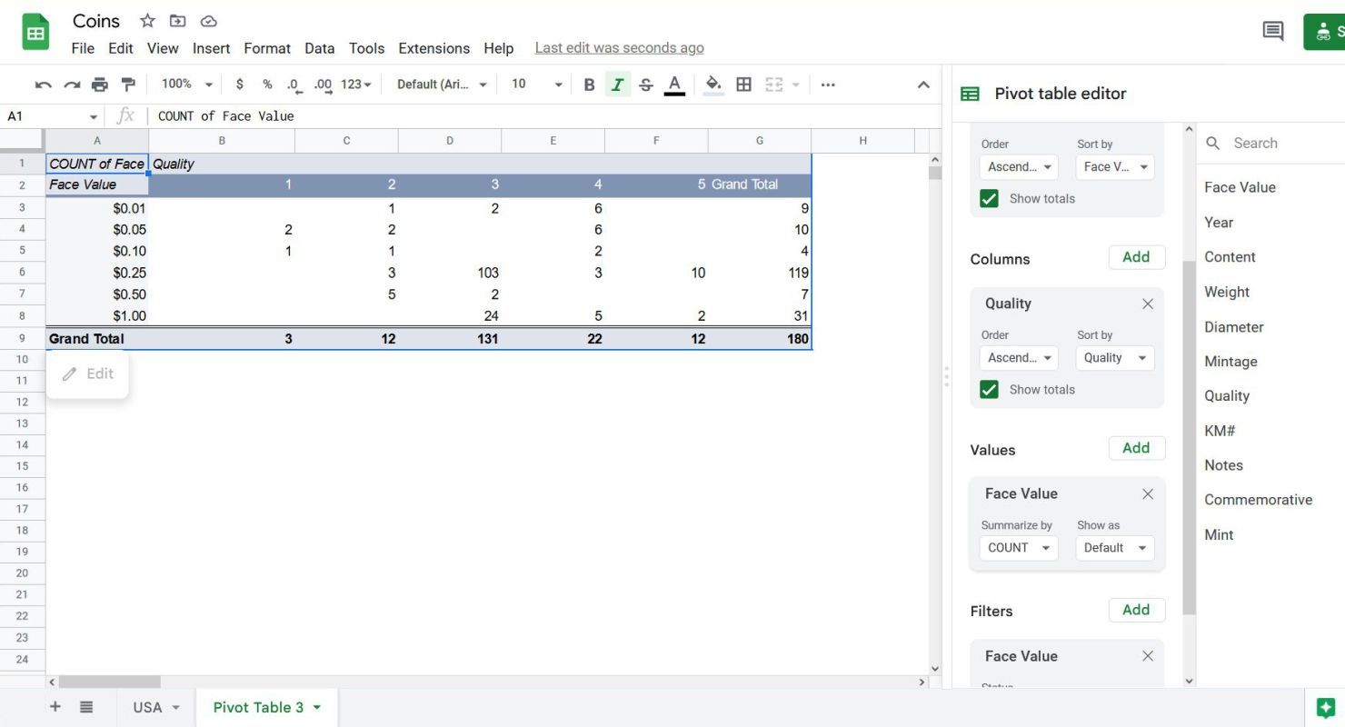


This shows how many coins are in the collection and the distribution of the quality of the coins across the different face values.
Making pivot tables work for you
Pivot tables weren't made for nerds to geek out on their coin collection. Pivot tables are a powerful tool for businesses that want to make sense of the vast amount of data they collect. People put proficiency with pivot tables on their resumes because businesses value employees that know how to use them.
This tutorial is far from being the definitive guide on pivot tables. There are tons of tricks to make them do what you want with minimal effort. Still, what we laid out is more than enough to start using them and figuring out how to make pivot tables work for you.