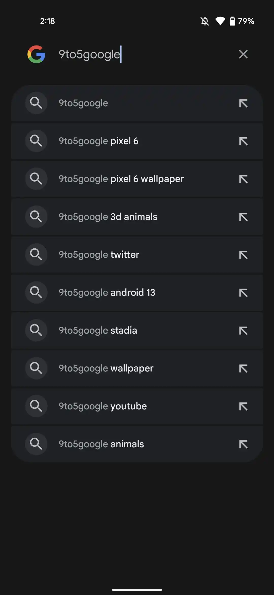
One of the consistent facets to Google's Material Design scheme over the years has been the use of cards to convey some sort of information. But the company's approach to deploying them has gained nuance over that time, especially with finding a new purpose in demarcating a giant pile of information. We're seeing that philosophy come to play with what looks to be an A/B test for Pixel owners on the Android 13 beta using Google Search.
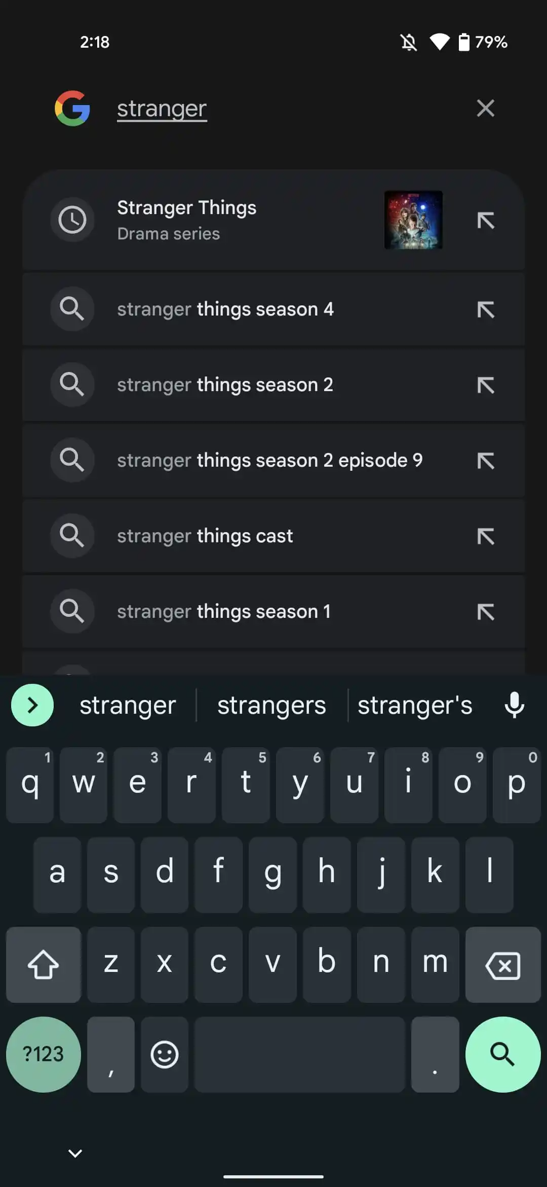
Currently, most Search users will see a generated list of suggestions that refreshes as they continue to type in their query. If we really want to be specific here, stage center for the typical item features the suggested query; to the left is an icon of either a looking glass or, in the case of a recent query, a clock while; the right side has a vestigial arrow pointing to the upper-left corner as if that's meant to convey something meaningful. Sometimes, popular topics get their own subheader text and thumbnail to drive home the point.
You'll notice the lack of any background to these entries and while humans typically do a good job with inferring spatial relationships, it can still be easy to tap an option next to the one you actually wanted to select by mistake.


If that's the case, you'll find solace, then, with 9to5Google's discovery of this new Material You-inspired suggestions schema, seemingly tied to the Android 13 Beta for eligible Pixels where each suggestion now comes in their own card. They even look a little taller than they were in the cardless interface. Okay, well, the top and bottom items feature large-radius corners to suggest that the list is just one big card with rule lines like on index cards or college ruled paper.
Scattered reporting on 9to5's end indicates that this design tweak is being fed as an A/B test, though the scope isn't clear. As such, even if you install Google Search beta v13.20 (via APK Mirror) on a Pixel with the Android 13 beta, you aren't guaranteed to witness the change for yourself.
But hey, different's different.

