No matter how smart and capable our handheld devices get, they still serve one core function: calling. The Phone app from Google is among the best at doing this, thanks to useful features like Call Screen, Hold for Me, and Clear Calling, and it's one of the reasons Pixel devices rank so highly among the best Android phones. But features aren't everything — aesthetics are important, too, and Google is delivering on this front with an update rolling out now that changes the Phone app's in-call UI.
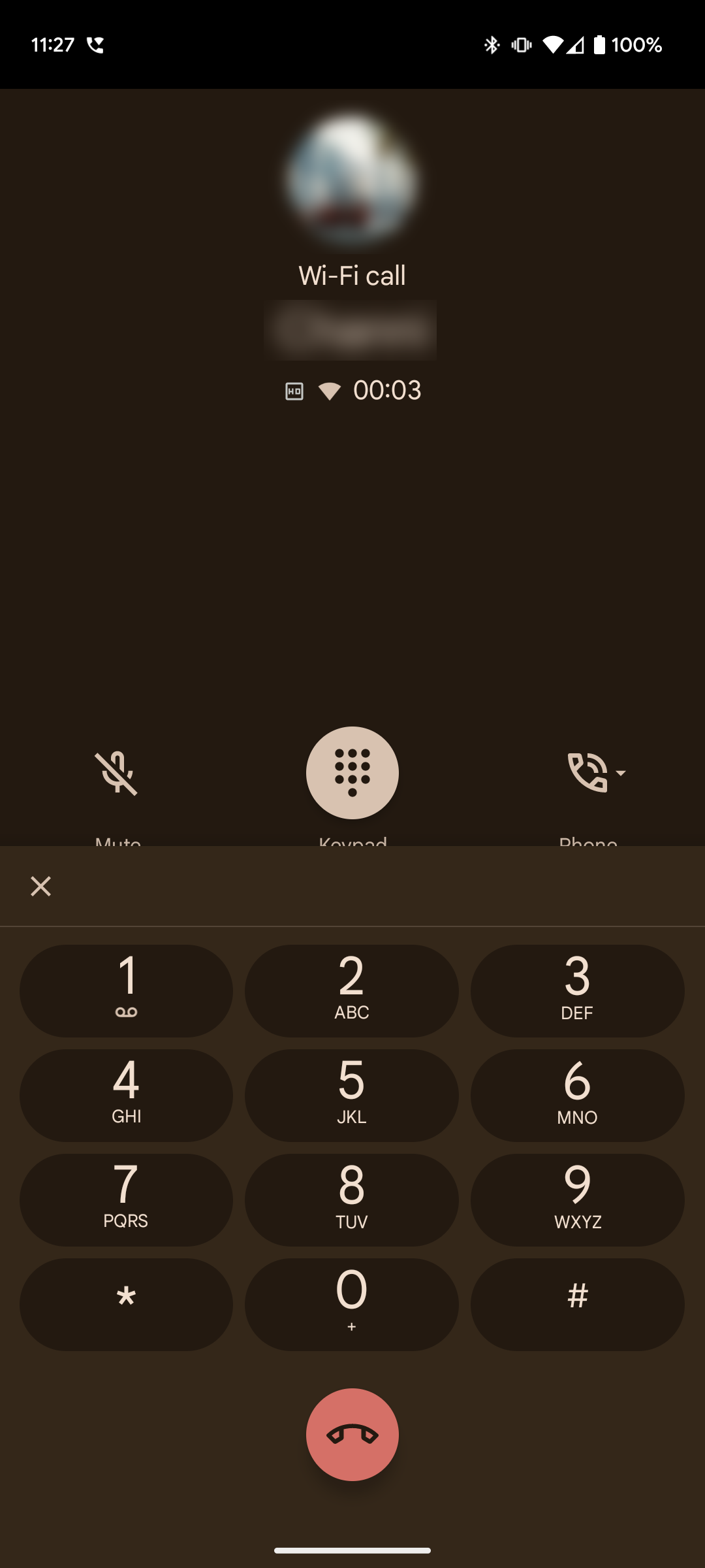
The new update has kept the familiar bits of the interface from previous iterations, like placing the profile picture, name, and contact number up top along with the bottom-aligned red button to end the call. The biggest change (via 9to5Google) is the placement of the in-call options like mute, keypad, audio output, and call recording. They are now accessible in a card originating from the bottom, with three options visible by default — Keypad, Mute, and the audio output selector.
When you tap the three-dot More button on the card, other options emerge in a row above. The keypad also appears as an extension of this card. The call interface and card background are also dynamically themed, in accordance with Google’s Material You design guidelines.
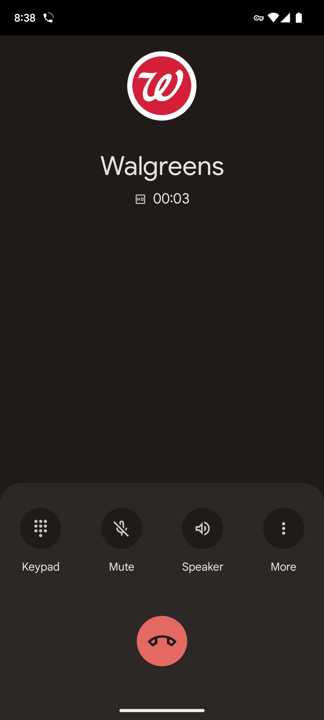
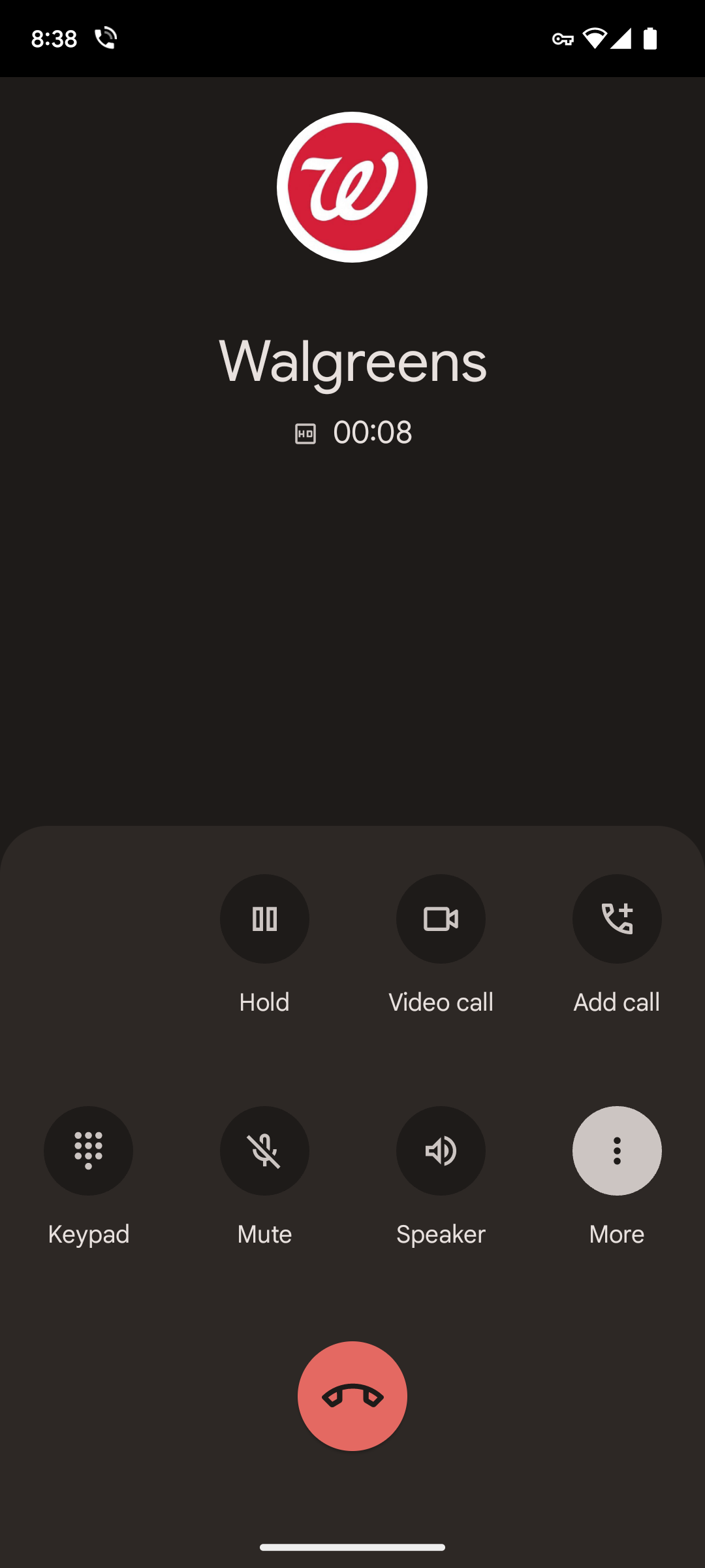
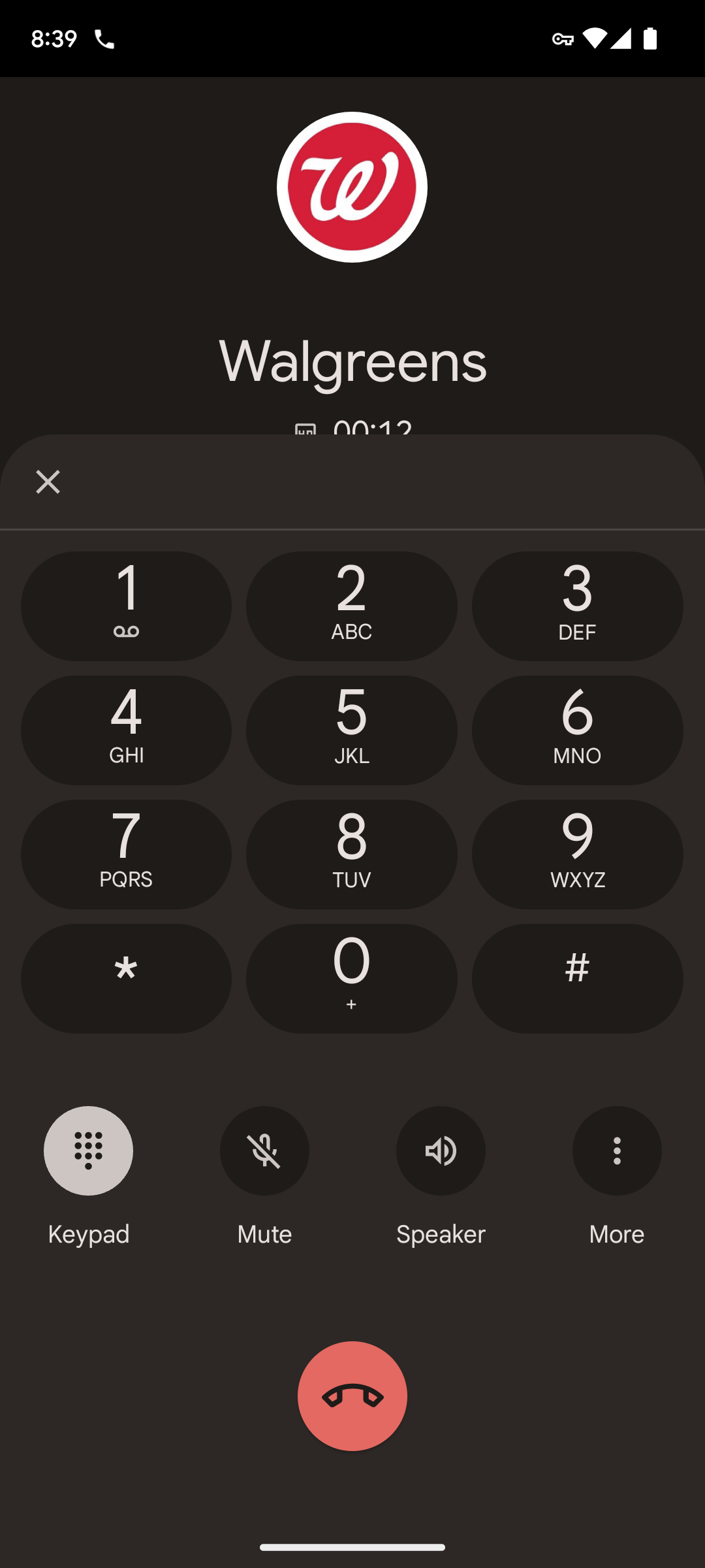
The new in-call interface
The previous interface placed all the in-call utility options in the middle of the screen, but it often required two hands to operate. The new card-style layout should be much more convenient for one-handed use — at least when it comes to the call options, as the keypad is actually a bit higher now. If nothing else, it's a visual upgrade in the sense that all buttons are now part of the same overlay.
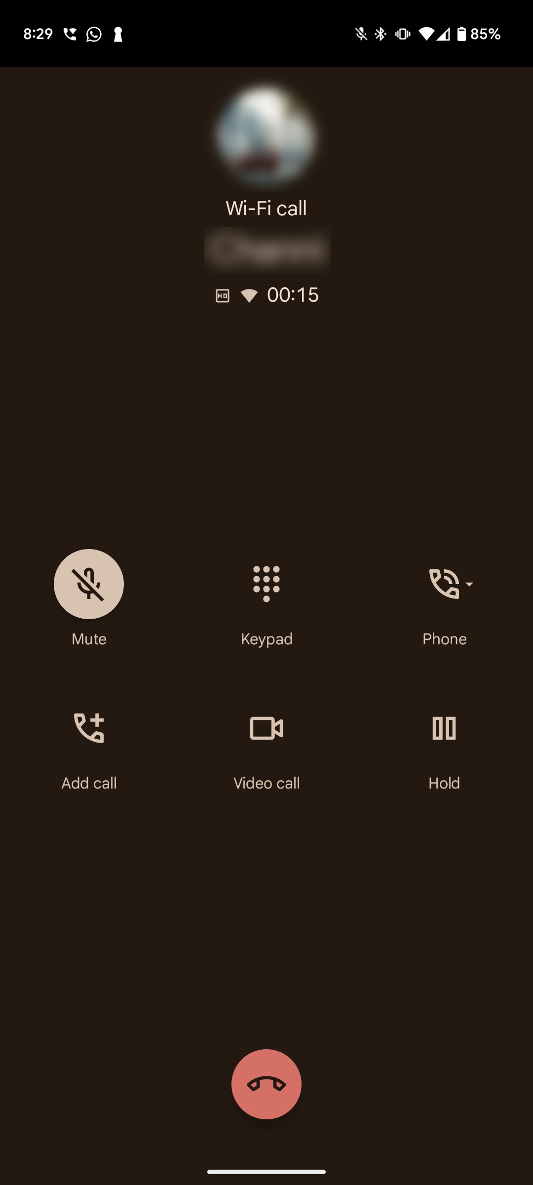
The old in-call interface
The new call interface is rolling out widely with version 98 of the Phone app in the stable channel, and we have it on a few of our devices. On Pixel phones, the changes seem to require additional server-side updates to take effect even on version 98, and they are rolling out gradually. If you have the new in-call interface, you might also notice the new pill-shaped call duration counter in the status bar replacing the floating bubble when you use other apps while on a call.
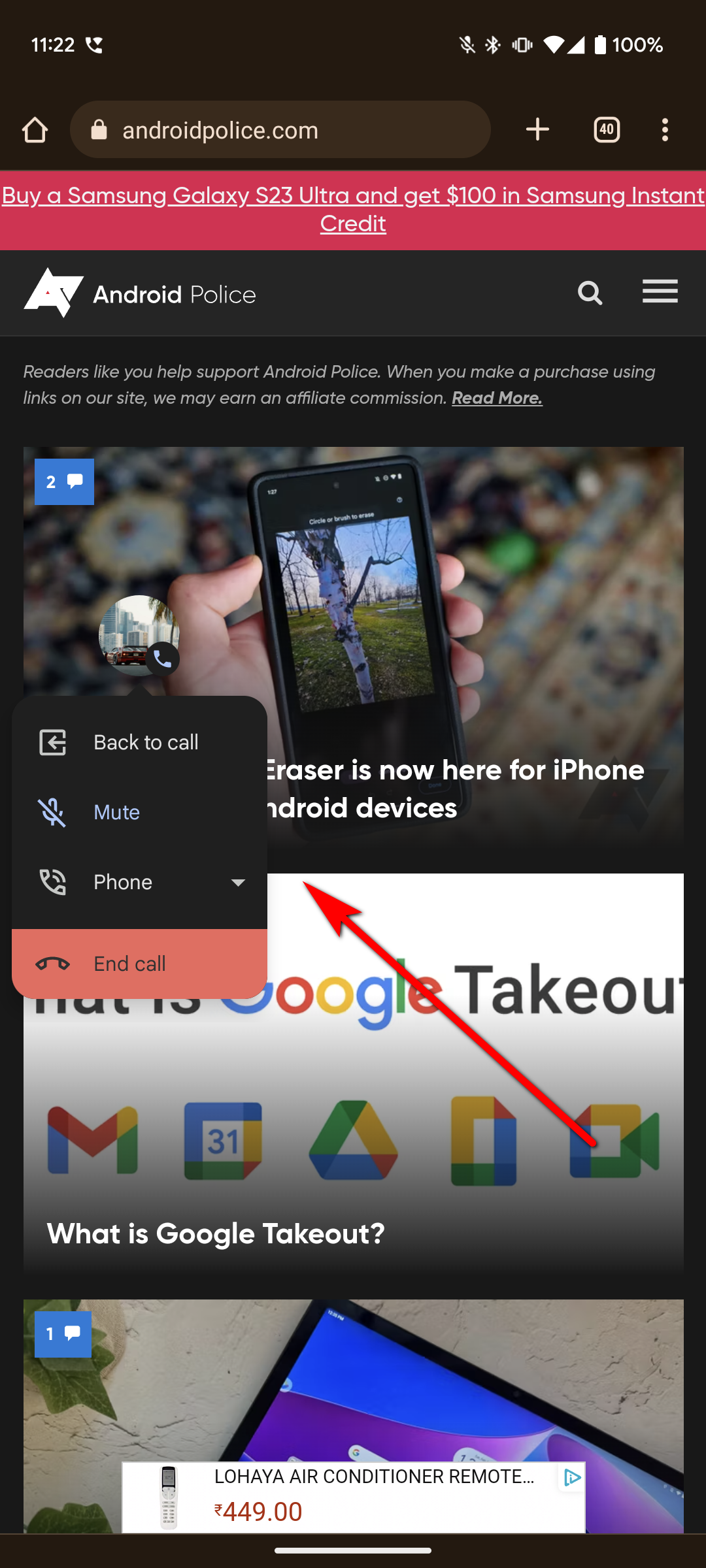
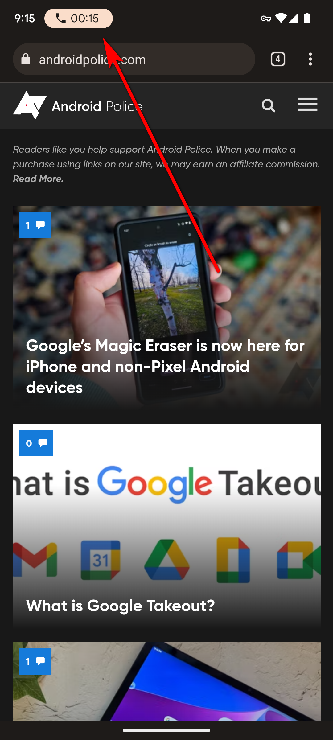
Old floating call button (left); New pill-shaped duration indicator (right)
It’s a minor detail, but makes it a tad bit harder to get to your ongoing call. On the contrary, some people might see it as a welcome change because the floating indicator was quite distracting.

