Despite the plethora of cloud storage services available today, Google Drive has stood the test of time with a continually padded feature set. But, as it's been the case for Android tablets, the large-screen mobile app has left a lot to be desired. That's about to change now with Google rolling out a redesign for Drive, featuring a lot of the same interface changes we've seen with redesigns to the Contacts app and others. The big picture takeaway? It makes better use of the display area.
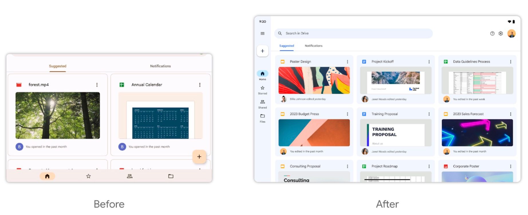
The design change begins with the repositioning of the navigation bar from the bottom to the left side of the screen. There's a button at the top of this navigation bar that lets you collapse or expand its contents. Below it, you will find a traditional floating action button followed by tabs for Home, Starred, Shared, and Files, in that order. Moreover, the search bar on the top is restricted to just half of the screen's width, a change consistent with the recent Contacts redesign for tablets.
The side-by-side comparison image posted by the Google Workspace Updates blog (via XDA-Developers) gives us a clearer picture of the changes onboard. While the Suggested and Notifications tabs are present with the new design, they take up significantly less space than before.
Thanks to the better utilization of that fallow real estate, Drive also gets three small icons on the top right for Help, Settings, and the user's Google profile. Lastly, more files come into view thanks to this new update with the home screen showing up to 9 of your recent Drive files compared to just two on the older version of the app. Google says the redesign also simplifies the process of checking out file details on Drive.
Just over a week ago, the web version of Drive and Docs received a Material You redesign. With the company also making some long overdue changes for its tablet apps, it looks like the stage is set for the Pixel Tablet's arrival, possibly around the same time as Google I/O this year.
All users will eventually get this UI change — Rapid Release domains are getting it now while Scheduled Release domains will start receiving it on April 3.


