Google, like all big tech companies, seems to feel that experimentation is the best way to improve the experience customers have with its products and services. The company regularly changes things in apps like YouTube, Gmail, and even the Discover feed. In its newest experiment, Google is using card-style pop-ups to open articles from Discover instead of fullscreen previews we've grown used to.
Based on changes gleaned from the Google beta app v13.37 running on multiple Pixel phones, 9to5Google reports Search results and Discover articles open in a card-stytle sheet with a little of the Search page or Discover feed visible in the upper region of the screen. We see the change in the Google app’s Discover feed and the scrolling list of stories accessible by swiping right on a Pixel phone home screen.


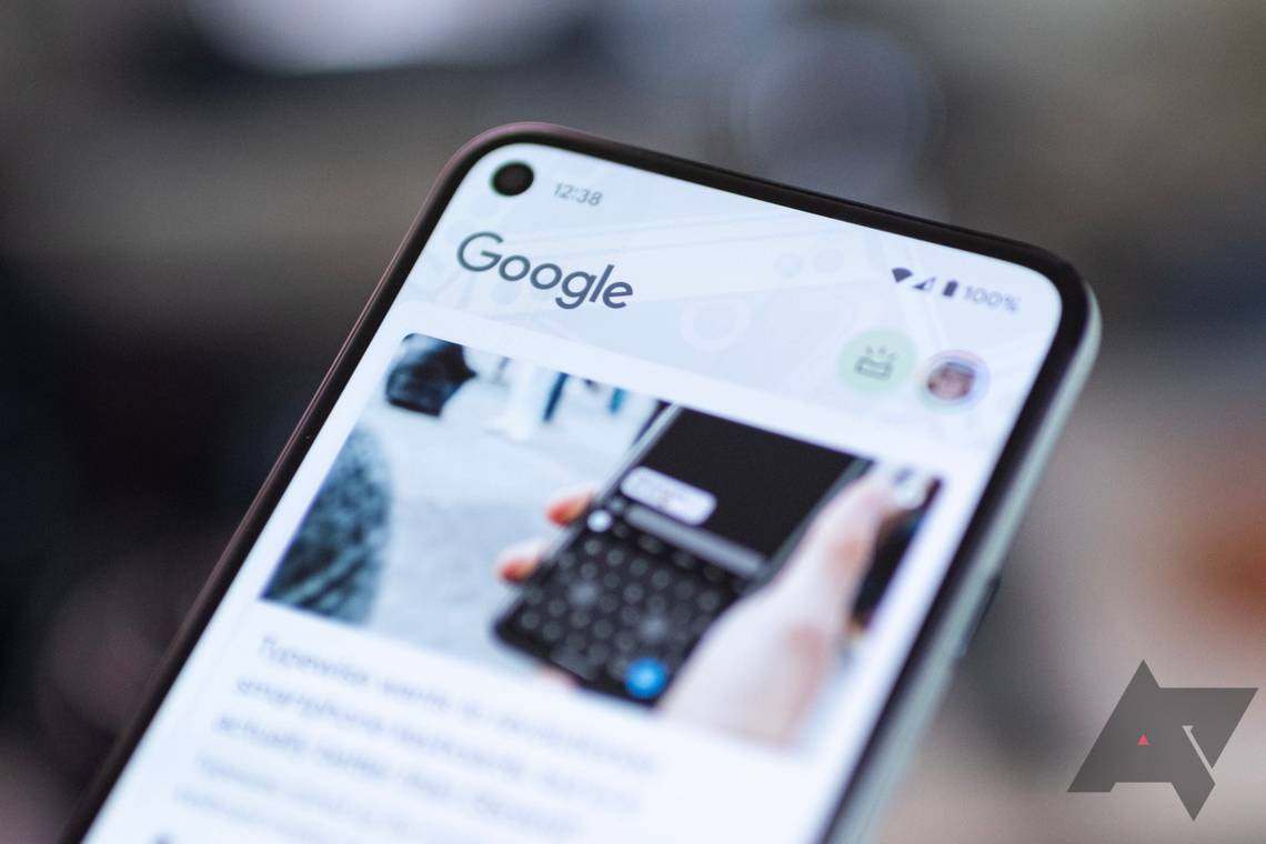
The new look when you open articles from the Discover feed.
In our testing we found the new sheet still uses Google Chrome to open articles. Controls like the close button, share icon, save icon, and three-dot menu are in their familiar locations. Swiping down on this sheet closes it, taking you back to the Discover feed or Search results. You can also swipe up to enter the fullscreen mode if you want to. Interestingly, the app still uses fullscreen previews in some situations, like when you open videos.


The card-style preview when opening Search results.
Although there is ambiguity regarding why Google switched from fullscreen article views to the card views, we believe it helps you return to your feed or Search results more seamlessly. You lose a little on-screen vertical space to the feed in the background, but it is a welcome change to the user experience.
9to5Google suggests the new interface could be rolling out as an A/B test for users, but we think it is a widespread beta rollout because we see it on multiple devices running the latest beta of the Google app. Hopefully, a wider rollout on the stable channel follows.