Google spent most of 2021 redesigning its lineup of Android apps ahead of the debut of Material You. Android 13 might not sport a whole new design language, but that doesn't mean the company is letting its apps languish with last year's look. Contacts was one of the first apps to get a Material You-style design, and in its latest update, cards are getting an all-new accent color.
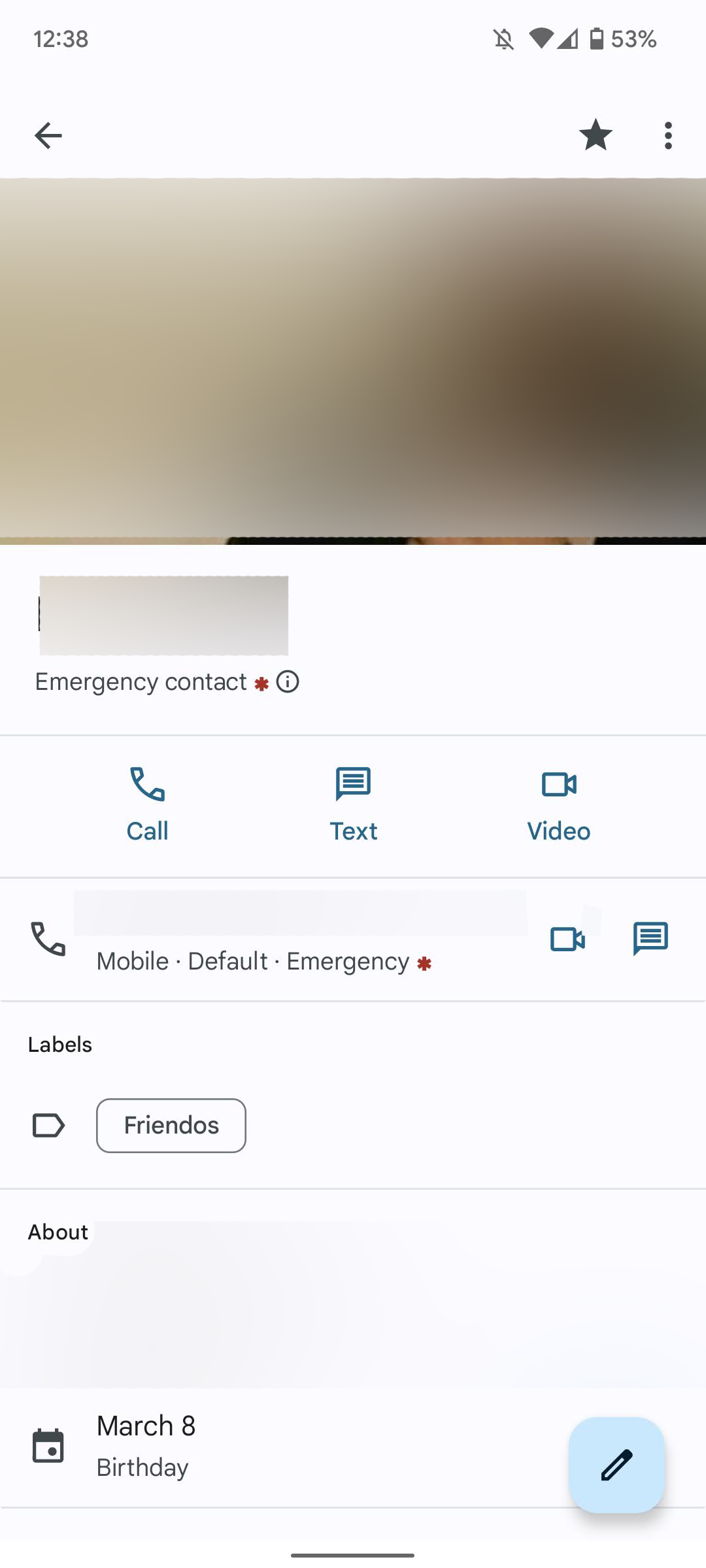
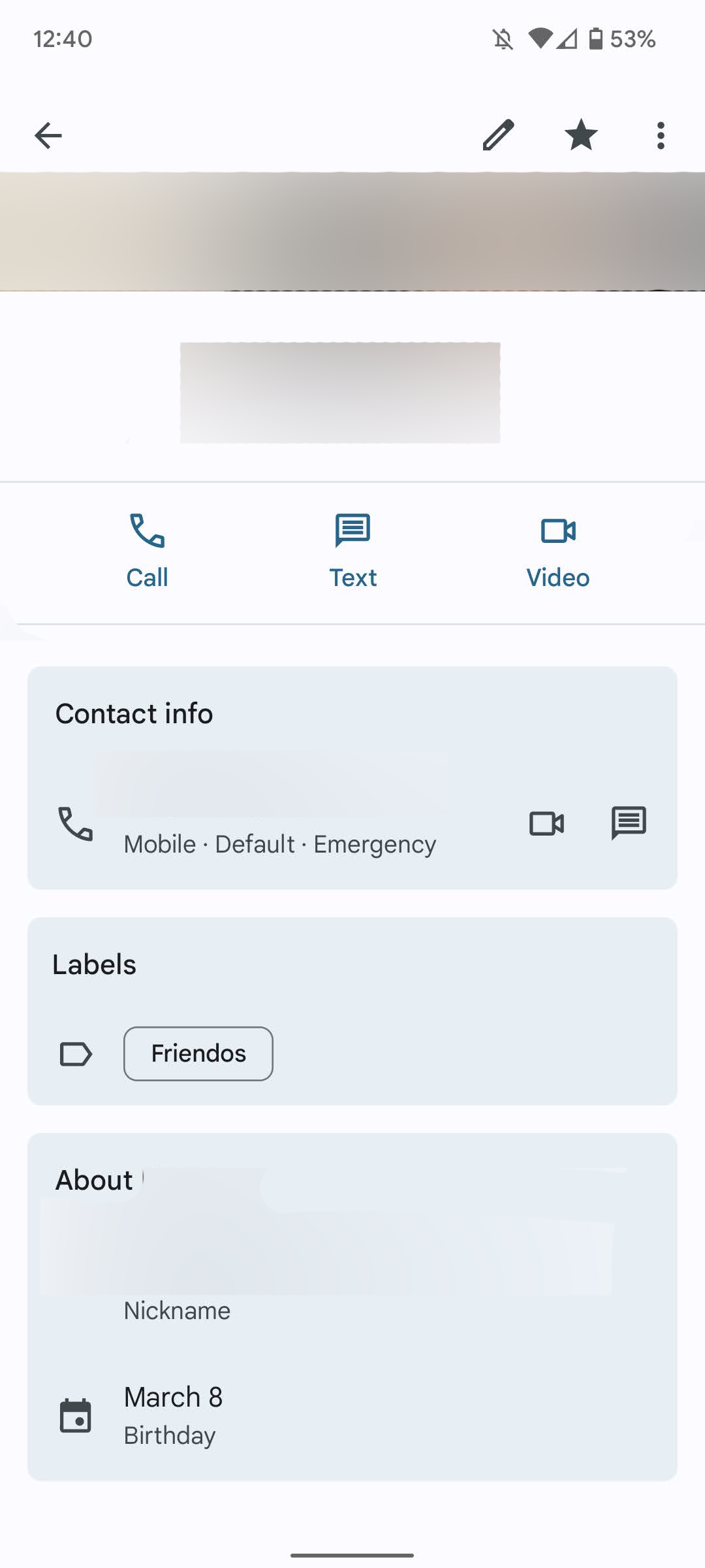
Currently rolling out in the latest update to Google Contacts, this new UI change applies directly to each person stored with your account. This new look removes the old-school lines separating categories of information, now dividing everything up with various cards matching your Material You theme. It's a small change, but immediately noticeable once you stumble on it.
Many of the category names, including Labels and About, have carried over from previous designs. Phone numbers and email addresses, meanwhile, now appear in a category of their own: Contact info. It doesn't change anything about how the app works, though it looks a little more unified with the rest of the layout.


Left: Old design. Right: New design.
It's not the only tweak in this patch, though. Contact names have been centered below icons or profile pictures, abandoning the left-justified text used in older versions. Like the rest of this redesign, it's a minor tweak, though a welcome addition that looks more in line with the rest of the UI.
Our tipster noticed the change in Contacts version 3.70.3.453319987, though I've spotted it in slightly older versions as well, which might point to a server-side update instead. Regardless, I've noticed it on two different Pixel phones running Android 12 and 13, respectively, so the change is likely seeing a wide release.
Thanks: Prajjwal

