We all recognize Google Chrome as one of the most popular web browsers on Android as well as desktop, and ease-of-use plays a huge role in maintaining the browser’s continued appeal. A clean and clutter-free UI goes a long way towards making users feel comfortable, but Chrome developers seem to have strayed from that path with the desktop release. Right now, there's just too much clutter and duplicated functionality in and around the omnibox and overflow menu. Thankfully, a major Chrome redesign is in the pipeline and Google has the opportunity to make things right.
Google calls the Chrome browser’s address bar an omnibox, and that's a fitting name for it because of how much it does — like how you can type in Google Search queries directly, without visiting the website first. The omnibox and the space adjacent also house shortcuts to things like pinned browser extensions, buttons to share a webpage or bookmark it, an account switcher utility, and a side panel shortcut. I've got a few ideas for how all this can both look and work better.
Extensions are extending more than they should
Chrome extensions are convenient add-ons that help you customize the browsing experience and make it uniquely yours. There are some you may access many times a day, like price trackers and note-takers, and others which just run quietly in the background, like ad-blocking extensions.
By default, Chrome shows your pinned extensions squished between the omnibox and the Extensions shortcut. You can pin 23 such extensions in this tight space if you feel like really pushing things. Clicking the Extensions shortcut opens a drop-down list with your pinned add-ons at the top, followed by all the others and an option to open the extensions tab of Chrome settings. Notice how the pinned shortcuts beside the omnibox are just a click away in the drop-down, but they add needless clutter to the UI.
Google could conveniently do away with the pinned extension shortcuts shown beside the omnibox, since these are available in the drop-down. However, the redundancy doesn’t end there. You’ll find another roundabout way to jump to the Extensions settings in the browser’s overflow menu. Just click the three-dot icon, select Extensions from the drop-down menu, and click Manage extensions.
Extensions sub-menu in the overflow menu (left); Pinned extensions and shortcut menu beside the omnibox (right)
To Google’s credit, the mention of Extensions in the overflow menu also links to the Chrome Web Store, where you can go shopping for more of these add-ons. Having three menu items to access the same browser feature with varying options each time seems a little excessive, though, especially when they are omnipresent on every tab you visit. Perhaps only the Extensions shortcut drop-down beside the omnibox should remain, with a link to the Chrome Web Store added in for good measure, so only one icon shows up, taking us to everything "Extensions."
Bookmarking shortcuts just end up marring the Chrome user experience
Chrome also includes a handy shortcut for bookmarking webpages right in the omnibox. One click, and you can tuck the webpage away for future reference into a designated folder or the Bookmarks bar for easier access. The option is easy to access, and intuitive to use. However, there’s also the overflow menu option for the same feature, fleshed out with granular options to view recent bookmarks, toggle the bookmarks bar, and create reading lists.
Bookmarking shortcut in the omnibox (left); Bookmarking options in the overflow menu (right)
We wouldn’t mind going through one additional click to create a new bookmark if team Google removed the overflow menu item and made the omnibox shortcut a fully featured drop-down list for bookmark management. When we have such an implementation for Extensions, why not for Bookmarks as well?
Chrome is popular, and Google needs to adapt
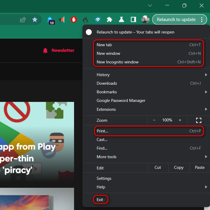
Chrome has been around since (wait, let me look that up) 2008, making it over a decade old. It's been the world’s most popular web browser for some years now, and as a result, a whole lot of people are familiar with its basic workings, like how to open new tabs, new browsing windows, the webpage printing utility, and how to close Chrome when they're done. Keyboard shortcuts for these actions are also on the fingertips of plenty of power users.
Nonetheless, all these options exist as individual entries in the Chrome overflow menu, and they seem pointless, at least to the small crop of keyboard shortcut-loving folks. There’s the counter-argument that youngsters and older adults learning how to use tech would find these options useful, even if they hide in the overflow menu. The thing is, UI design today is more intuitive than it's been in years, and we just don’t see that many people actually struggling to use Chrome.
Despite UI improvements, the overflow menu still houses a few basic shortcuts
We aren’t suggesting Google remove these rudimentary tools from the overflow menu, but perhaps there is a middle path — a Settings toggle to switch to a minimal overflow menu designed to cater to power users.
Google has an opportunity
If you’ve been following the changes coming in recent versions of Chrome Canary, it's evident Google is paying attention to the appearance of the omnibox and overflow menu. Among the noteworthy changes, the former recently became slightly taller, while the overflow menu was updated with icons for individual items. Google will probably bundle together all these changes into one grand visual update in an upcoming release.
Google can further enhance the ease of use Chrome is known for if it condenses the overflow menu and the list of icons beside the omnibox. Even if that visual change is only for power users, it should be easy enough to implement with a hidden Settings flag. As long as the general direction is that of progress, we aren’t too disappointed in Chrome. There's always room for improvement, and we haven’t given up on Google listening to its users yet.


