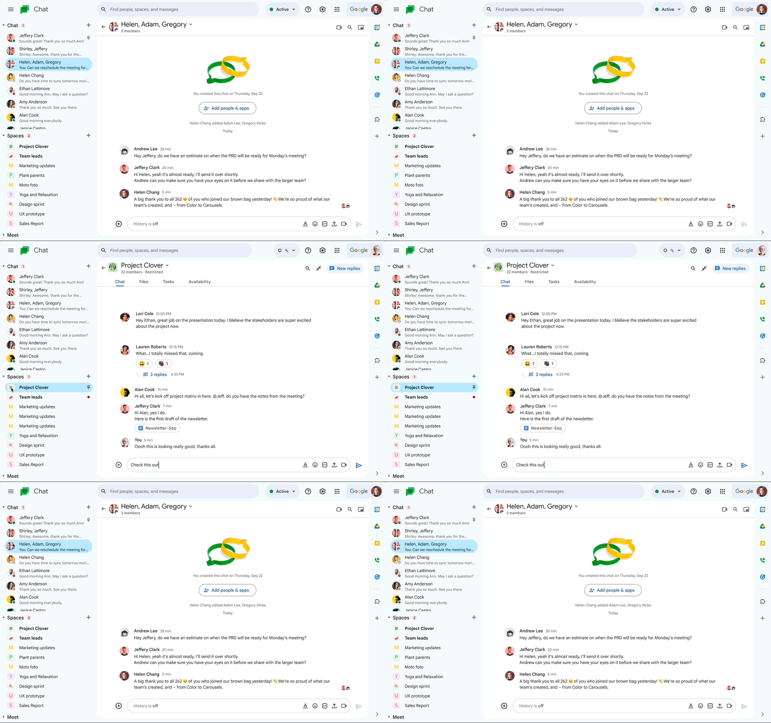
Ever since Android 12 brought along the third iteration of Material Design — of which Material You is a part of — we've seen all sorts of UI embracing the scheme, one by one. This includes those on both web and mobile apps that are part of the Google Workspace ecosystem. Apps like Docs, Slides, Sheets, and Drive on the web received a similar design refresh last month while Gmail got it last July. Google has just started rolling out a refreshed UI for one more Workspace web app — Chat.
The changes pointed out in the Workspace Updates blog are fairly similar to previous Material Design-related changelogs, mentioning tweaks to the main message view, new topic button, compose setup, the top app bar, and the left navigation key. Meanwhile, the thread panel inside Chat, both for Spaces and direct messages, is also getting some adjustments. From a broader perspective, the redesign brings along all-new colors, layouts, fonts, and panel sizing.
The update will be available to all Google Workspace customers, in addition to G Suite Basic/Business users and personal Google account holders. The rollout has already begun as ofApril 13, though it could take a couple of weeks to be visible for all Google Chat customers.
While there was initially some confusion about Google's strategy with the co-existence of both Chat and Messages apps, we've since grown to know the former as more of a Slack-type messenger for large organizations. Last year, Google Chat on the web allowed users in an organization to create their own emoji from scratch, with admin restrictions. Separately, a UI change to the Chat app in January allowed users to better distinguish between group chats and Spaces. This was preceded by the addition of advanced search chips to the web app a year after the mobile version received the same functionality.


