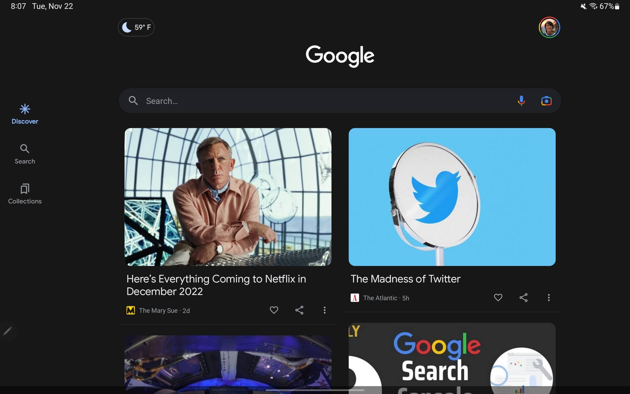
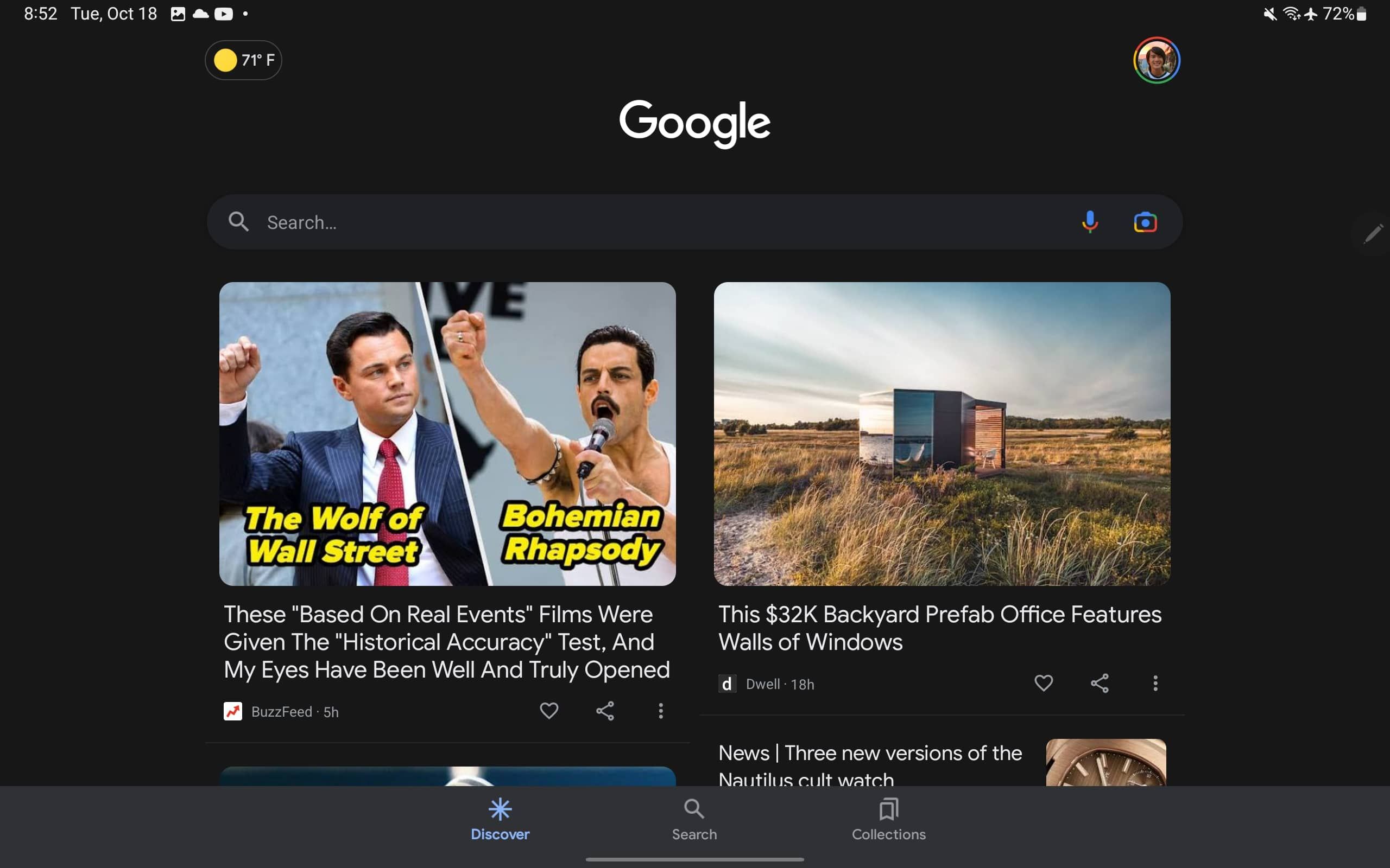
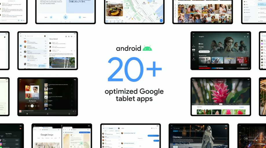
Google is currently getting its apps optimized for foldables, tablets, and other big-screen devices. We’ve seen enhancements like better drag-and-drop support, enhanced multi-column layouts, and more. The latest app to look better on tablets and foldables is the Google Search app, which now moves its bottom bar to the left side when it makes sense.
The change was first spotted by 9to5Google and is as straightforward as it could be. When using a tablet in landscape mode, you have more unused space at your disposal on the right and left side of the main content. Google long introduced navigation rails for that reason, an alternative layout that replaces bottom bars on big-screen devices.


New vs. old
Navigation rails are a concept that Google never really used much outside of desktop computers, and it’s only slowly making its way into Android apps. Thus, it’s great to see the Google app becoming a good example, which hopefully means that a lot more Google apps and third-party developers will follow suit as foldables and Android tablets become more predominant again.
The new design doesn’t appear to be available on all screen sizes, though, as I don’t have it on my foldable with its 7.9-inch screen. It might be restricted to tablets for now, though it’s clear that foldables would also benefit from this.
The new navigation rail shows you the same options as the bottom bar does on your phone, listing Discover, Search, and Collections in a convenient way. It’s rolling out as part of the Google app beta version 13.46, which you can get from the Play Store by joining the beta program.

