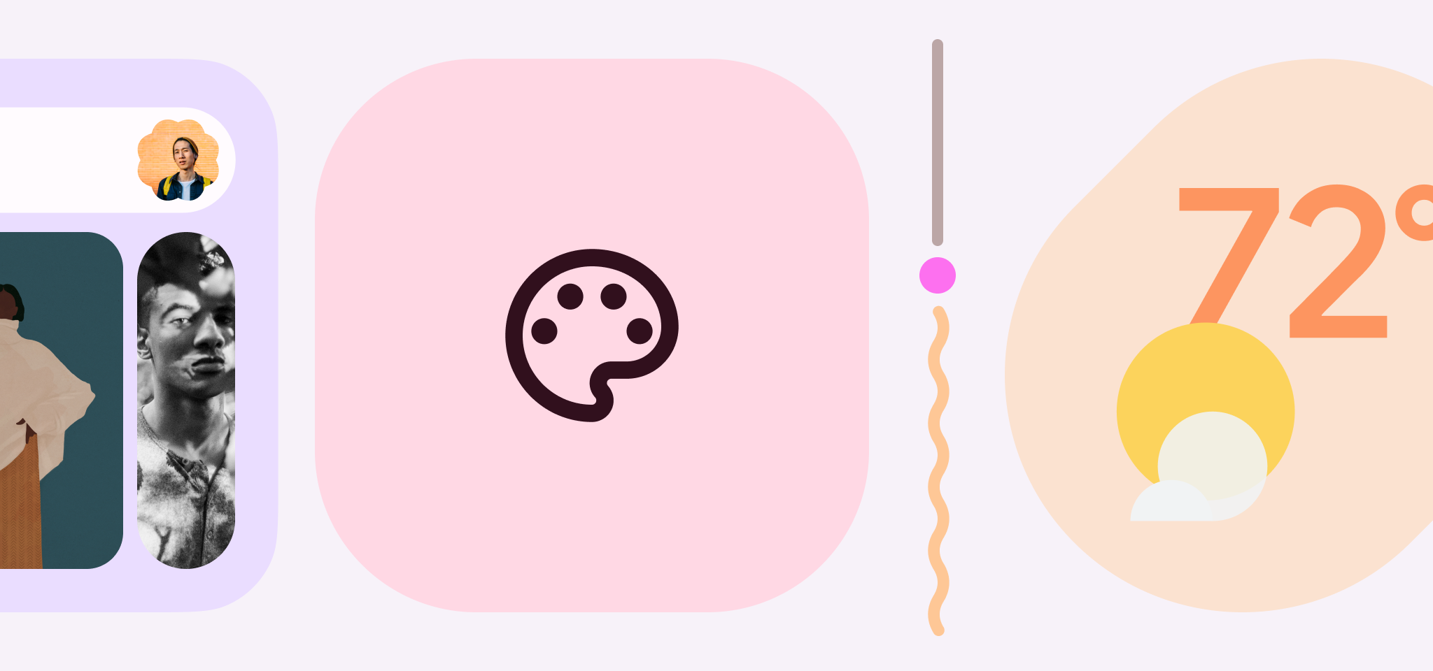
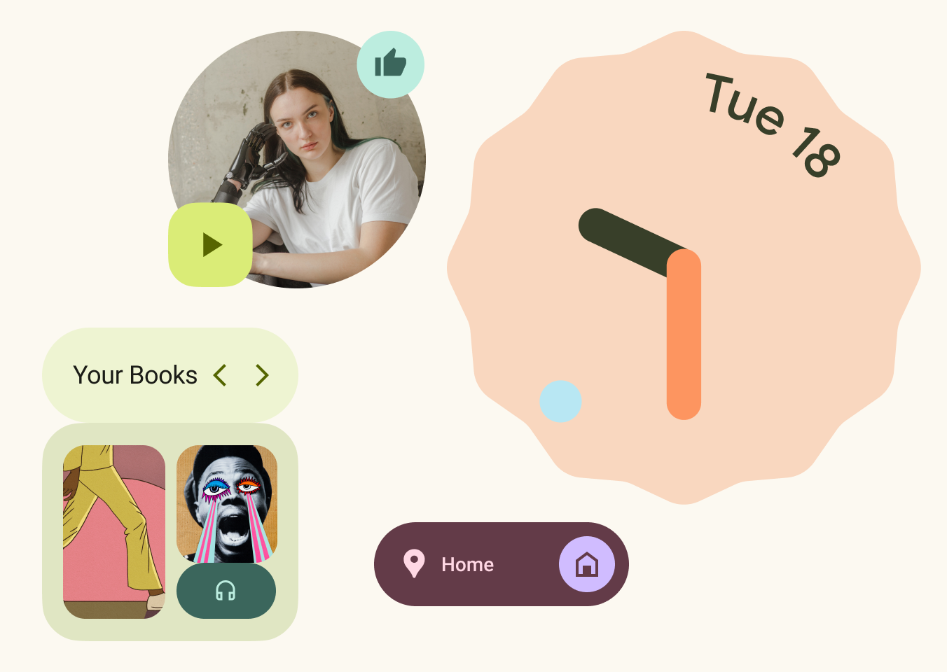
Android 12 has been lauded as the biggest redesign to the OS since its inception, largely thanks to Google’s new Material You design system. It’s all about big, rounded shapes and bold dynamic colors — a quintessentially Googley design language that looked as though it would be an exciting update, at first glance. And while there are lots of positive aspects to Material You, as Manuel points out, I believe there are also a few reasons to be less enthusiastic.
The most obvious visual change when you upgrade to Android 12 is that important elements on the screen are bigger and shapes are more playful. This is a fun change that makes a great first impression, but as I settle into using the new UI, it’s hard not to see it as a little childish, especially compared to the more mature (but admittedly more boring) aesthetic of iOS. In its eagerness to differentiate Android, Google has dialed up the random whimsy with a large variety of different border radiuses and shapes, as well as bigger headings throughout, and the end result can look somewhat muddled and unharmonious. Information density is also on the low side, with a greater emphasis on negative space — this is usually welcomed, but Google may not have gotten the balance quite right. Nowhere is this more pronounced than in the notification shade, where very little detail is displayed unless you expand each card. There are also fewer quick settings on screen at any one time, with more descriptive titles. This almost feels like change for the sake of it since the smaller tiles have worked well for the last few versions of Android. Google seems to have prioritized making a splash with the latest iteration of Material Design, but whether or not the new system has been designed to last is up for debate.
Material You is being marketed as uniquely personal and customizable thanks to its dynamic color theming (Monet). It’s undeniably impressive, pulling complementary accent colors from your wallpaper to theme the entire OS, including many of Google’s first-party apps, system-level settings interfaces, and the vibrant new suite of widgets. The same applies to app icons, too. Google already got plenty of stick for redesigning many of its icons to feature the company’s four basic colors on “white plate” backgrounds. It was already much more difficult to distinguish between them on a busy home screen, and some (see Gmail and Maps) have been stripped of their long-standing identities., but the problem is exacerbated if you choose monochromatic themed icons in Android 12. It looks neat, but it won’t help you quickly jump into an app. It will also take many third-party developers years to support dynamic icon coloring, if they do at all, which means that your homescreens remain a mess of incongruity if you use this option. This isn’t turned on by default, at least, but my objections to Material You run far deeper than app icons.
Google is slowly updating its core apps to display dynamically themed colors within them. By all accounts, this will be aesthetically pleasing so long as you have good accent colors pulled from your wallpaper (or chosen yourself from the meager selection of four basic hues), but that’s not my issue with it. I think the lack of visual diversity in Google’s own services could get old pretty quickly. Switching between apps and tasks when each one has its own style and personality makes for a much better user experience. When everything looks the same, the system can be less enjoyable to use and potentially even confusing for less tech-savvy users. This was already problematic as Google transitioned its apps to be mostly white (in preparation for dark mode and probably also Material You) but dynamic theming strips even more personality from various products.
History tells us that getting Google’s own internal product teams to consistently implement Material You in its many apps will be a difficult task, but a lack of support from third-party apps will once again be a major stumbling block. This means some of your interfaces will match your phone’s general theme while many more will not. I can’t see big companies such as Spotify, Twitter, or any of Meta’s apps ever diluting their own branding in favor of supporting dynamic theming, and with good reason. Google’s own YouTube is also unlikely to ever go down this route, as its brand identity is too important to mess around with. This results in a situation where some Google apps and icons can be colored to match your phone’s theme, but the majority of your other apps will never support this, and that’s not a good look.
When Google first introduced Material Design, many apps followed it far too closely and we were left with a sea of homogenous UIs with absolutely no character whatsoever. This led to Google’s more recent efforts such as Material Theming as a way to differentiate branded apps with variables such as color, shape, and typography. It showed app developers that they could make their software look and feel unique by exercising a little more creative freedom without completely abandoning the Material Design guidelines. Color is so important when it comes to brand recognition, something most logo designers have understood for many years. Imagine if Microsoft’s icons for Word, Excel, and Powerpoint were all the same color. Even Google knew the importance of giving each product its own color when it essentially ripped off those logos for Docs, Sheets, and Slides. With all of this in mind, it's perplexing that Google has abandoned this core principle with Material You in favor of a half-baked uniformity.
Android 12 has lost some of the customization options from the last OS version.
Google would have us believe that Material You’s dynamic theming makes Android 12 more personal and expressive than ever before, but the reality is that it’s less customizable than Android 11. You can no longer change the container shape, icon style, or font used across the OS, and there are fewer basic color options available to those who don’t wish to use adaptive wallpaper theming. This means that, with the exception of color, Android 12 is far more restrictive. Google’s latest Pixel version of Android does not compare favorably with other OEM skins, either. Samsung and OnePlus, especially, allow for far greater customization, with always-on display clock types, fonts, button shapes, and icon packs all able to be personalized. The excellent Good Lock suite on Galaxy devices takes this many steps further, as well. I can’t deny that Material You’s color theming is well implemented and can look beautiful with the right wallpaper, but I think it’s disingenuous for Google to say that this makes Android 12 its most personal OS yet. You are still very much confined by the theming options available to you, although we may well see Google reinstate more customization options down line.
One thing’s for sure; you can’t accuse Google of playing it safe with Material You. While I have my reservations, generally, there’s still much about the new design direction that I’m fond of. To that end, Manuel outlines everything he loves about Material You in his counter to this piece. Go check it out and let us know which camp you’re in.


