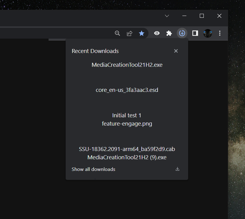
Late last year, we learned that Google was introducing a new download UI in Chrome. The change — albeit experimental — saw a toolbar download icon similar to that of Microsoft Edge replace Chrome's usual download bar that popped up at the bottom of your screen. However, we expected Google to introduce a couple of other features to the interface in the near future, and one of them just arrived.
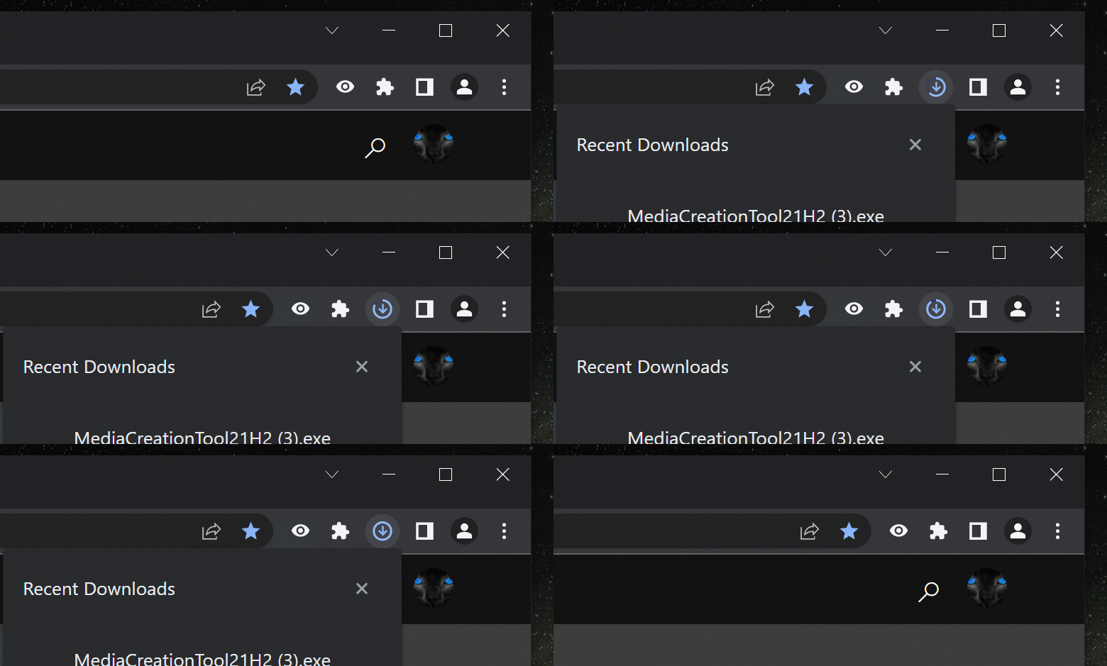
According to Redditor u/Leopeva64-2, Google has now added a loading circle around the download icon in Chrome’s toolbar. The ring will appear during active downloads and fill based on download progress. After completion, a new button (a plain download arrow with a line tray under it) will take the place of the ring. For now, the button remains blue after a download is completed, but a nifty color switch feature is in the works. When implemented, the icon will turn from blue to gray when the button is pressed or about 1 minute after the download is completed.
As part of the latest additions, clicking the new download icon will bring up a dialog box showing your most recent downloads and a button to take you to your past downloads page — previously, clicking the downloads arrow did nothing. However, despite Google’s progress with the new UI, we’re still expecting new changes. So far, options we’ve been used to on the old download UI like “Show in folder” and “Open when done” have not yet arrived but should be in the works.
All of this UI change is still experimental, so the old bottom download bar remains the default option for users on the stable Chrome channel. However, if you’re one of those that can’t stand the old interface, you can try out the new one on Chrome Canary or wait until it becomes generally available (soon, hopefully). Google is clearly getting some inspiration from Edge, in a good way. Who knows, maybe it’ll follow it up with better RAM management like Microsoft's browser.
Thanks: Leonardo


