Google Chrome has been the go-to web browser for tons of people throughout the years partly due to its developers constantly drafting, scrapping, and deploying of new features with the hope of improving usability and performance. One such feature includes how Chrome looks and, as such, Google is slated to launch a significant redesign this year. We're now getting more information about what this would look like courtesy of a new flag that can be enabled on Chrome Canary for desktop right now.
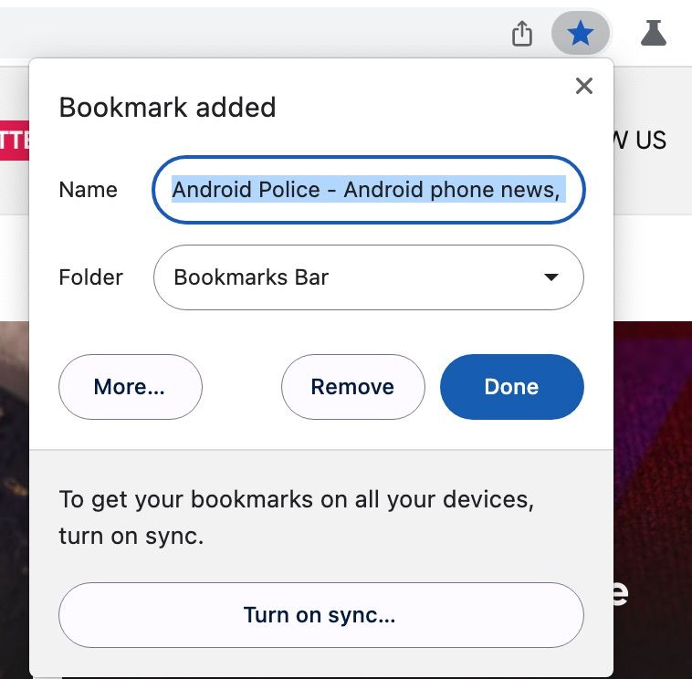
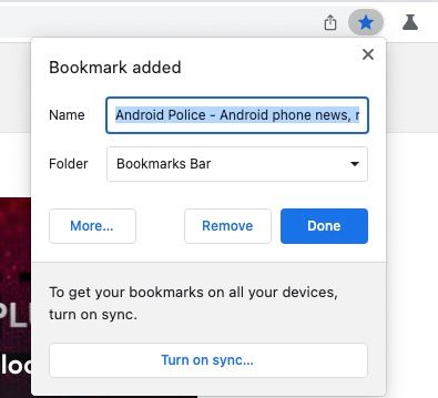
To be perfectly clear, we only see a couple of visual changes right now, though more should be on the way. The most noticeable change is the bookmarking window — which we've illustrated below — offering rounded buttons and text boxes compared to the older version (right).


The tab backboard gains a bluish hue with the flag enabled (left), though it's hard to tell much apart from this, at least on the macOS version of Chrome Canary. You can try out the partial redesign yourself by enabling the following flag — chrome://flags/#chrome-refresh-2023.


As 9to5Google points out, developers have been teasing the Google Chrome redesign with entries in the Chromium repository since last November.
Last week, we were given a glimpse of some new-look accents that appear to be linked with the new design. Besides that, Google is also working on other visual upgrades for Chrome on desktop, such as a new download counter for when you have more than one ongoing download.
Hopefully, more people will be able to see what's in store from the redesign as it makes its way through the channels in the weeks and months ahead. Most of the changes we've talked about here should arrive on the stable channel for desktop clients at some point — that's including for Lacros and Fuchsia.
Don't expect official word to come for a while yet. You'll definitely more breadcrumbs on the blogs, including here on Android Police.

