I’ve always liked colors. Simple, bright or saturated, sometimes flashy, riveting light reflections that catch your eye and make you stop for a second and think, “Wow, that’s beautiful.” For me, there’s nothing interesting about grey or black, or at least there’s very little that’s interesting and very little any object can do to be interesting if its outward appearance sits somewhere on the greyscale. This personal opinion holds for a lot of items in my life, and it certainly is true for my smartphone, the one object that I carry everywhere I go. But flagship after flagship, manufacturers seem hellbent on disappointing me recently.
I have followed the phone industry since the 20th century — some of you may not have been born then. I’ve seen my dad brandish his gigantic antenna-ladden Ericsson GH 688 that had a utilitarian “design” with zero style, only to later be left speechless in front of the colorful and stylistic Nokia covers that donned the wall of every phone shop in the early ‘00s. Then I observed as we descended into the dark abyss again toward the end of the decade and early ‘10s, when smartphones emerged, black and grey and lifeless as they were. These were serious tools now, they should look like serious tools, not children’s toys.

That beautiful blue first-generation Pixel.
Then something magical happened and we were back in the rich and vibrant world of colorful smartphones. Manufacturers, like Samsung, Google, Apple, Huawei, finally realized that they could apply color without being gaudy. That they could play with hues and create vivid and unique shades, sometimes matte, sometimes flashy, without detracting from their flagships' functional importance. We saw the original Pixel in blue, the Galaxy S6 in beautiful green and blue, the red iPhone 7 and OnePlus 6, the stunning gradients of Huawei, Honor, and Xiaomi’s phones, and more. Purple, blue, teal, green, red, orange, no color was too much. No color was forbidden. Suddenly, phones could have lively and psychedelic tones on their exterior, but still avoid looking garish. Quite the contrary, glass and metal and other materials gave them an elegant and refined look.

Stunning red OnePlus 6.
And yet here we are, on the opposite side of that spectrum again, back to boring, subdued high-end smartphones. This year saw the release of several flagships from various brands that followed the same pattern: somber shades for the high-end model versuss relatively colorful but often unsaturated pastel options for the cheaper variant. Let’s recap:
Pro vs non-Pro color options: Google Pixel 6, OnePlus 9, iPhone 12. Notice the pattern.
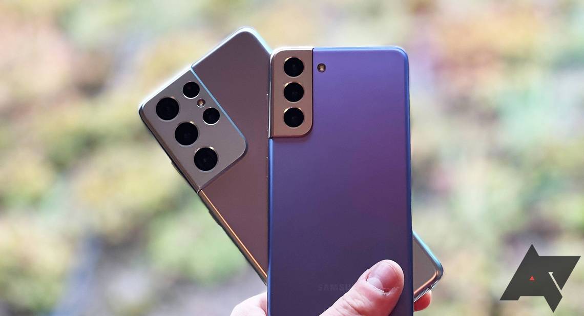
- The Galaxy S21 Ultra comes in dark brown and grey and black hues, while the S21 Plus offers red and purple options.
- The Xiaomi Mi 11 Ultra is available in white and black, while the regular Mi 11 has two blue variants, one of which looks stunning.
- The OnePlus 9 Pro gets three dull variants, while you can pick up the regular 9 in light blue or purple.
- The Galaxy Z Fold3 offers three somber-looking tones, while the cheaper Z Flip3 has that neat light purple option.
- The iPhone 13 Pro and Pro Max only have that silvery blue option, while the 13 and 13 Mini come in a very saturated red or blue color.
- The Google Pixel 6 Pro will be released in white, gold, and black, while the smaller 6 will offer a blue/green and orange option.
Color options (left to right): Galaxy S21 Ultra, S21 Plus, and Xiaomi Mi 11 Ultra, Mi 11.
If this isn’t a pattern, I don’t know what is. All smartphone brands, even the biggest rivals amongst them, seem to have decided that a Pro/Ultra phone should only be made available in dull and austere hues, as if elegance was synonymous with inoffensiveness, and importance synonymous with vapidity. As if a premium look could only be achieved with the most drab tone there is.
But let’s call it what it is. These Pro/Ultra colors look boring and lame. Granted, this approach might appeal to a large audience, but I’m sure I’m not the only one who’d like at least one colorful option to pick when buying my next flagship.
I don’t want to spend a thousand dollars on boring and lame. I want to spend it on something that fascinates me. Something that captures my attention when I set it on my desk or table. Something that glows and catches light in unexpected ways, and that still exudes refinement and style.
I can’t wait until we close this loop once more and go back to vibrant flagships, but we might still have to suffer for a couple of years before that. Give me a saturated teal or emerald green Pixel 7 Pro, that’s all I ask for.