Liam Spradlin
Contributing since August, 2011
-
1523articles
About Liam Spradlin
Liam loves Android, design, user experience, and travel. He doesn't love ill-proportioned letter forms, advertisements made entirely of stock photography, and writing biographical snippets.
Latest Articles
Sometimes telling my own story is a challenge. So, after more than 5 years at AP, figuring out what to include in this post and how to write it hasn't been easy. But in the interest of eliminating suspense, I’ll give you the news up front:
Since Google introduced material design in 2014, the questions of whether and how to use the design language on other platforms like iOS has lingered. But Google hasn't been a stranger to material on iOS. Inbox users for instance should feel right at home moving between iOS and Android, as many of the interface's core components are shared.
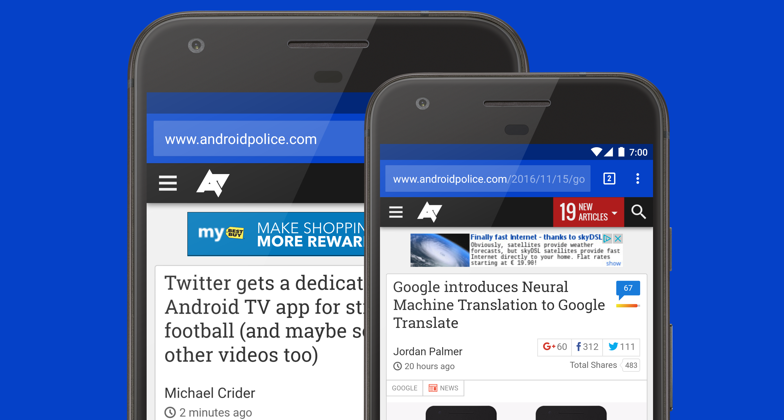
If you're into framing screenshots with beautiful device art, the process really doesn't get much easier than using Google's official Device Art Generator. Perennially updated with the latest Google devices, the tool started its life as part of Roman Nurik's indispensable Android Asset Studio project, but since graduated to the official Android developers site.
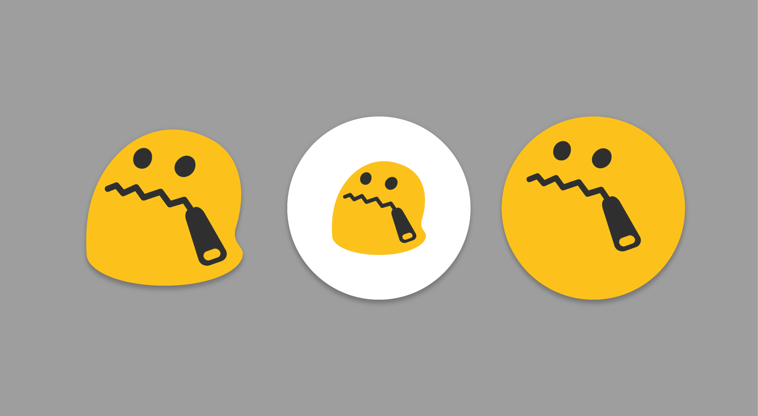
By the time this post goes up, I'm sure most of our readers will have seen Google's circlified icons in the new Pixel launcher, bound for the new Pixel phones. I've been asked a few times what I think about the new launcher and, for the most part, I don't have a strong opinion. But I do have some thoughts about the circlified icons, some guesses at the rationale, and some thoughts about the downsides of consistency for its own sake. As with any written-from-the-outside post about design, I want to note up front that we aren't privy to any research, data, or other information Google used to make its decisions, so the best we can do is respectfully speculate and ponder.
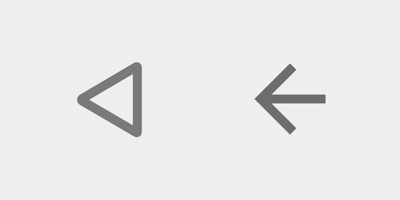
After adding an entirely new section on motion - and new guidance on onboarding and growth - back in May, Google Design is back with another update to the material design spec.
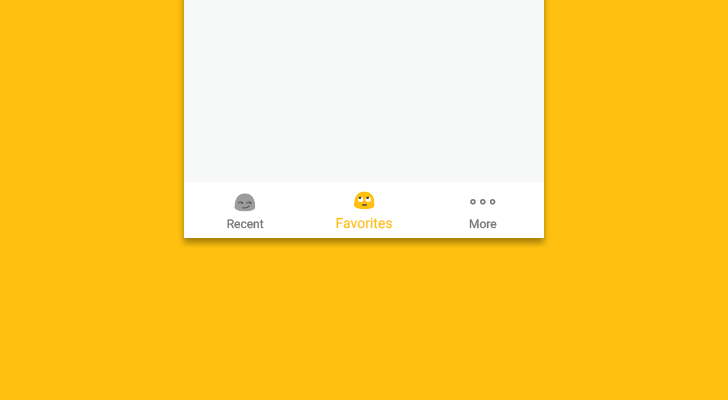
Bottom nav bars. Between the time of Gingerbread and Marshmallow, they seemed to become significantly less prevalent on Android (or maybe I was just able to avoid more of them), with many developers and designers going for other navigation models. But those other nav models - specifically the hamburger menu - aren't always ideal. Often, teams worry that items in the drawer are "hidden" from users. Sometimes immediate visibility and total obscurity seem like the only two realistic options.
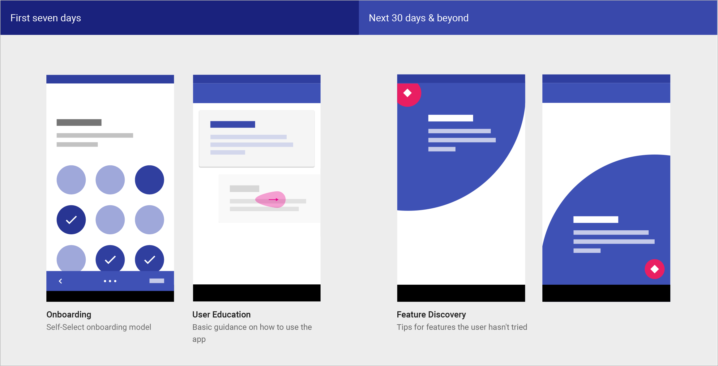
Google, following through on its promise that the material design spec is a "living document," has updated its design guidelines and suggestions again, this time adding more guidance on motion design, along with new sections for growth & communications and expanding panels.
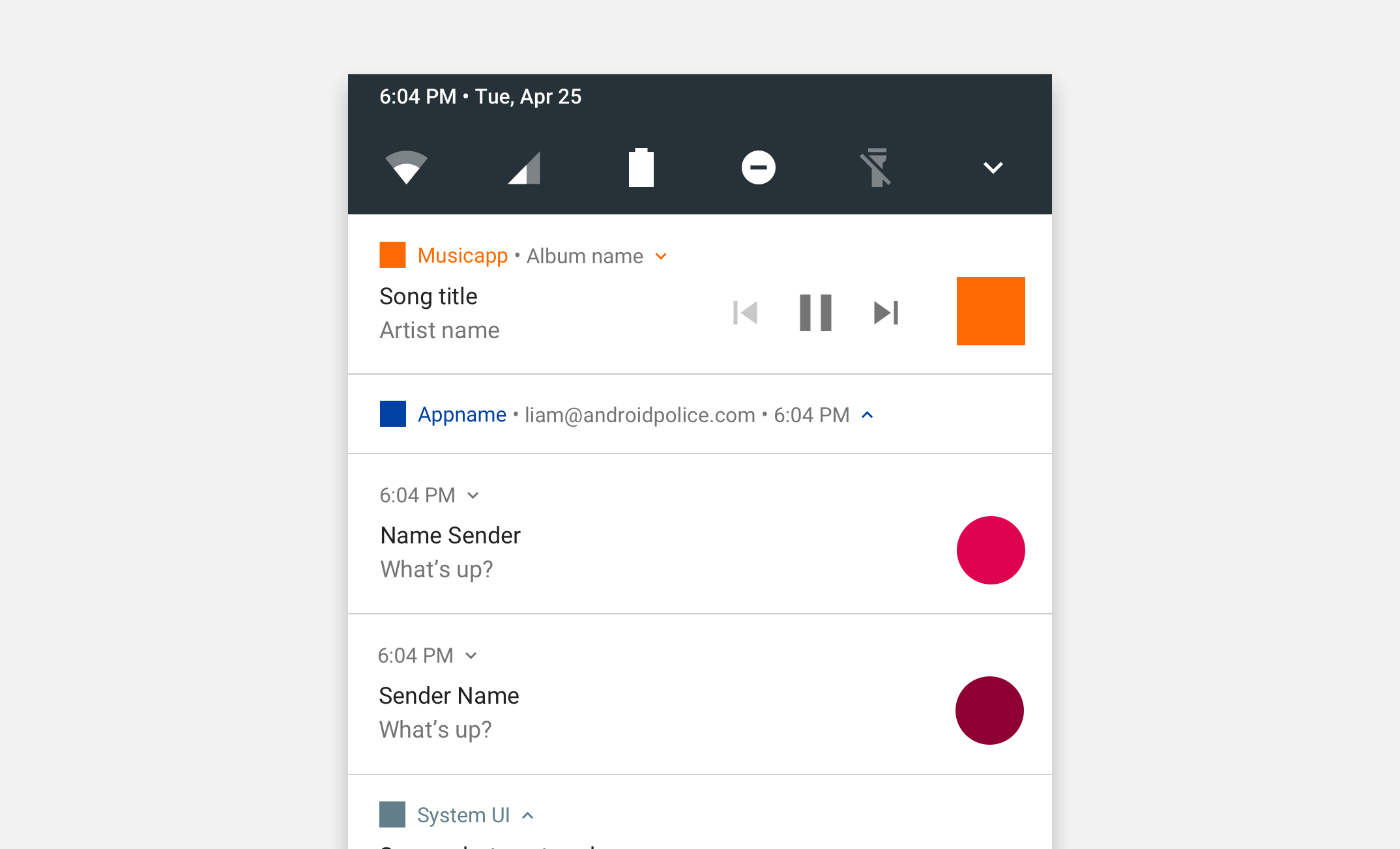
For the designers in our audience, I'm back with another quick Sketch resource to download - this time, it's a sticker sheet for N-style notifications. There are eight variations, plus a simple frame to stick your sample notifications in.
Hey, did you notice yet? Our other site, APK Mirror, got an update a little while ago. Things are... different. The site's design has been updated, and that means we've made some functional changes too.

If you entered the Google I/O lottery this year, dust off your F5 keys - lotto results have started showing up in inboxes.
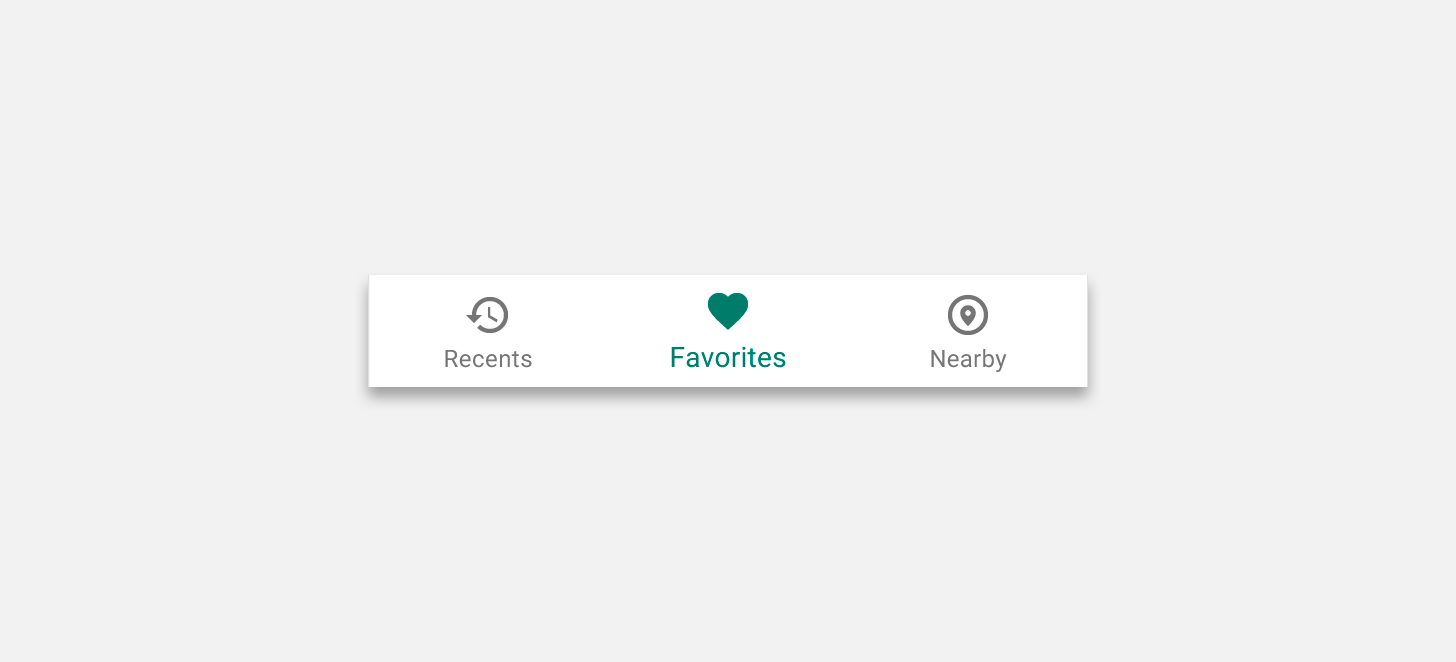
In a spec update timed perfectly for Pi day, Google has introduced some interesting new guidelines for developers and designers including - love it or hate it - bottom bar navigation.
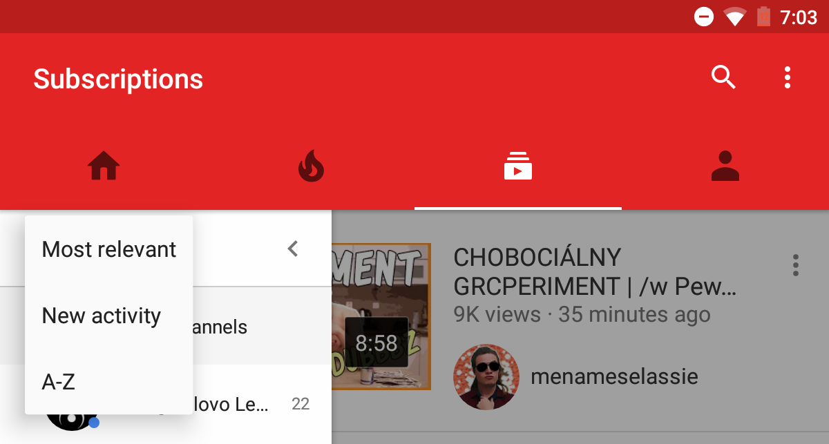
Back in December, we reported on a new "pseudo-drawer" for the YouTube app on Android - replacing the horizontal list of avatars and activity indicators found on phones, the drawer gave users a scrollable vertical list of subscriptions - avatars and names - along with actual numbers.
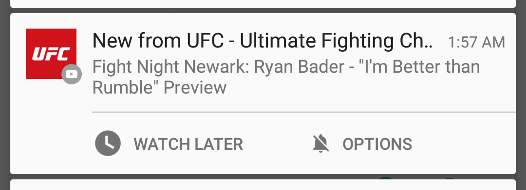
Google added the handy "bell" icon to the YouTube app's channel screens last summer to make signing up for "new upload" notifications quick and painless. But until now, users could only watch the video immediately, or take a shortcut to settings to disable the notification.
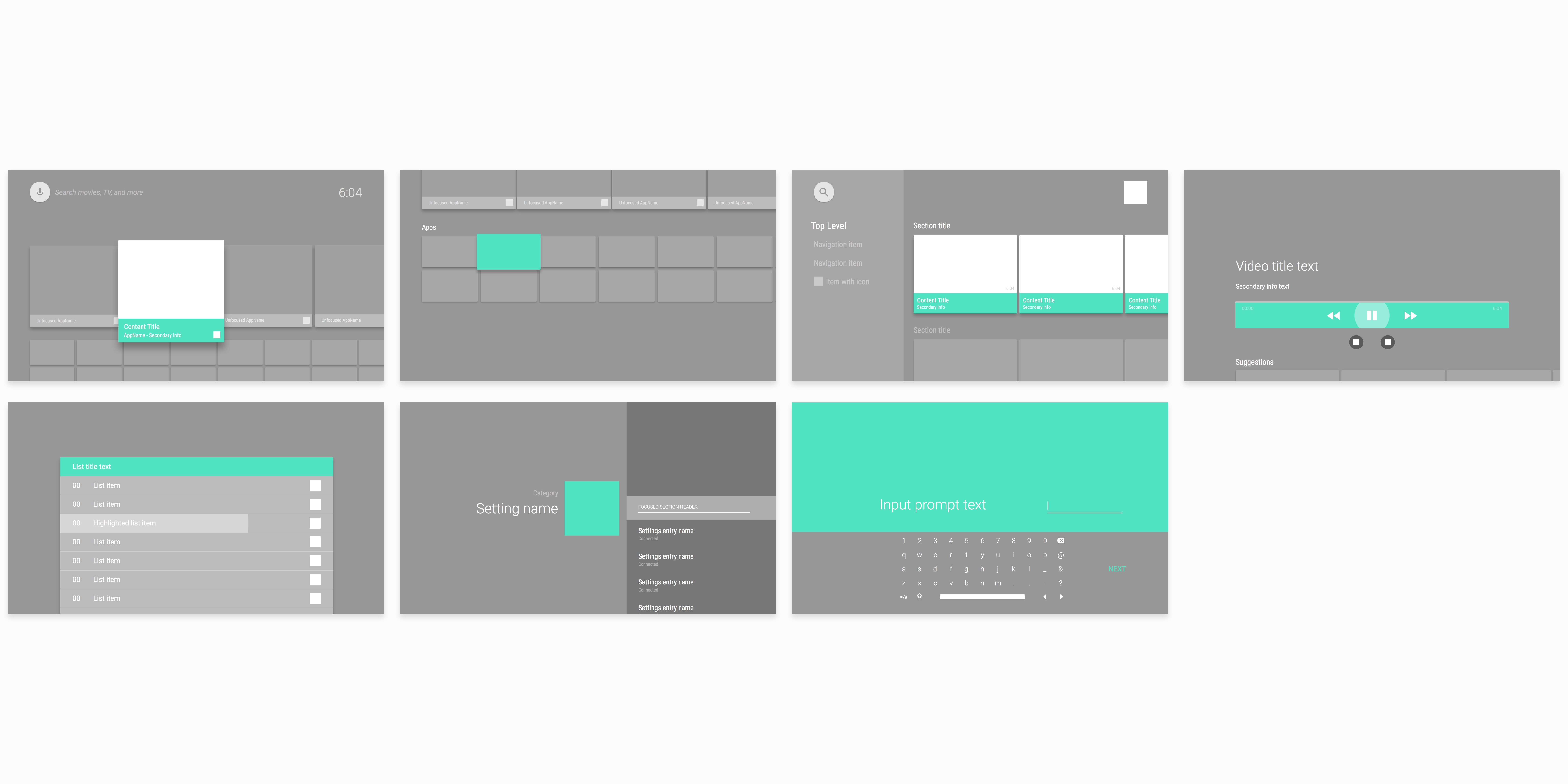
Yesterday, I was starting work on some sketches for Android TV. When it was time to move into Sketch (my current mockup tool of choice, mostly because of its Zeplin integration), I realized I hadn't really seen any good ready-made sheets, frames, or stickers for Android TV UI. So I decided to just go ahead and build a few screens, and then maybe - if they came out decent - upload them for other designers who might want to do a quick TV mockup or two.
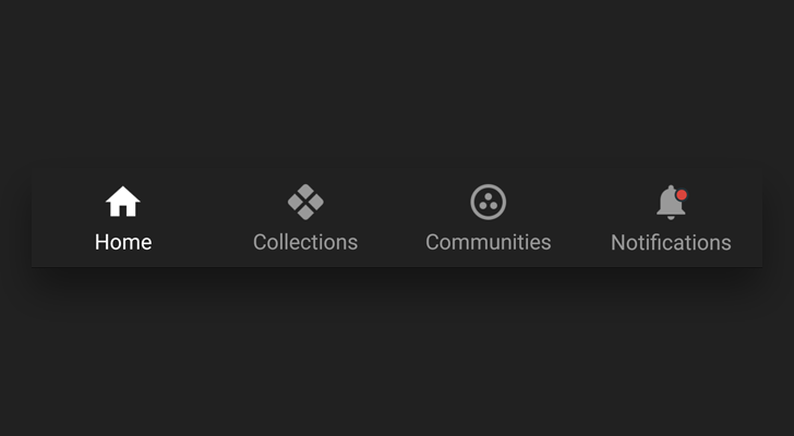
Many a double-take were... taken? when the brand new Google+ redesign was unveiled. Not because the design didn't look great, or didn't perform well (as we know, the website is highly responsive and super speedy), but because of an interface element that appeared on the new Android app - the bottom tab bar.
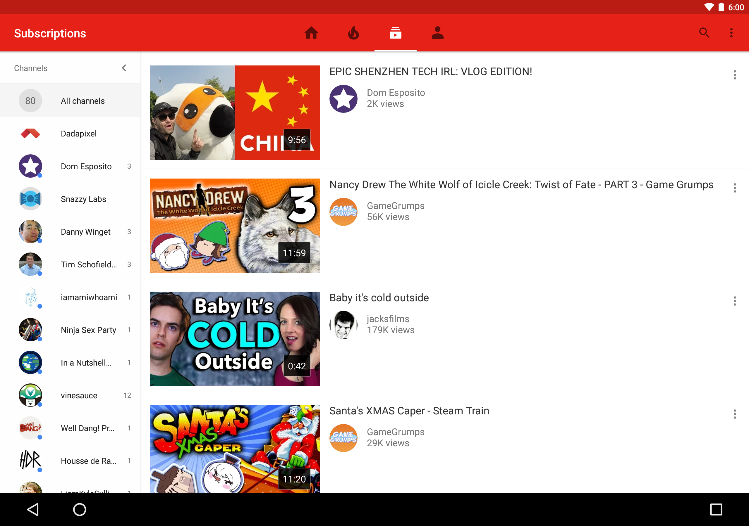
The YouTube app's hamburgerless layout has been with us for a while now, and while it's gotten a mixed bag of reactions, Google is still iterating on it slowly but surely. It seems like the latest development is a new layout on tablets for the subscription tab.
I'm already a fan (and subscriber) of Project Fi, Google's experiment in being a wireless carrier, but photos popping up across Google+ suggest that the service just got a little more awesome.
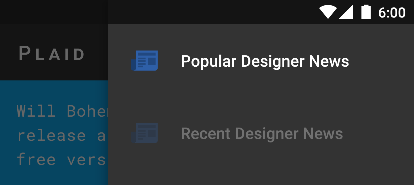
Nick Butcher (Developer Advocate at Google) recently published the source code for Plaid, an app meant to showcase material design on Android with playful animations, impeccable typography, and a simple, bold aesthetic. The code will provide useful examples for developers, but the app itself is worth keeping installed too - Plaid pulls stories from Designer News, Dribbble, and Product Hunt to serve up design news and inspiration, catered to your preferences.


