Android 14 Beta 2 was released during Google I/O yesterday. As expected, Google saved a lot of the visual tweaks for this post-I/O release, and from our limited experience with it so far, it’s also a lot more stable than Beta 1. This almost makes Android 14's Beta 2 feel like it should have been the first public beta release, with the fun of testing and experimenting with the new release only starting now. Here are some of the visual tweaks we spotted.
Home and lock screen tweaks
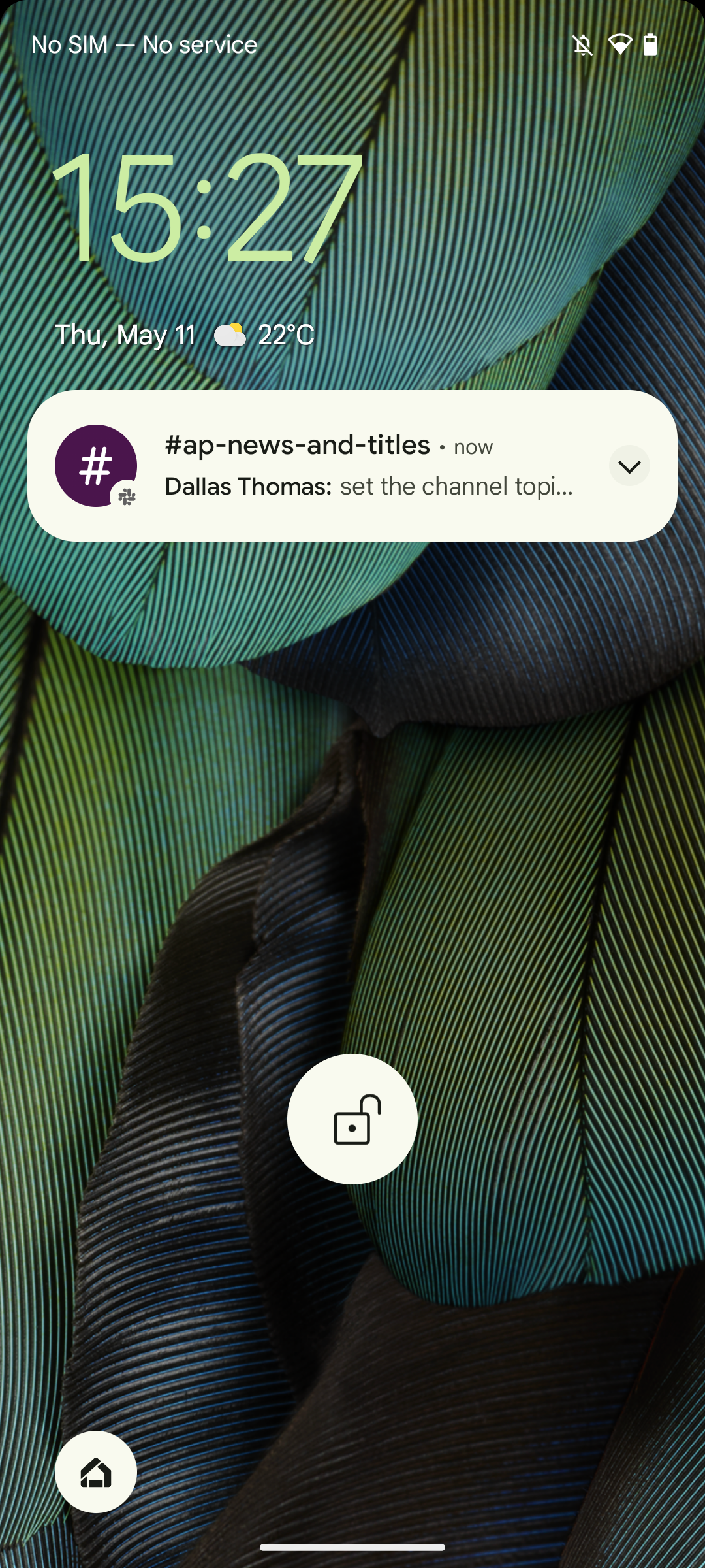
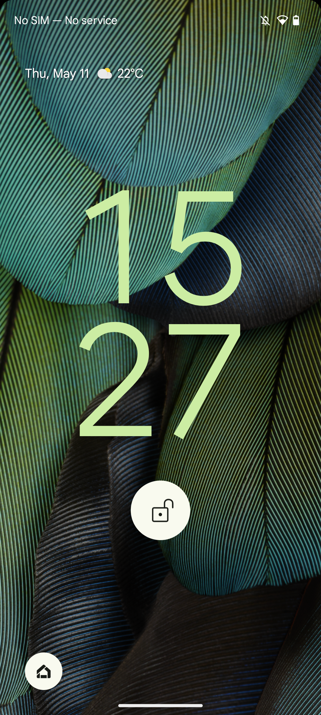
Google teased that it’s bringing lock screen customization to Android 14, allowing you to switch to different clocks and different shortcuts in the bottom corners. While these options aren’t live yet, the company has introduced some more subtle tweaks. Most notably, the At a Glance widget switched to a single-row interface on the lock screen, with the current date and weather now displayed next to each other rather than on top of each other. This interface reverts to the familiar dual-line design when more information is displayed at a time.
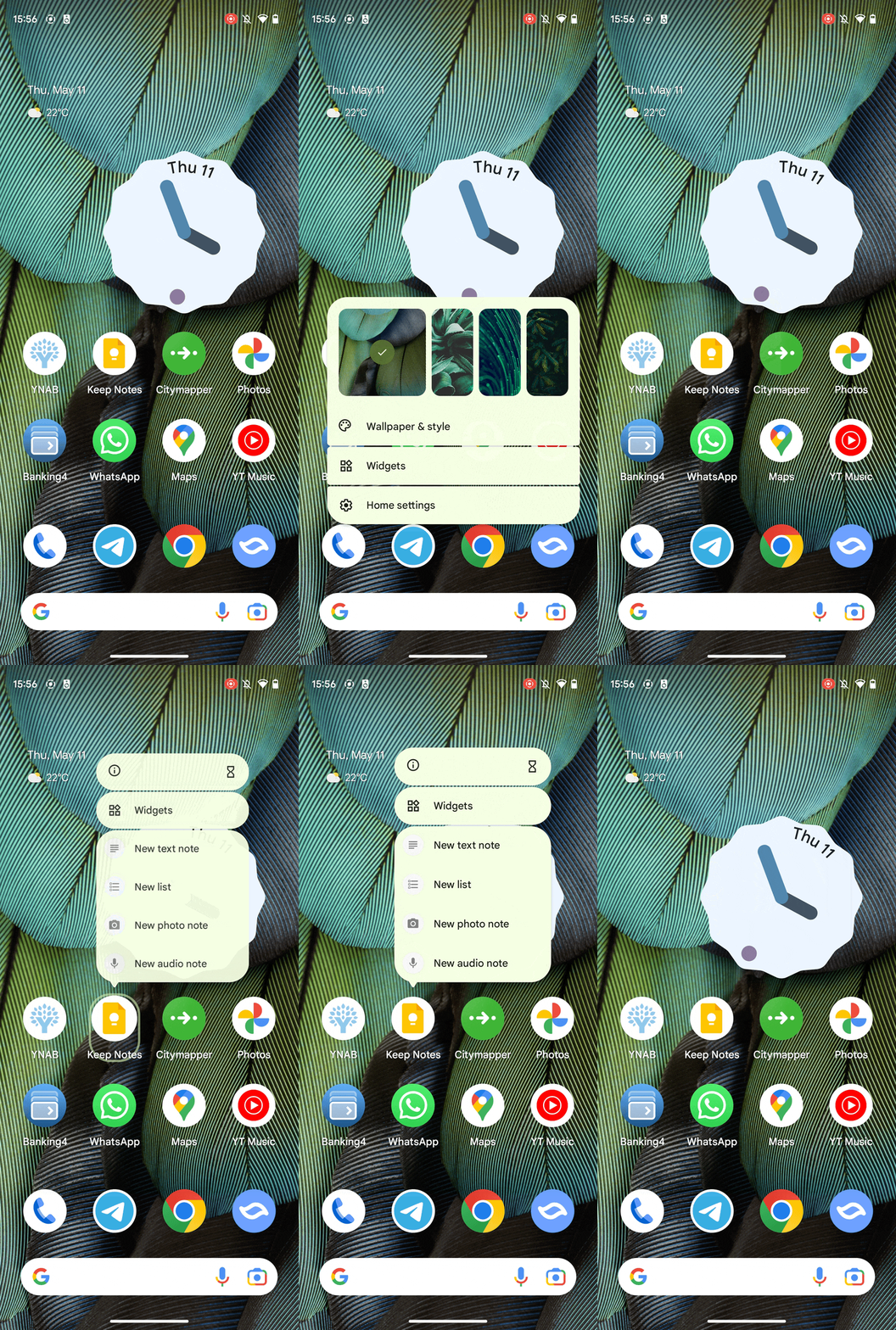
On the home screen, the At a Glance widget still retains its old dual-line look, and it’s unclear if this is going to change until we see the final Android 14 release. You’ll notice a bigger tweak when you tap and hold an empty space or an app icon. The pop-up window has a different animation now, more fluidly flying in from the spot you tapped. It also saw a small redesign, with the different groups of actions now sitting in one complete bubble rather than having an individual bubble for all entries. It makes for a less busy look. This change was previously available, but hidden behind a flag that could only be tweaked when your version of Android is rooted.
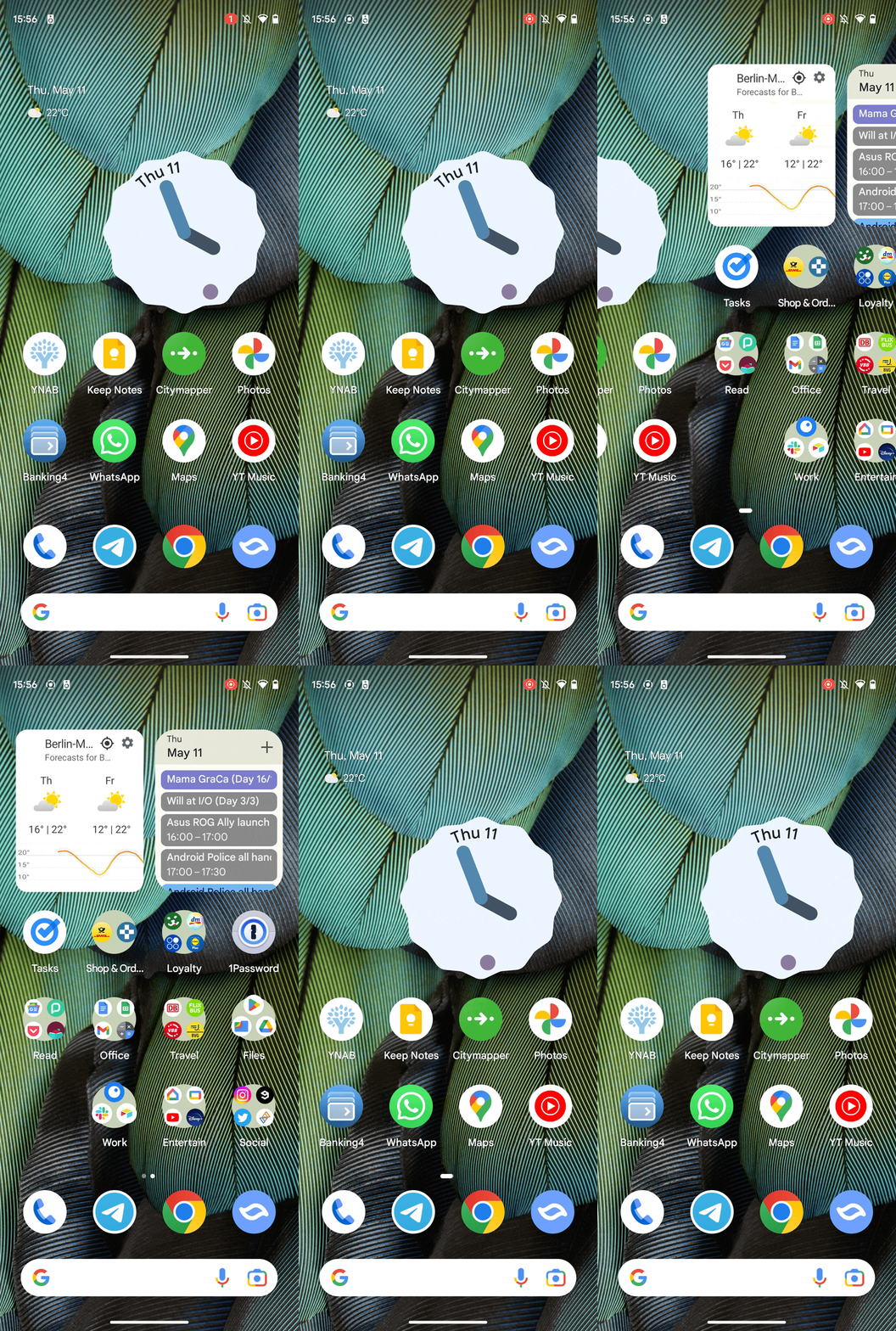
Google added another small tweak to the home screen. The home screen page indicator has been tweaked to use dots rather than a horizontal line.
Battery Saver explanations
When you use the battery saver quick settings toggle for the first time, you’ll now see a popup asking you which battery saver mode you’d like to use: Standard or Extreme. The popup also adds a short explanation for both modes, explaining that the standard mode will switch to dark mode, reduce the screen refresh rate, and limit visual effects and background activities. The Extreme Battery Saver offers the same tweaks, but also fully deactivates all non-essential apps, leaving you only with some system apps and those you manually exempt. These two modes are not new in Android 14, but the explainer will likely be much appreciated by anyone picking up a Google Pixel 7a or Pixel Fold after the stable Android 14 launch.
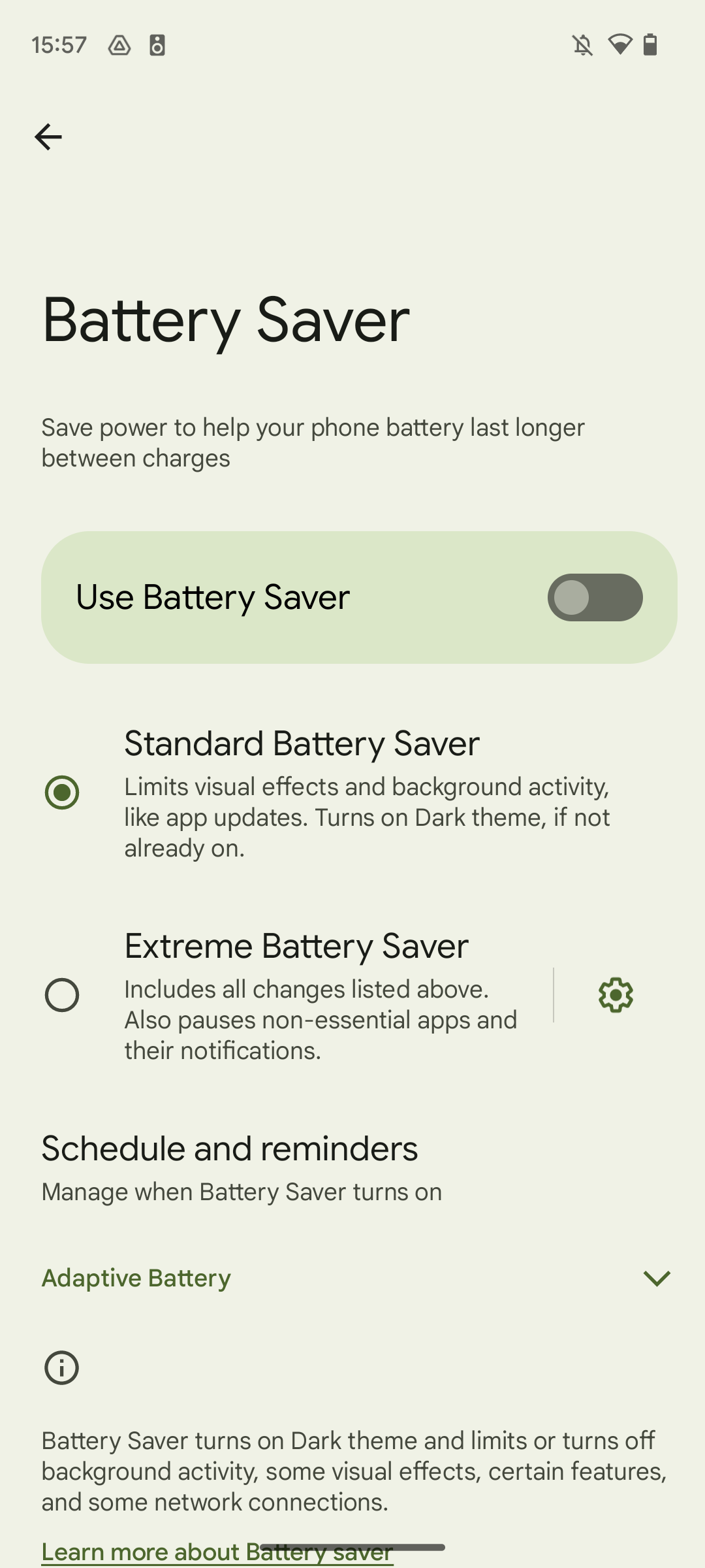
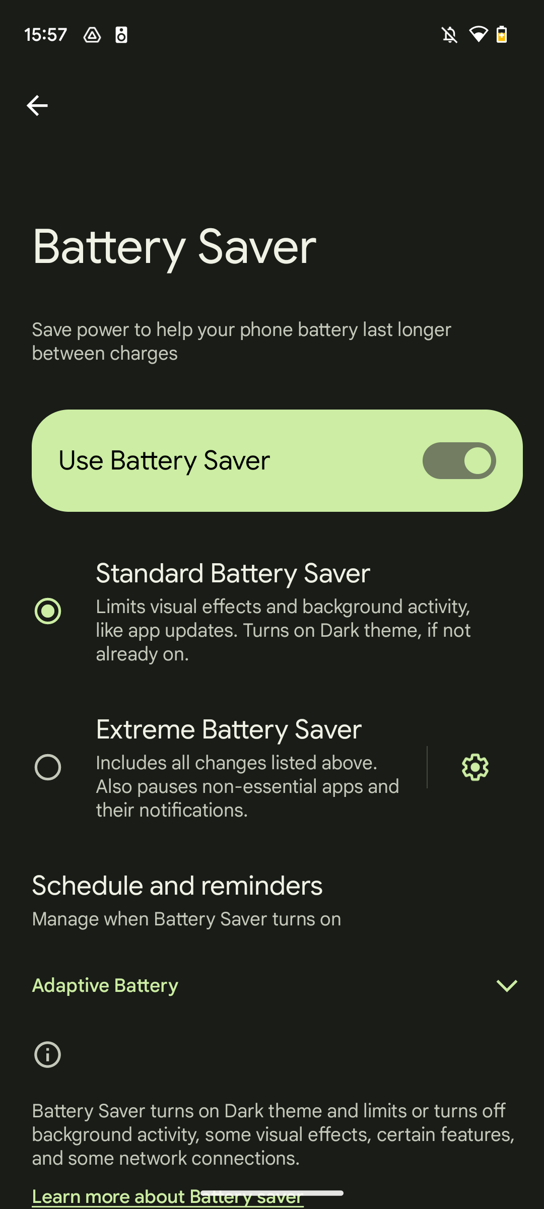
We don't have a screenshot of the new popup, but it's these same two options and descriptions
In addition to this, Google also changed the way the battery icon looks when you use the battery saver. Rather than putting a red frame around the icon, it now colors the remaining battery level yellow. The new design retains the plus sign, though. The standard battery saver also doesn’t stop vibrations anymore, giving you haptic feedback when you type on the keyboard or when you unlock your phone.
Denser share sheet layout
Google is making the system share sheet a lot more powerful with Android 14. Apps can tap into it and add their own actions, an option that Chrome already utilizes to get rid of its custom share sheet. The browser gives you options like copying the current link or printing the website right in the system share sheet.

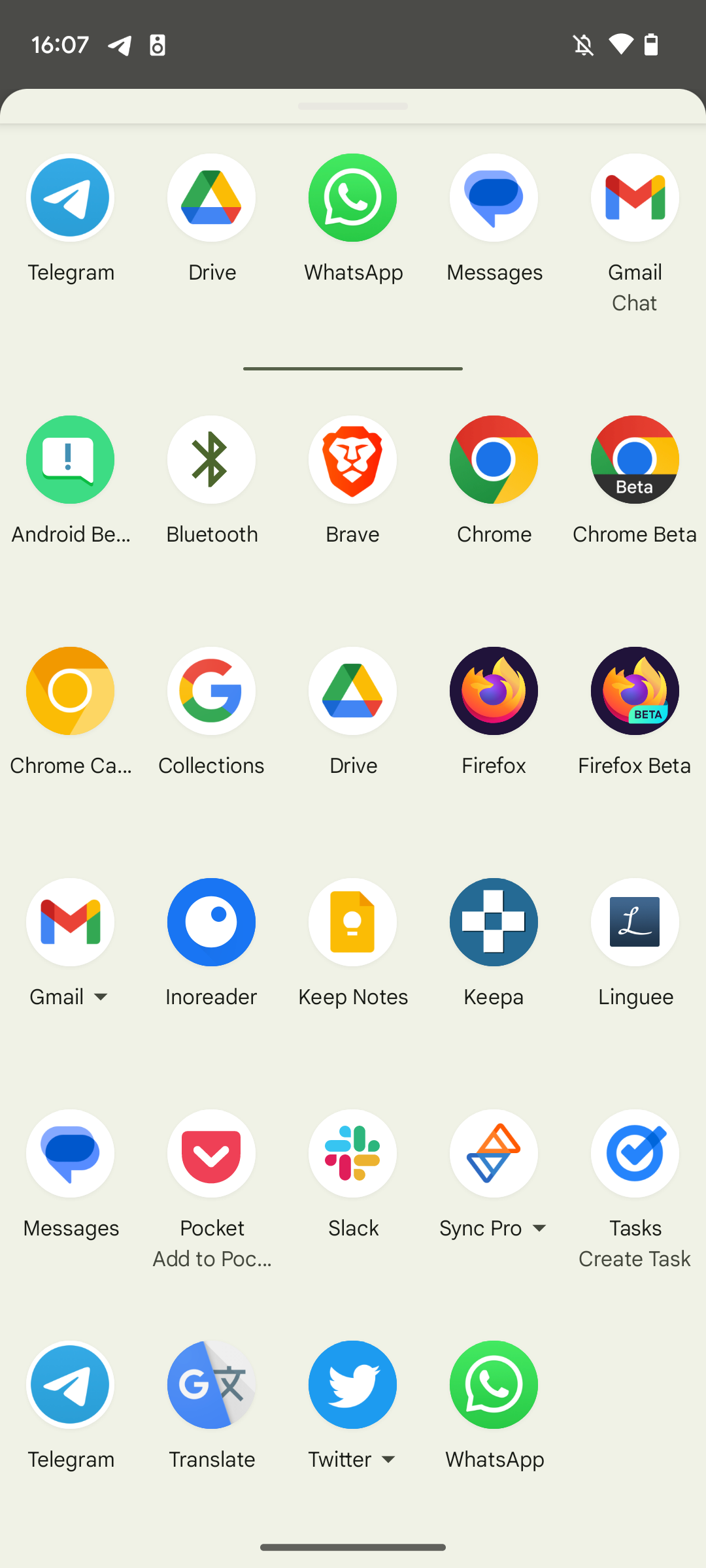
Android 14 Beta 2 makes the interface more condensed, now showing five direct share targets and apps per row rather than four. It's a small change, but it's more than welcome in the name of information density and usability.
Predictive back navigation feels more fluid
Predictive back navigation is a new feature Google introduced to make navigating back easier on Android, allowing you to peek ahead to which app or page you’re returning to. You still need to enable a flag in developer settings to see this in a handful of supported apps like Google News or the system settings, but compared to earlier versions of Android 14, the navigation system feels a lot more stable and less finicky. In almost all cases, the animation will now properly kick in and animate fluidly, which couldn’t be said for Beta 1 or even the developer previews.
The monochromatic theme is here
Like Google announced on stage, Android 14 Beta 2 is adding a new monochromatic Material You theme to its non-wallpaper-based themes. Like the name implies, it’s a black, white, and gray interface that gives your phone a more serious vibe. It’s the first option in the Basic colors section inside the Wallpaper & style customization options.
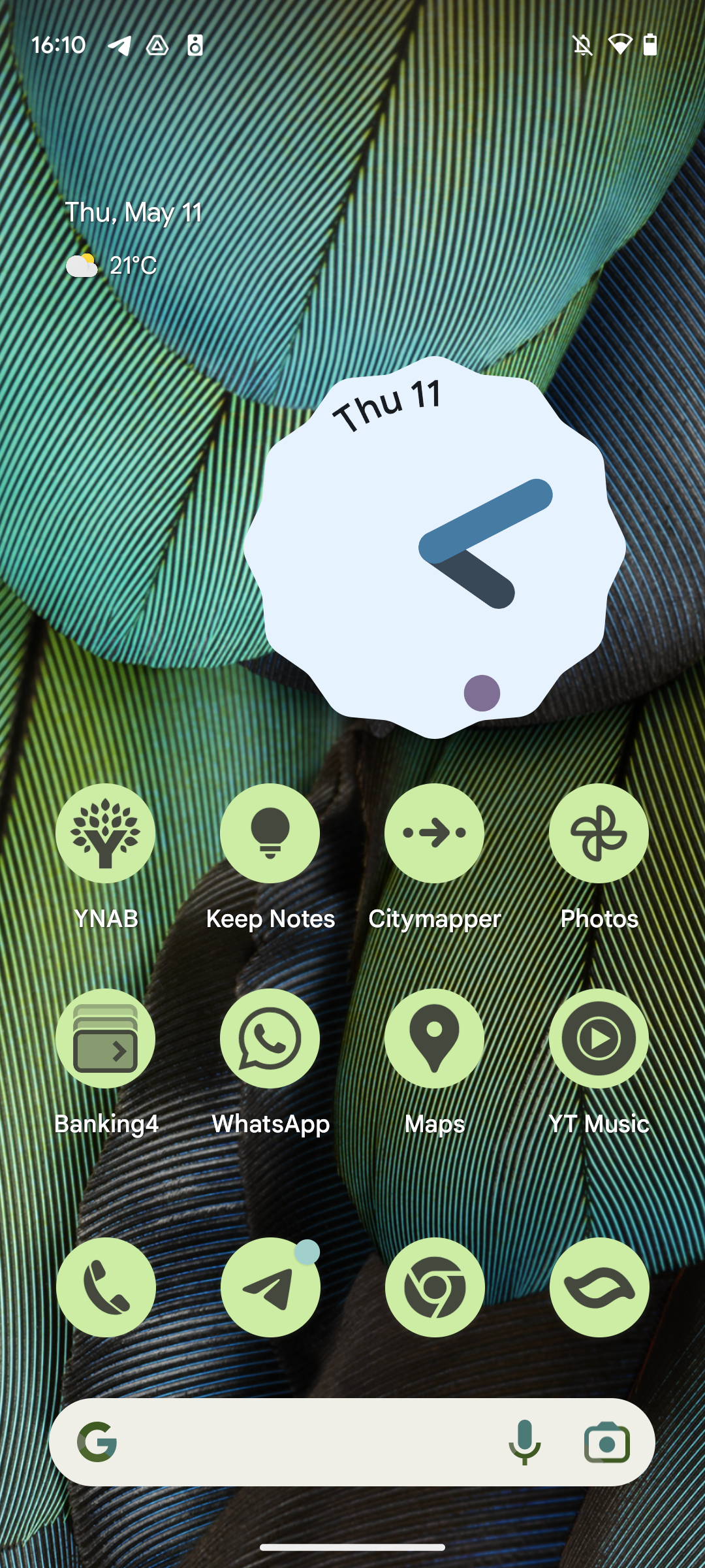
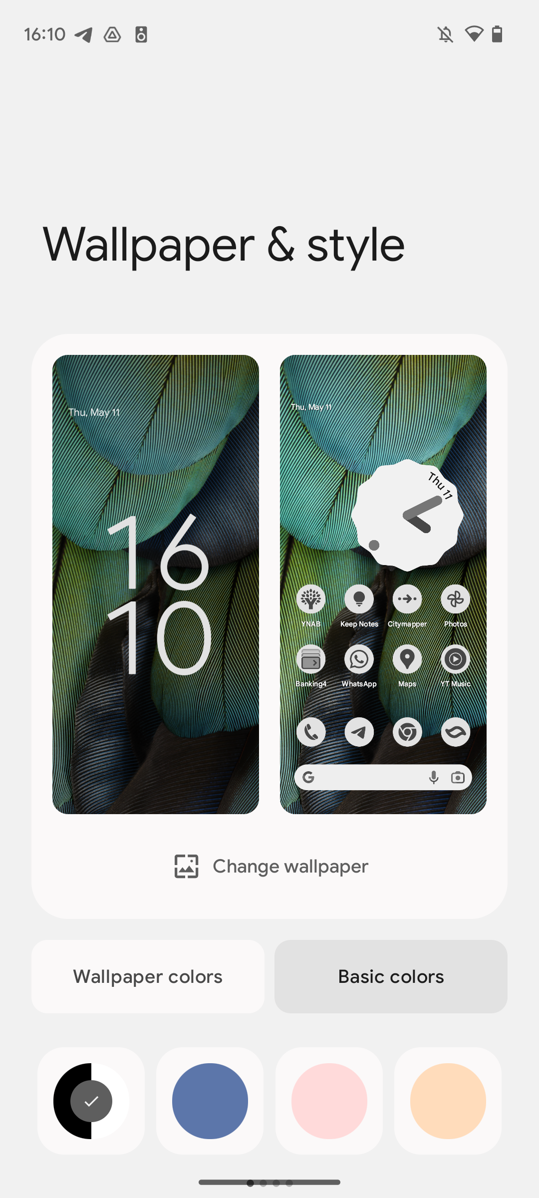
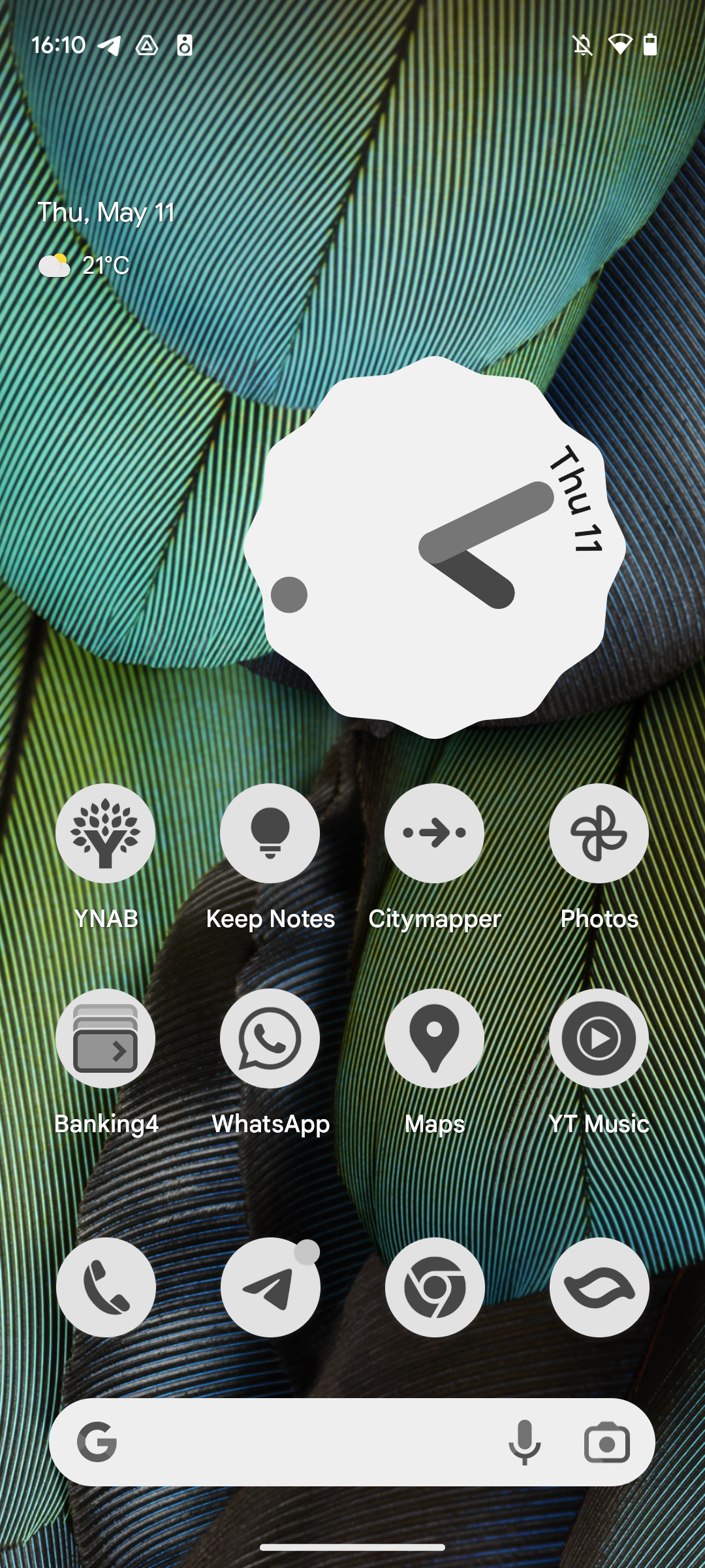
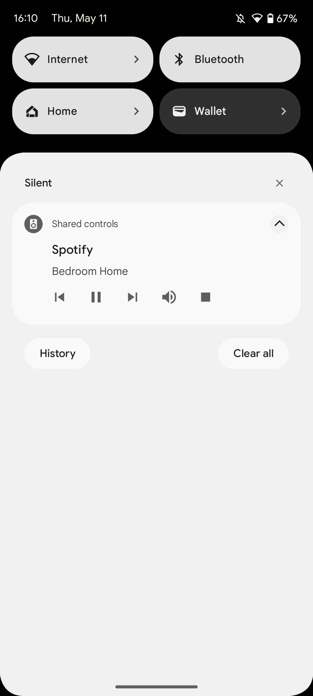
Default Material You theme vs. monochromatic theme
Like most of the other features and tweaks mentioned here, this was uncovered earlier, but is only now coming to everyone installing Android 14 Beta 2.
Android 14 is looking like a bigger update than Android 13
Whereas Android 13 was concerned with tying together loose ends from the big Material You overhaul that Android 12 brought, Android 14 is looking like a bigger update in the visual department. The biggest change is still missing in action, though — the lock screen customization options will make your phone even more personalized than what Material You can provide, but it looks like we’ll have to wait a little longer until that rolls out.

