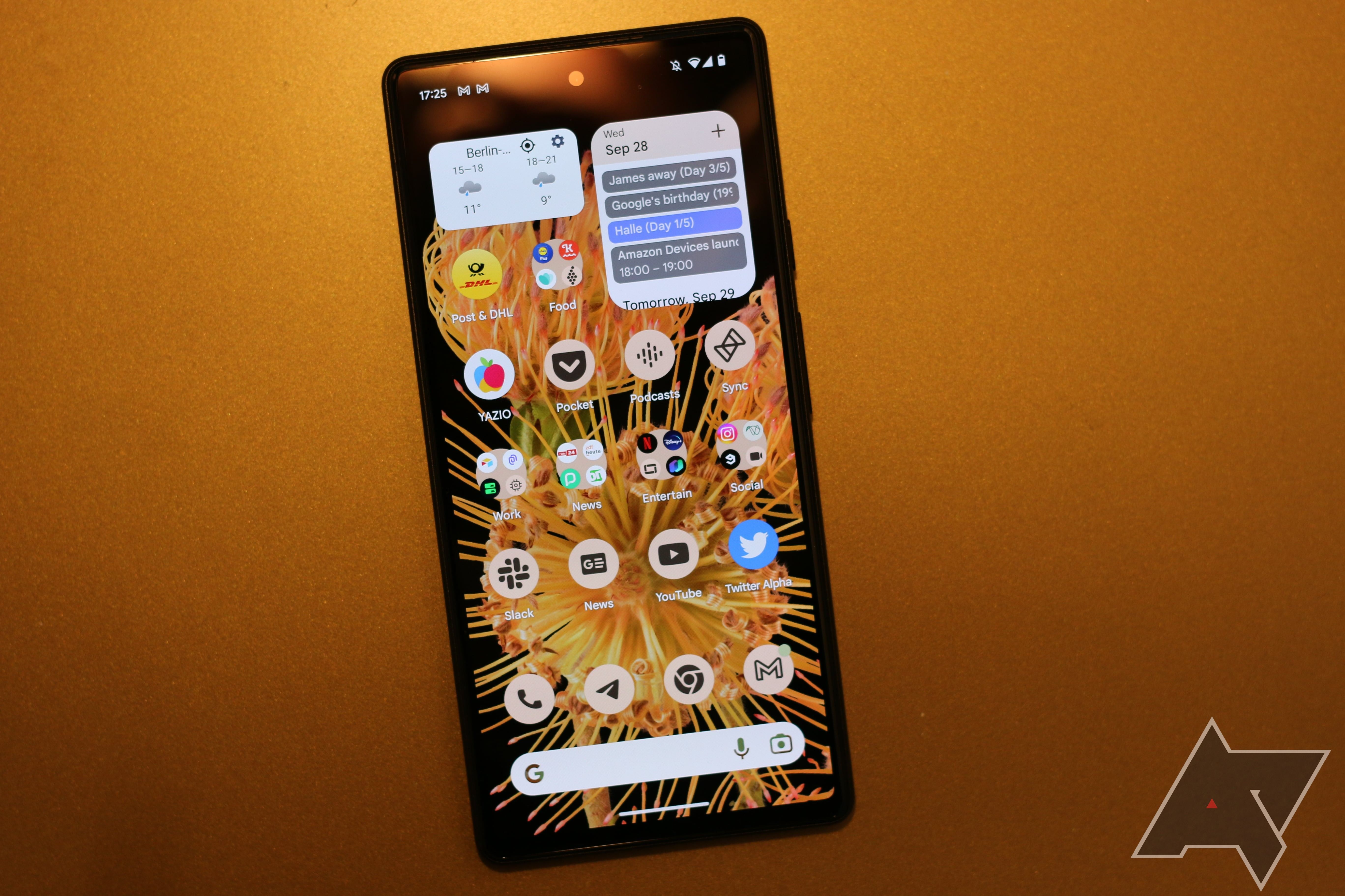
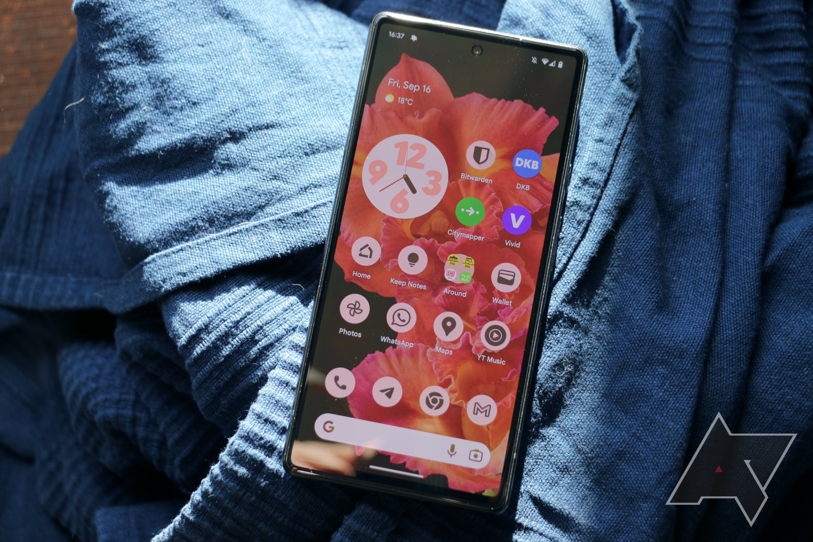
Android 13's new themed icons want to give you a more consistent look on your homescreen. Rather than allowing all apps to showcase themselves with their colorful icons, the new optional mode for Google Pixels and the other best Android phones creates a monochrome look that's supposed to give you a consistent homescreen. As beautiful as this can look when all your favorite apps support it, there are still many issues with themed icons. But let's not get ahead of ourselves.
To understand what's going on, we first need to look at the history of themed icons, starting with so-called icon packs. These are essentially apps that contain custom icons for as many apps as possible on your phone. They often can only be applied when you use a custom launcher, which replaces the original homescreen on your Android phone. Some phones come with homescreens that can work with custom icons, though. The Pixel Launcher isn't one of them.
Google tried to fix this shortcoming with Android 12. Here, the company first introduced a collection of custom monochrome icons for its first-party apps on Pixel phones. In contrast to icon packs, which allow for endless customization options and hundreds of different looks to pick from, Google's icons are tailor-made for the company's new visual language, Material You.
The Material You theming engine analyzes the dominant colors of your wallpaper and assembles a fitting theme based on it, dunking your app interfaces in that color palette. It's a constant reminder of which wallpaper you set, and it's supposed to give your phone a personal touch without you having to get knee-deep into theming everything yourself.
Themed icons, then, rely on the same engine and only offer a look that makes them fit your wallpaper. All the icons come in the same color, and you can only tell them apart from the different logos and shapes on them as well as the labeled names.
When you only rely on Google apps or go out of your way to only add Google apps to your default homepage, this creates a beautiful look that's right in tandem with your wallpaper and your Google-issued widgets. Google thought this system further in Android 13. The company made it possible for third-party developers to add their themed icons using a standardized API. This could pave the way for easily customized homescreens, but that still doesn't solve my biggest issues with the system Google has decided on.
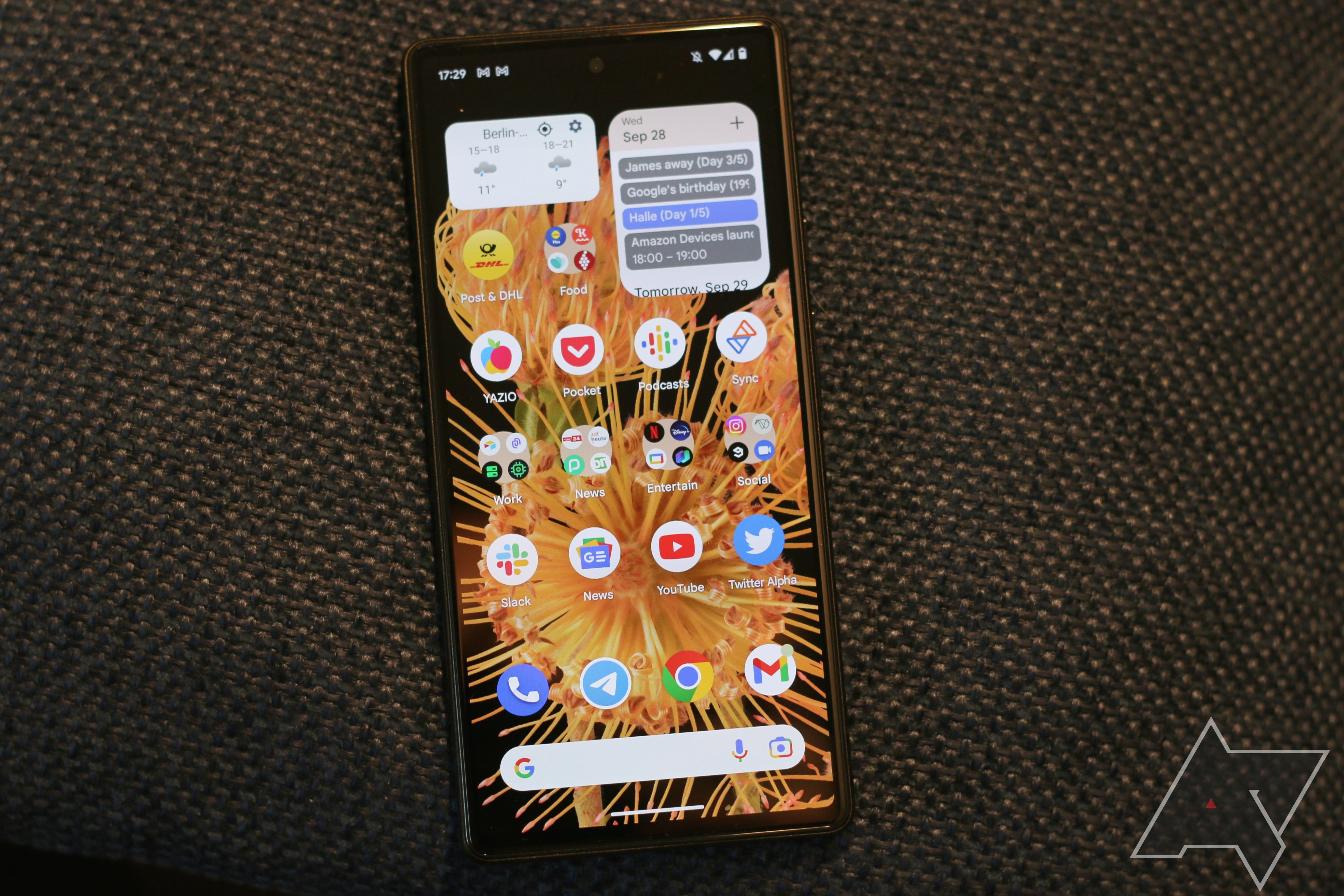
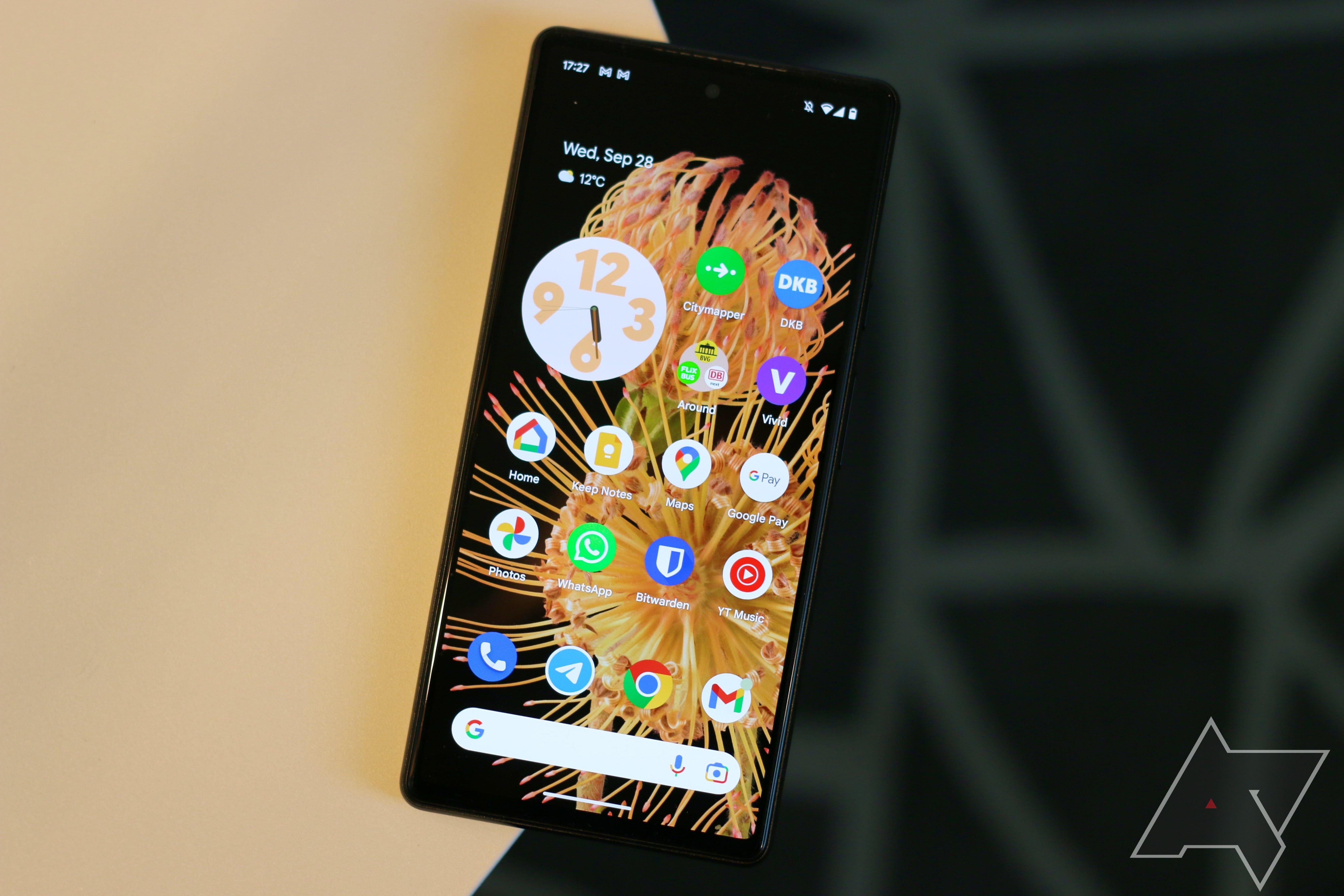
No themed icons make it much easier to spot which is which.
My problem with themed icons is that they are too little and too much. For those who want to theme the heck out of their devices, the option to only use wallpaper-based colors for the icons and still having to use what is provided by app developers might be a turnoff. Many people who are into theming also rely on third-party launchers and third-party icon packs, which makes them a different target audience than what Google has in mind.
Then there are people who just want their phones to work. They are happy enough with using their device as it is out of the box and would not think about changing settings like the always-on display, the quick toggle order, sounds, or security options—let alone turn on themed icons. At best, people might be interested in changing the interface color that is pulled from their wallpaper, which can be done with 16 theming options in Android 13.
Themed icons as they exist right now would likely appear as an indiscernible mess for these people, who, I would argue, are the majority of smartphone users. Why are some of the icons based on the wallpaper colors, but others aren't? Why would I change how I use my homescreen just to make it look prettier with icons that I can't tell apart? Google apps are hard enough to tell apart due to all of them using the same colors, and themed icons are not making matters easier.
This leaves only a small target audience for themed icons: those people who love Material You theming and want it to be extended to all the apps they use on their phone (and yes, I am part of that group).
It's nice that Google offers this fan service for those who love the design the company created, but Google is also essentially forcing other app developers to take part in it. Otherwise, Google's fans are left with messy and incomplete-looking homescreens, making them want to stop using themed icons sooner or later. And that would hurt further adoption as well, as developers would have even less of an incentive to create their own monochrome icons, no matter how easy they are to make.
Compare this to the image at the top of the article!
Things would probably be a lot easier if Google automatically created themed icons for all third-party apps. I think this would be easy enough to accomplish. All apps need high-resolution assets for their icons in the notification shade. Best, these have to be monocolor by design. Why wouldn't Google just tap into that resource and use these icons to quickly have 100% support?
Sure, you might have to get used to slightly different-looking app icons that way, as many applications don't match their app icons with their notification icons 100%. Still, people will know which apps these are. After all, people see these icons in their notification shades all the time.
Instead, Google chose to go down a long and winding route that may or may not end up with 100% support, leading users to other solutions and thus hurting the adoption of themed icons even further.
But who knows, maybe we'll see it as an Android 14 feature, or maybe it won't arrive until the Android 15 update in 2024. After all, Google also forced its adaptive icons on developers after allowing them to use their old icons for a long time by just fitting existing icons into rounded shapes on Pixel phones (and other shapes on other phones). I, for one, cannot wait for Google to do this for themed icons. As fast as developers are at adopting themed icons right now, I'm not sure this momentum will keep up, and I would love to have a consistent homescreen—no matter how complicated it will make things for other users.


