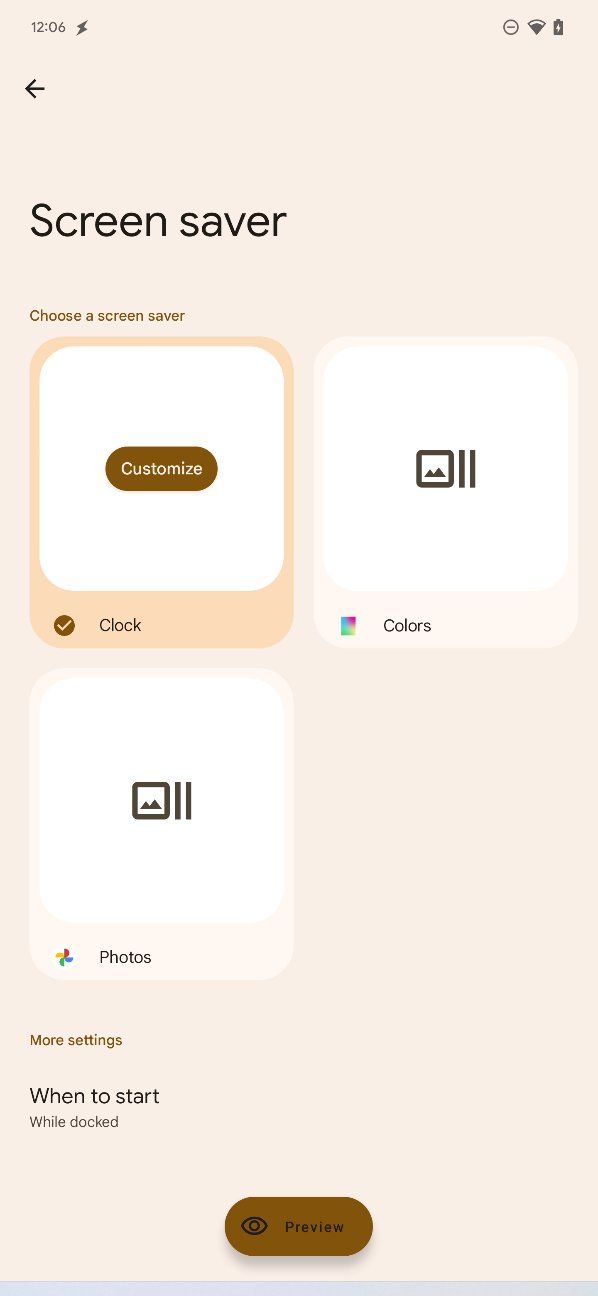
Last month, the first Android 13 preview release gave us an idea of the changes Google could introduce to the way the operating system manages screen savers. Today Android 13 DP2 has arrived, and it starts to flesh things out a little more, giving us a better look at how the new screen saver settings will appear.
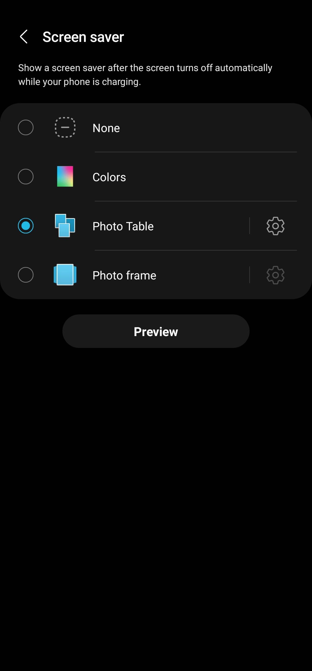
Settings now take proper advantage of screen real estate, showing the Clock, Colors, and Photos options on the first page, like Samsung’s One UI. However, unlike One UI, where the options are in a list format, Android 13 employs a grid-like look (as spotted by Android expert Mishaal Rahman). Each option will include a thumbnail preview, and selecting one brings up the option to customize. We get a new option for additional settings down below, and at the very bottom now find a preview button.
.png)

The current Android 12 screen saver menu feels more like an afterthought than anything. For starters, Google fails to take advantage of the entire page, and you only get to see your currently-selected screen saver option — Clock, for example — with a setting icon to the side for changing the style and applying dark mode. To see and select the Colors and Photos options, you’d have to first tap on Clock — a quite unintuitive design choice.
With Android 13 beta releases right around the corner, we could soon see even more changes to the interface. While we await Google's next build, make sure to check all the other changes arriving with DP2, or follow our Android 13 installation guide to try out the software on your own Pixel.


