Google's new Material You design language, first debuting with Android 12, is steadily making its way to all the company's other services. Today it's coming to the Google Photos app for at least some users, spreading out subdued pastel hues and rounded interface elements while keeping most of the basic structure the same. So far the changes are appearing primarily for Android 12 devices, but a few users on older Android versions are telling us they're seeing it, too.
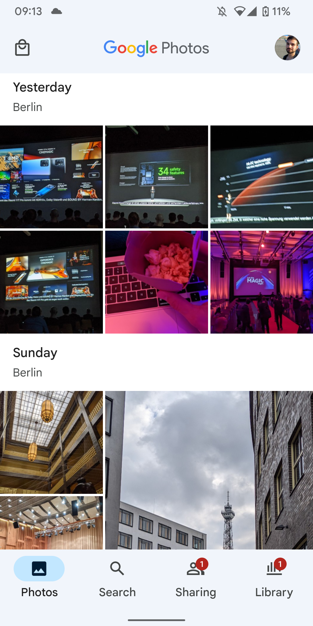
While we can see Material You influences in multiple elements - the oval Search bar, oval highlights on the bottom navigation panel, and that big rounded-off + Shared album button — the transformation isn't quite total yet. The app is still using a basic light or dark theme, not automatically adjusting its colors based on the user's background, as some other Material You apps are doing.


The interface changes don't appear to be linked to any specific version of the app, so cross your fingers if you're hoping to see it early. Presumably the more dramatic changes will be showing up once Android 12 is ready for a full release, which should be within the next month or so. We can't wait.