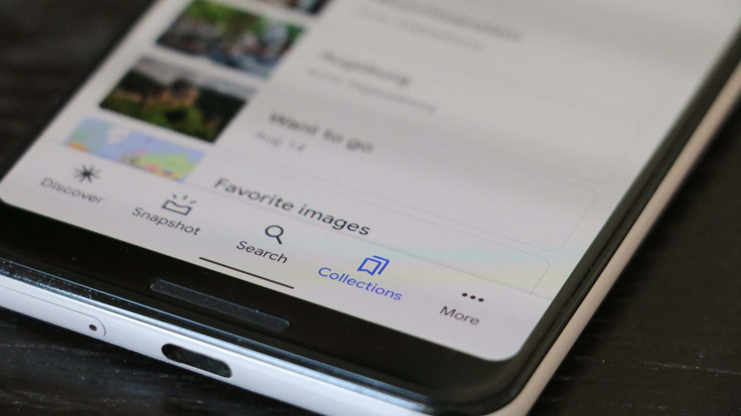
Google introduced Material You this year, its new design language that will define its apps' looks for years to come. That's why the company is going on a redesigning spree, with the latest app to receive a makeover being Gmail. Thankfully, Google isn't redoing all of its apps just for the sake of the fresh look — the company is also viewing it as a chance to add better functionality in some places. Google Collections appears to be one of these. The Google app's integrated bookmarking feature doesn't get dynamic colors, but its redesign makes it much more useful to many people.
As spotted by 9to5Google, the new version is much more focused on aggregating recently visited websites, favorite pages, suggestions for further research, shopping, and your watchlist, while the previous design mostly only revolved around giving you access to your saved pages as well as places from Maps. The new Collections shows you a "Quick access" section first that gives you access recently saved websites or places from Google Maps. It's followed by a "Shows & Movies" card filled with a carousel of films and series you recently searched for, as well as your Google TV watchlist. Only below that you can find your collections consisting of saved websites and places, followed by a shopping card full of recently searched products that you might want to buy.
Above: New look (via 9to5Google). Below: Old look.
In contrast to many other recent redesigns, Collections doesn't receive quite the Material You makeover with interface colors based on your wallpaper. But it's clear that Collections takes some cues from Google's new design guidelines, like bigger headers and a lot of rounded corners and buttons.
As with most of Google's updates, it looks like the new Collections tab hasn't rolled out to everyone just yet. It might take a while until you can see it in your Google app, and there's no way to speed up the process, as far as we know.

