Late last year, I decided it was time to move from my Huawei MediaPad tablet and get a new iPad. That wasn't my first foray into iOS/iPadOS — I'd previously had an iPod Touch and an iPad Mini — but it had been a few years since I'd last used Apple's mobile operating system. I was excited to discover what it offers and to explore all the big and small differences between it and Android. My journey uncovered some frustrating truths, but over the months, I've also come away with a newfound appreciation for features I'd taken for granted on Android, but that are either missing or aren't as good on iOS/iPad OS. Below is a list of eight of these.
Consistent back gesture
Although Google was late to the gesture game (for stock Android at least) and implemented this mode of navigation after Apple, it did something better in my opinion: the back gesture is consistent and reliable on Android. You swipe from the left or right edge of the screen and you go one step back, anywhere, anyhow. At first, I wasn't a fan of the way it conflicted with the side menu in some apps, but after a while, I realized I used the back gesture an order of magnitude more than the side menu. (Plus, many apps have since eschewed that menu for bottom tabs or a floating menu à la Google Maps and Photos, to name a few.)
Swipe back, go back. Every time.
There's no real equivalent to this back swipe on iOS. In a few apps, swiping from the right edge of the screen does go back, but that gesture isn't universally implemented, neither by Apple nor by all devs. In other apps, you have to use the back button on the top left, the furthest place your finger can reach. And in some instances, you just navigate without the back button, using bottom tabs to move between sections and tapping outside of floating menus to go back. Overall, navigating on iOS is cool as long as you don't need to go one step back. For that, you just throw a dart at the wall and hope you hit the right mechanism.
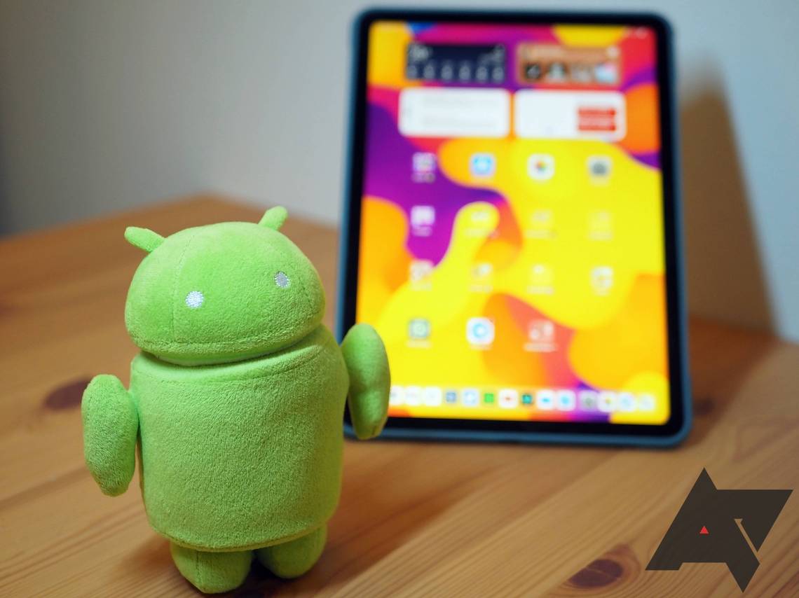
Share sheet
It's no secret that we are not big fans of the Android share sheet here. We've begged Google to fix it once, and twice, and covered every tiny good and bad change it's received in the past years. But no matter how bad I think Android's share sheet is, it's nowhere near as confusing as the one in iOS.
What in the tiny app icon row is that?!
Maybe I'm failing to understand how it works, but each time I hit that share button on my iPad, I have no idea what I'm going to get. The only thing I appreciate is that I can show, hide, and re-arrange the apps that show up, but I have to be pro-active about it because the default is neither organized nor logical — at least Android implemented alphabetical sorting by default. The app icons UI is so tiny and scrolling horizontally through a long list it isn't convenient, and there are so many options that appear in certain apps but not in others, to my dismay. Plus, some apps show up in both the icons list and the action list, creating a lot of redundancy. And if you thought Apple didn't have custom share sheets, think again. Twitter, YouTube, and plenty of other apps make you go through their own sheets before you get to Apple's.
Notification bundles and channels
Another classical example of the "I thought it was bad, until I saw worse" club are notifications. On Android, they can become very overbearing very quickly, there's no way to manage them in bulk, they get delivered to all devices including inactive ones, and there's no smart system managing what you get notified by depending on the time of day.
Apple tried to implement the latter in iOS/iPadOS 14, but it's still years behind Android in everything else. Bundling doesn't work all the time and I've often found a bunch of individual notifications from the same app listed one after the other. Smart actions aren't available, so you can't open links and set reminders and check Maps or do other relevant actions from a notification.
If this is what happens when notifications are grouped...
But the worst offender is the lack of channels. Apple's system is all or nothing, so an app developer can't let you decide what type of notifications you want to receive and which ones you'd rather not see — well, not unless they manually implement a picker inside their app. This has lead me to basically disable all notifications on my iPad. I'm already getting the important pings from the apps installed on my phone, I don't need to duplicate them on my tablet. But goodness help those who own an iPhone...
Enabling the notification channels that matter. Disabling the others.
Everything about Gboard
I knew I'd miss Gboard on my iPad, but I didn't know I'd miss it this much. The Apple keyboard can't come close to delivering the same experience as Gboard on Android, and sadly even Google's own Gboard sucks because Apple limits third-party keyboards on iOS so much that Google can't implement any of its signature features.
You lose the number row, a crucial element for my transliterated Arabic typing — we use the numbers 2, 3, and 7 to replace letters with no vocal equivalent in the Latin alphabet. You also have to say goodbye to multilingual support and manually switch between each language you plan to use. On-the-fly translation is gone too, so you can't use it to quickly find how a word or sentence is said in another language.
Gboard on Android has Emoji Kitchen, a clipboard, easy translations, plus more awesome features.
Add to those no GIF searching and inserting, no clipboard manager to quickly paste several items, no autofill suggestions, and no ridiculously awesome emoji kitchen. All the reasons that make Gboard extraordinary on Android are gone on iOS and it's almost like using a skinned version that's barely a shadow of its Android glory.
Overview text and image selection
Although it's a Pixel-only feature, the ability to select anything in the app Overview window on Android is often forgotten and undermined. Simply swipe up in any app to trigger the switcher, and you get an interactive card where tapping and holding allows you to circumvent any app's tap-and-hold limitations. Instagram not letting you select an image? You can do it from Overview. A website or app not letting you select text? Overview again. It's such a simple solution, and it's augmented by Google Lens, which simplifies text detection. Add on top of that all the contextual elements you get once you select something — open link, translate, open in YouTube or Maps or Spotify, call a number, send a message, add to your calendar, etc... — and you have an exquisite tool that gets under-appreciated way too much.
Overview selections for images and text are extremely handy.
Consistent double tap or tap-and-hold
I'll file this one in the same bucket as the back gesture and share sheet. Maybe I don't know iOS/iPadOS well enough, maybe I'm not privy to their secret ways, but I swear to the heavens, I have no idea how to use double tap or tap-and-hold on my iPad. Sometimes they select text, sometimes they place the cursor in the middle of text, and sometimes they don't. Sometimes they're the equivalent of a right click on links, other times they select the link's text. And most times they do the thing I don't want them to do instead of the one I want. Insert twenty frustrating seconds of me trying to do it again and again, and for some reason, it succeeds. I literally repeated the exact same gesture a few times, but one time out of five or six, it did what I expected, the others not.
How can this be so frustrating and so inconsistent? On Android, I know what a double tap or a tap-and-hold does, every single time. There's no second-guessing, no trial and error, no inconsistency. "It just works."
Resetting apps
I never realized how important it is to be able to go back to an app's blank state until I started using an iPad. Whether it's because an app has started misbehaving, or I want to clear all cached data to free some space, or I want to start fresh with an app for whatever reason, Android allows me to do just that.
Clearing an app's storage or cache, or going back to its original version is child's play.
On iOS/iPadOS, there's no such option. A few rare, very rare, apps offer a reset setting, but otherwise, your only real bet is to uninstall and reinstall the app from scratch. Even then, some data might have been backed up and associated with your account, which is a good thing if you're setting up a new phone but a bad thing if you're trying to get an app back to a blank state. There are a few tutorials online about this, but nothing as simple as the Clear storage and Clear cache options that Android offers. That's without even mentioning the Uninstall updates feature that lets me go back to a preloaded app's original version.
Live Captions
When Live Captions were announced on Android, a couple of years ago, I didn't expect to be using them well into 2021. But here I am, lying in bed next to my still-sleeping husband or waiting somewhere in a public place, and trying to watch a video without provided captions. I don't want to turn the sound on, so I enable Live Captions and can read what's being said without disturbing anyone.
It's nice to be able to silently watch videos on Twitter and Instagram and read their captions.
I didn't know I'd miss this so much on my iPad, but when situations like these occur while I'm using it, I silently curse underneath my breath, and save the video for later.
Default apps
Although Apple has gotten better at giving us the option to pick our favorite browsers and email apps, it still ties everything else on iOS/iPadOS to its own services. I had taken the convenience of changing the default file browser, photo gallery, launcher, calendar, and maps apps for granted on Android. Now, I appreciate them a lot more because I know how annoying it is to be tied to a choice you don't favor.
Setting defaults works for a bunch of app types, not just the browser and email client.
Expanding my horizons with different ecosystems (when I can afford to) is always an interesting experience. I discover what other companies are doing differently, how they've implemented certain features, and where they excel compared to my OS of choice. And more often than not, I also come away with a newfound appreciation for my current OS. That's not to say that I'm ditching the iPad anytime soon. I can keep both Android and iOS/iPadOS in my life and divide my usage according to the strengths of each one. I call this a win-win.