I find myself doomscrolling on Twitter more often than I’d like to admit, so I've implemented a program to cut down my phone usage, involving some self-discipline and Android’s Digital Wellbeing tools. So far, that effort's proven fruitful, but every time an app timer runs out, the ensuing pop-up makes me furious at how inconsiderate Android's system is by design — and leaves me wishing it were more like iOS’s alternative.
With Wellbeing, when an app reaches its daily limit, you have two options — either move on to something else or add a few extra minutes to finish up whatever you’re doing. That’s where I take issue with the approach. Firstly, there’s no way to extend the daily quota temporarily, and the only way to tweak things it is by changing your recurring timer. And to do that, you’ll have to go all the way to the phone’s settings app.
While that’s unintuitive but still doable, what’s far more maddening is that Digital Wellbeing completely shuts down an app and removes it from the app switcher screen as soon as its timer is up. So if you were a few minutes into a watching YouTube video and the app closes, you’ll have to adjust the app timer in settings, reopen YouTube from the menu, find that video again, and finally scrub to the spot where you were last at. Now imagine the same ordeal happening during more critical situations — say, when an online payment is processing, or you’re typing some text that you can’t afford to lose.
Left, Center: iOS's Screen Time and App Limits dashboard; Right: Android's Digital Wellbeing.
One may argue that Digital Wellbeing gives ample forewarnings up to the last minute to wrap up soon, or that those extra steps were added to deter you from extending the timer endlessly. While those are indeed valid points, I feel that Digital Wellbeing’s real purpose is to remind and help us use our phones more effectively, and not to police our own rules.
That’s the reason I find iOS’s corresponding Screen Time much more thoughtfully designed, taking into account the various scenarios a user may come across. I get a similar full-screen message on my iPad when an app timer runs out, but here with several actionable options: I can take a minute to wind up things quickly or add 15 minutes in case something will take longer. It even lets me access the app for the entire day — and none of that changes my original timer setting.
While I select my options, the app remains active in the background, letting me jump right back in without any additional steps, which feels like a godsend when coming from Android. Apple is usually known for making this kind of navigation difficult for its users, but here, its approach is one step ahead of Android.
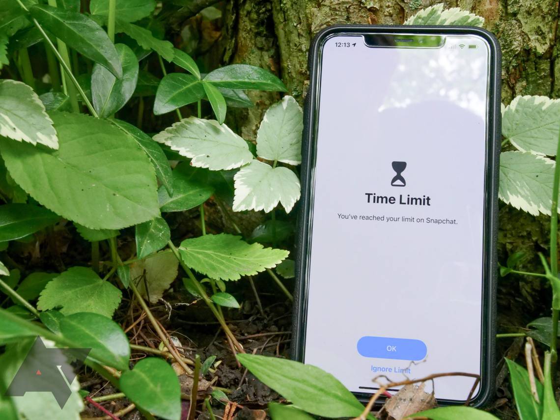
Left: Time limit pop-up on iOS; Right: On Android.
There are plenty more things Screen Time does better than Digital Wellbeing — like in Apple’s version, you can set timers for entire app categories instead of just individual apps. You’re also experience many ecosystem advantages, as you can apply these settings across all your Apple devices and even inside Safari for timing website usage.
The thing is that Digital Wellbeing hasn’t evolved enough to meet changing user needs since it debuted a couple years back. Its feature set is good enough when you’re starting your digital health journey, but as you move up a few levels, it starts to feel limiting and, in my case, irritating. Google already allows easing Focus Mode rules temporarily akin to iOS’s solution, so it isn’t like I’m asking for something too far-fetched.
Will Sattelberg contributed to this post.