Read update
- As part of the latest Google Play Services update, these app install indicators are rolling out widely
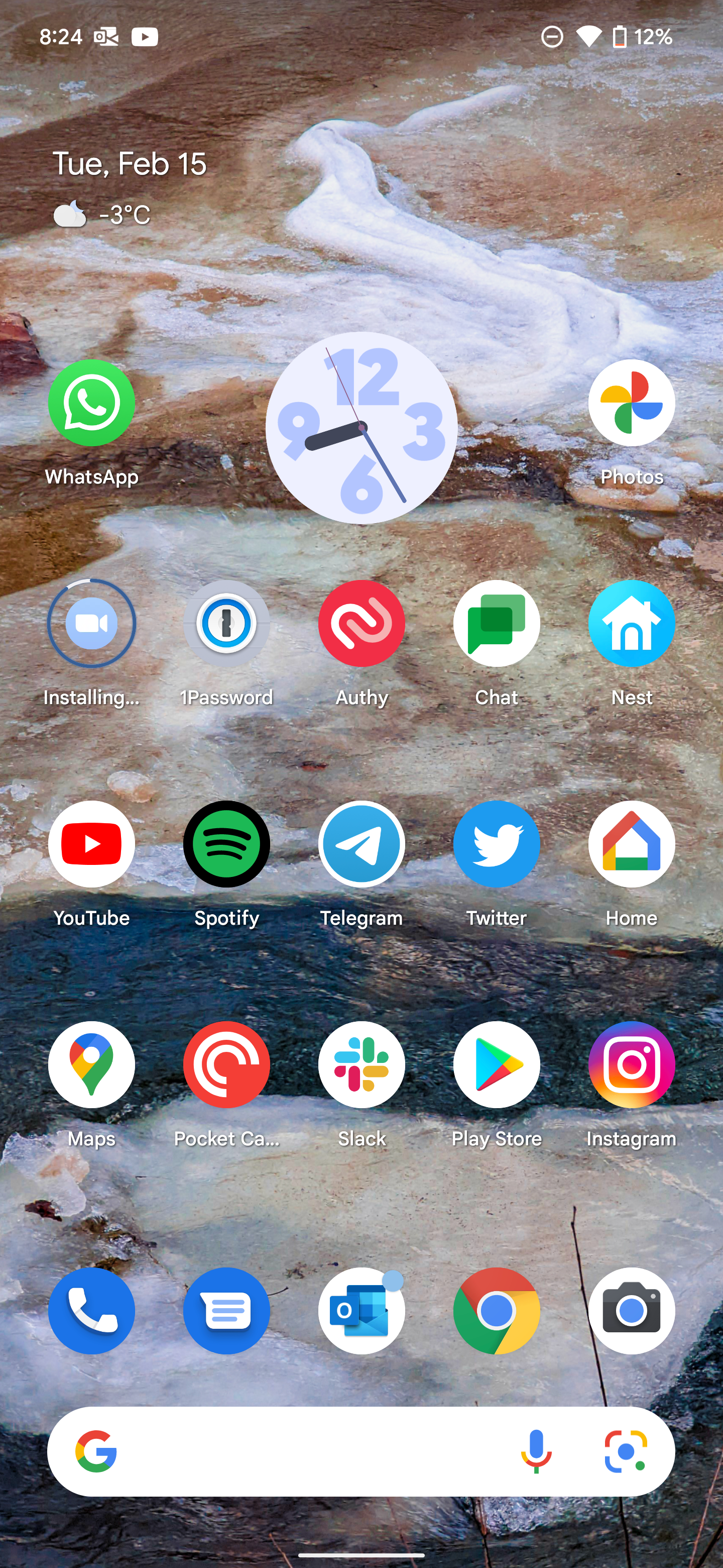
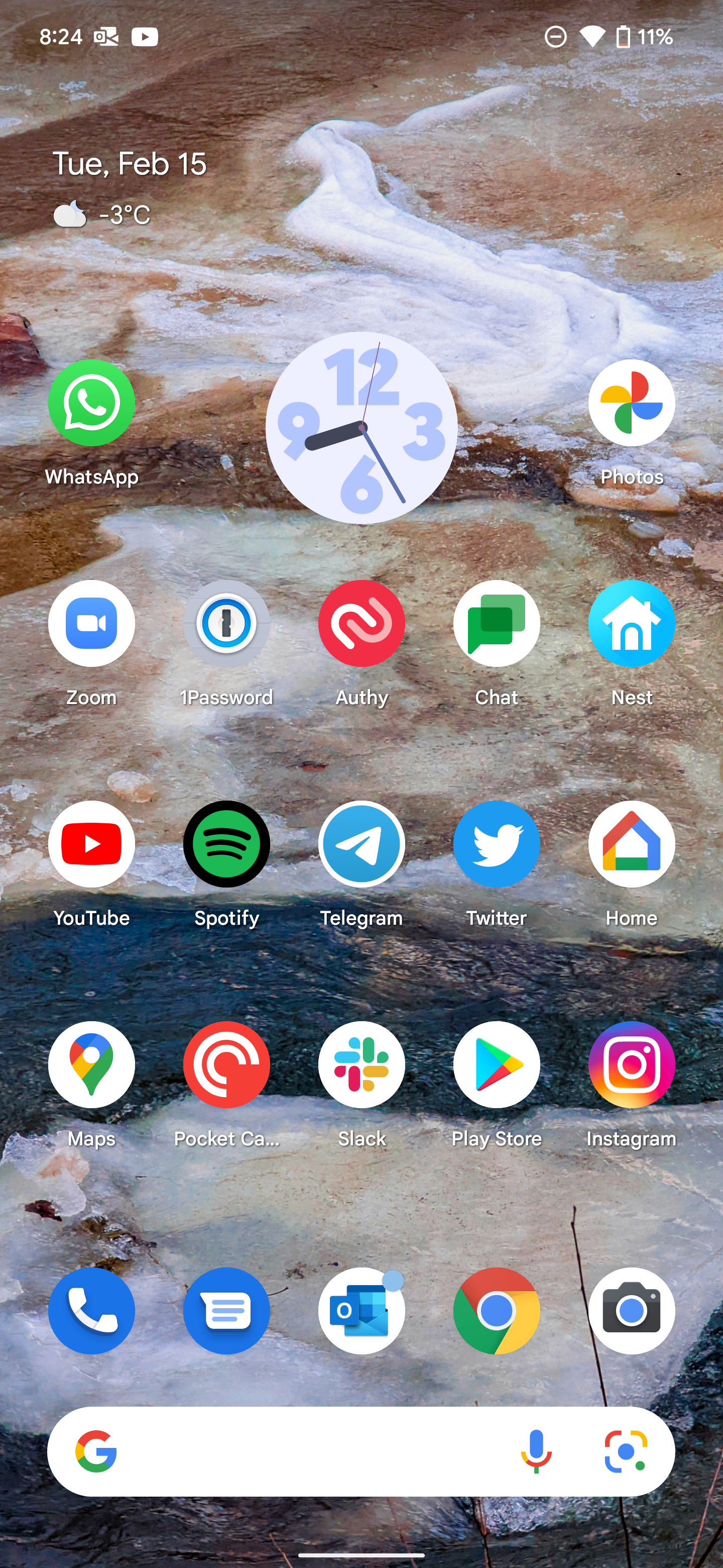
Google has just been spotted testing iOS-like update progress indicators. It's almost certainly a limited test (we don't have it, ourselves), but if you aren't familiar with the concept, that means Google is showing icons in the launcher for apps currently being updated or installed as grayed out, with a progress bar that indicates update progress and text that replaces the app name explaining what is currently happening.
Close crop of a larger screenshot of the update progress indicators. Image via XDA Developers. iOS for comparison below.
The feature is slightly different from iOS visually in using an exterior bar progress bar that follows the edge of the icon rather than an interior circular/pie progress bar. It also seems to be picking up on system accent color cues, based on the examples we've seen. Like iOS, though, it grays out the app icon during the update process, and text beneath the app icon is replaced with a description of the current update action.
Video of the feature triggered for newly-installed apps, via XDA Developers.
The indicator also shows up for newly installed apps if you have your launcher configured to dump them on your homescreen, where they'll appear as grayed-out with the progress indicator and label until they're installed.
We should also point out that Android also already does something similar for apps when restoring them from backups during the device setup process, showing apps from your home screen layout backup as grayed out before they are installed. Although that has a similar progress indicator that also follows the icon shape, it doesn't do the label replacement as this newly spotted feature does:
The report comes from a Pixel 5 running the Android 12 Beta 1 with the Pixel launcher and a fairly recent version of the Play Store. It isn't clear specifically what apps or app versions this test might be tied to — it could be an Android 12 feature or something else, and we probably won't be sure until more reports of the change land or it rolls out more widely. Google is known to do extensive Play Store A/B tests, and we might see this come and go in various forms over the next several months.
It's also not the first iOS "inspired" tweak Google would have made to the Play Store or app update process. A big new redesign rolled out widely back in April after months of testing that hid the items previously in the sidebar inside the profile icon menu instead, more similar to how Apple has the App Store UI laid out on iOS. That means updating apps manually in the new Play Store layout requires navigating into that profile picture menu, as on iPhones and iPads.
UPDATE: 2022/02/15 20:29 EST BY DANIEL BADER
As part of the latest Google Play Services update, these app install indicators are rolling out widely
It took nine months to go from a test in the Android 12 beta to widely rolling out to all users running Android 11+, but the app installation indicators first mentioned in May 2021 are now available for many Android users. The


As tipped by former AP owner, Artem Russakovskii, the feature works when you have the "Add new apps to Home screen" feature enabled, which can be enabled manually on most home screen launchers. We tested it on the Pixel Launcher and One UI launcher. In both cases, a greyed-out box of the app appears in its eventual shape with the words "Downloading," and then "Installing," before finishing up. You'll see the word "Pending" on queued-up app installs, since the Play Store only installs one app at a time.
The rollout appears to be part of the February 2022 Google Play Services update.

