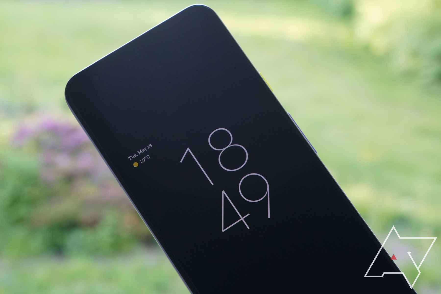
Welcome to the first beta of Android 12! Your official greeting is a big ol' digital clock, front and center on your Pixel's lock screen.
The old scheme (left) used a thinner font for the time at double the size when a calendar reminder was absent
The new emphasis on time, with the hour digits and minute digits on separate lines, contrasts significantly from past versions of Android where the digital time is shown on one line in a reserved size. Those who use a 12-hour display may find the leading zero a disappointing surprise — we saw a version of this look in an earlier developer preview. The calendar reminder gets shifted around, too.
Things change when you start piling up notifications. The time is now a proper single-line readout as it moves above the calendar reminder and becomes left-justified. You may also notice the pale blue shade on the numbers that was thrown about in earlier developer previews for Android 12.
For the always-on display, the layouts generally remain the same respective to whether notifications are available. Notifications, as they have before, are now indicated by icons.
As of now, users cannot customize the look of the clock in the Styles & Wallpapers section of the settings. Changes to the lock screen clock have been bubbling for the past few beta cycles as part of what we now know to be the Material You revision.
There are plenty of starts and stops to be had yet, so stick with Android Police and we'll help you keep track. Need help loading Android 12 onto your device? Find it here.

