Many of the new Material You UI changes that Google announced at I/O today are live in the first Android 12 Beta, which started rolling out just a short while ago. Not all of the new features are live just yet, but many of the "hidden" UI changes previously spotted in development are now public-facing.
Among the most easily visible changes are the reworked notification shade, which now shows just four quick settings toggles when unexpanded. Spacing for items has also been adjusted slightly ,and the separator between the quick-access toggles and notification section has been tweaked, as have corners: Notifications are much more rounded now.
The expanded quick settings menu has the chunky new brightness slider and switches to a two-row design that shows eight total toggles (on the devices we've seen it live on so far — it might vary). The edit button is still in the bottom left, but now it has a big icon surrounding it. Next to it appears to be an account switcher, and on the right is the fast access for Settings. As before, quick settings toggles include text that describes their state.
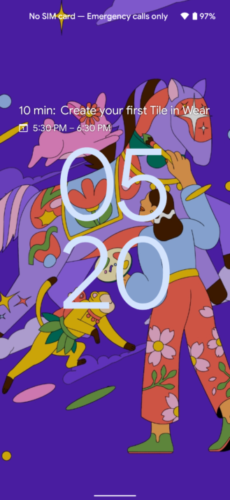
The new lock screen clock layout that leaked long before Android 12's first DP even landed is also live, though the ability to customize it isn't — and we expect that as well.
The "Monet" background-matching theme changes described during I/O don't seem to be live yet, and they're probably coming in a future release. Some of our readers trying out Beta 1 on the Pixel 3a have also observed that these visual changes aren't present yet. That happens every once in a while; for some reason, a beta or preview for a specific device doesn't have something that's available on the others. It will probably catch up with either a mid-release bug-fix update or Beta 2.


