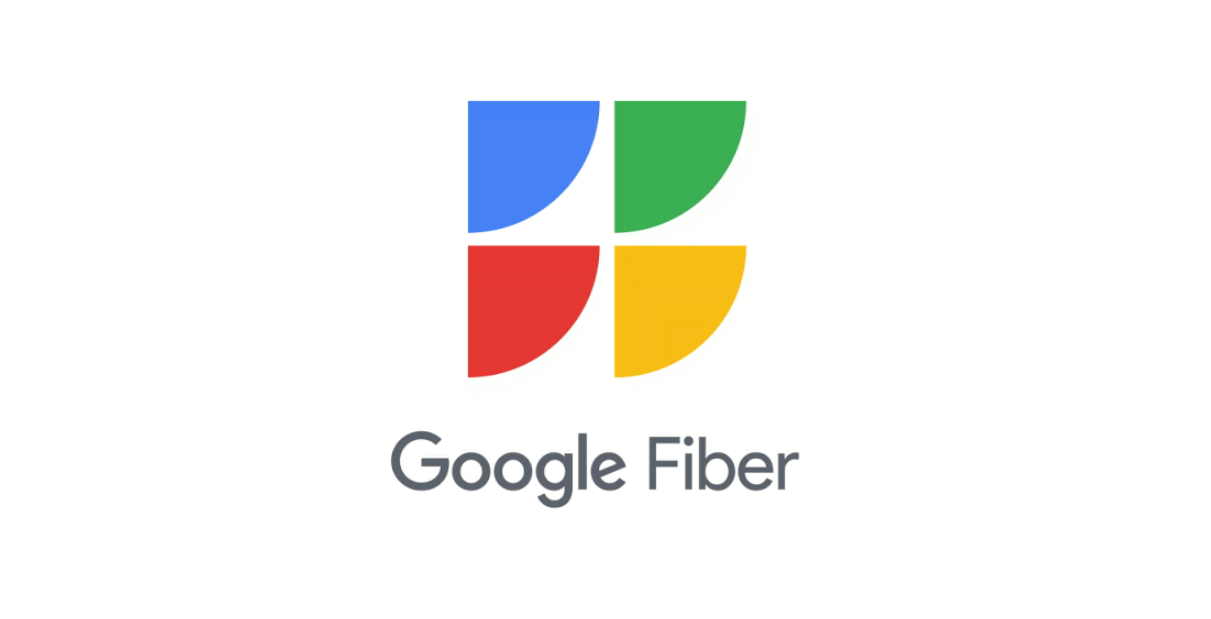
Above: The most recent text-only Fiber logo. Below: Prior imagery associated with Fiber.
Google claims that the new shapes "represent being fast, fairly priced, reliable, and open" among several other possibilities. Tech enthusiast literalists will probably see four tipped-over Wi-Fi symbols. And critics of the company's recent design language will almost certainly see them as simply another four-color geometric mess that's easily confused in a sea of all of Google's other four-color icons.
Google says the new logo will be used in ads and promotional materials, and though it isn't live on Fiber's site just yet, it is up at the @googlefiber Twitter account.
It remains to be seen if this new logo is tied to a broader marketing effort, or if we can anticipate any more consistency in regards to imagery going forward, but it is a curious thing for Google to be investing time, effort, and money into doing. After all, Fiber went years without expanding between 2017 and 2020, and the city of Louisville, Kentucky even lost access to Fiber. For a while, we thought the service might be toast. But in the last year or so, Google seems to have either remembered that Fiber is a thing or decided it's time to start investing in it again, as we've seen it hit two new cities: West Des Moines, Iowa and Millcreek, Utah. 2 gigabit service was also rolled out in some markets.
To date, Google Fiber is currently available in 19 different markets across the US, offering gigabit service for a mere $70 a month with no caps, plus mesh Wi-Fi hardware. As the US's defacto ISP monopolies continue to impose new ridiculous data caps while competition remains essentially non-existent in the majority of our markets, I just hope this new logo shows up in more places, whether I like it aesthetically or not.

