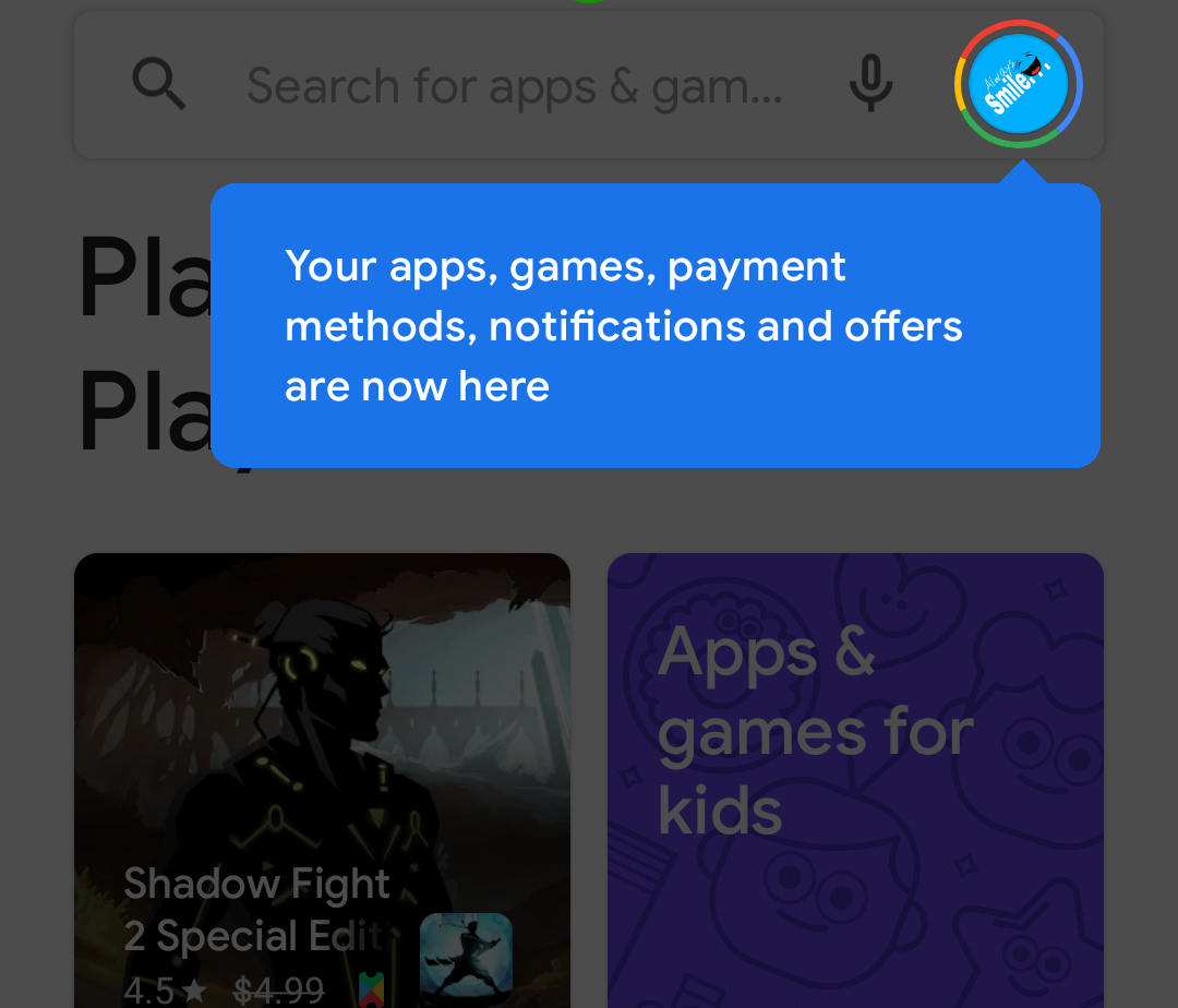
If you take a look at the Google Play Store on your phone today, you may notice things have shifted around a bit. A new version of the interface has been appearing for a small number of users over the last week or so, but seems to rolling out more quickly now. This slight shift to the UI gets rid of the familiar hamburger menu (the three horizontal bars that used to be on the left of the search bar at the top), and instead has you tapping on your Google profile icon to get to more of the non-obvious elements of the Store.
You'll know if you have the updated UI if you see the alert in the image above. To get to the items that were previously in the hamburger menu, tap your profile photo image in the upper-right. This will open a pop-up with most of the older items nested within, with a new header focusing on your account and Play Points. (Previously this pop-up only had account info.)
Left to right: old Play Store home page, old hamburger menu, new home page, centralized menu
The main link for Settings is near the bottom of this pop-up. Inside Settings things are divided a little more clearly now, broken down into expandable items for General, User Controls, Family, and About sections. All the old options seem to be in their usual places.
Left to right: old settings menu, new settings menu, new menu after "General" expanded
Search results are a little more robust, highlighting popular items for exact results with screenshots and app info without needing to tap on them. Other changes seem subtle, mostly focusing on larger, more eye-catching images over lists of app icons. And yeah, there are still plenty of advertised apps all over the interface.
Left to right: old search results, new search results, new app listing page
The updated UI seems to be rolling out in waves. We were able to force an update on several different phones by installing the latest version of the Play Store from APK Mirror, then force closing the app after it was opened.
Thanks: Aaron White, Eduardo Ribeiro, Mosh E, and others

