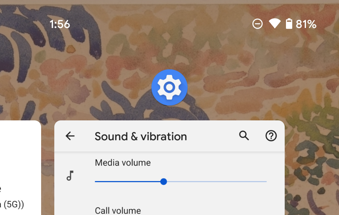
Among the other changes hiding in Android 12 are a handful of tweaks to the app switcher/multitasking menu/recents menu. It's subtle, but Google has moved the app icon so that it no longer covers your view of the app itself. The currently selected app also now has the same vertical height as the stashed previews to the left and right, and your view of the app is just slightly smaller than before.
Left: Android 12 DP1. Right: Android 12 DP2.
More easily visible in the direct pair of examples above, DP2 gives you a slightly smaller view of the currently selected app in the multitasking menu. The app icon that previously overlapped the top of that view has been moved up. Tapping it still brings up the same menu for app info, split-screen mode, and app pausing (visible below), but with slightly less padding for the section with the app name. Your view of apps to the left and right in the menu is also just slightly larger, matching the vertical height of the selected app itself.
Left: Android 11, for context. Middle Android 11 with the app icon menu open. Right: Android 12 DP1 with the app icon menu open.
Google may yet further adjust this in later releases as well. Not an Android release seems to go by that the multitasking menu doesn't get changed at least a little. Last year we picked up that screenshot button, Android 10 added visual changes for Digital Wellbeing timers, and Android 9 gave us that useful image and text selection feature. And each change has been accompanied by other minor visual tweaks over the years.

