We may have just caught our first glimpse of Android 12. A handful of images purported to be screenshots that illustrate features in the next release have been published by XDA Developers, originating from what is reportedly an early draft of an internal Google document. They indicate bigger visual changes than we might have expected, plus a long-awaited privacy feature that's been under development since Android 10 Q, and which iOS got just last year.
Before going any further, I should note: XDA Developers could not explicitly confirm the authenticity of the images, which may be screenshots or mockups. However, Android Police can confirm that some details in these screenshots match both our expectations for some upcoming features and other generally non-public information we have regarding Android 12. Details that XDA has shared with us but not published regarding the document that the images originate from also sound legitimate. In short, XDA is confident they're real, and based on certain details, so are we.
Behold:
While these images may be affected by a theme, which we expect Android 12 to roll out enhanced support for, they depict a very beige color scheme. Gone is stock Android's normal transparency, and though notifications still separate conversations into their own higher-priority group, they have been visually tweaked to sport much more rounded corners and what appears to be slightly more white space.
The number of Quick Settings tiles has been reduced to four (hopefully pulling it down shows more than four), and the tile icons themselves are bigger. At the top, you can also see the clock and date have swapped positions. But most importantly, you can also spot the new privacy indicators expected to debut with Android 12 — similar in both color and functionality to iOS, but Google's version sounds like it could be a little more useful.


Android 12's privacy indicators.
Unlike Apple's indicators, Google's clearly show if either the camera or microphone is being accessed with both an icon rather than only a colored dot. However, they do appear to collapse into dots under certain circumstances. Based on the screenshots above, it further one-ups Apple's implementation by also allowing you quickly and easily see a list of the apps accessing them — there's no tedious digging through settings to try to figure it out. We aren't sure if that's via a direct tap or something nested into the notification shade, though the image shows the latter.
Google's been working on this feature since Android Q, and a leaked Android 10 GSI from 2019 even had it, though it didn't appear in the final release.


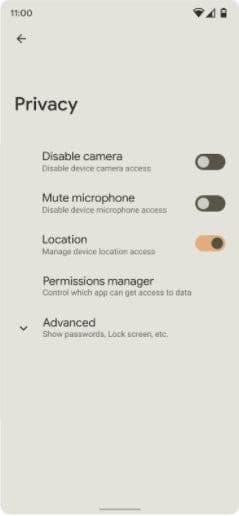
Left: Sorry for the resolution on the Privacy settings image. Center/right: More privacy indicators.
Tweaks to the basic Privacy settings menu are also apparently planned. While the image could merely be a guideline, it depicts a trimmed-down menu that hides more details in an "Advanced" overflow section, with new options to outright disable the microphone, camera, and location.


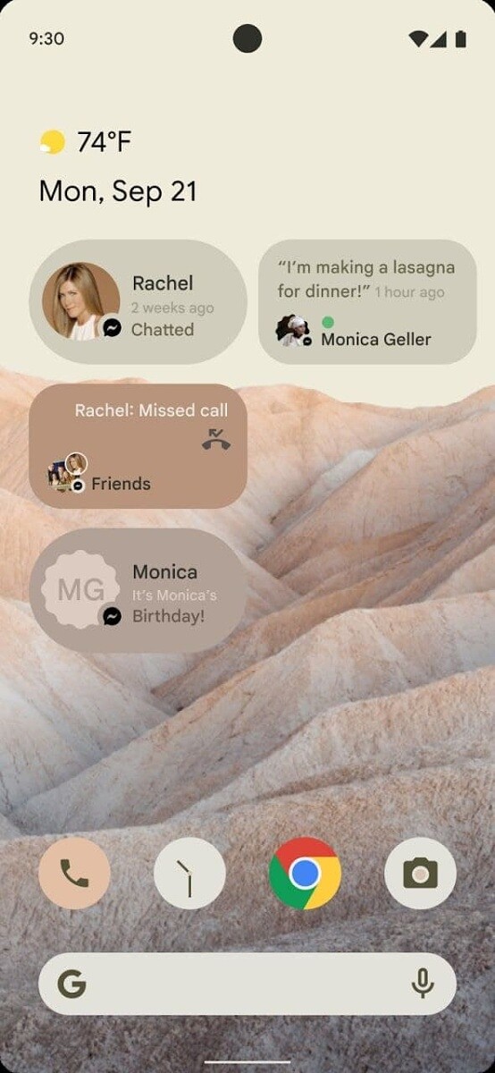
Android 12's Conversation widget.
Some of the images depict a new "conversations" widget, which states it will show "recent messages, missed calls, or activity statuses," though the image of it in action on a launcher also shows a birthday notification. There could be other functionality as well. This new Conversations widget seems to build upon the previous breakout of conversations into their own notification section in Android 11.
Curiously, the Friends-themed example has clear Facebook Messenger iconography, which may indicate it could do more than just scrape notifications — perhaps opening up new APIs for better integration with third-party messaging services, as we saw last year with the notification bubbles.
Details in the document acquired by XDA Developers indicate that Google will outright mandate the new privacy indicators in Android 12, prominently shown at the top of the screen and always visible when either the camera or microphone is being accessed, in the colors depicted.
I expect these images will prove polarizing among our audience. Already we're of a mixed opinion regarding the overall look internally, and the knee-jerk reaction to both the features and visual changes could bring iOS or OneUI to mind. However, it's worth pointing out that these privacy indicators have been described in development for several years — longer than iOS has had them. But while there's more to Apple's design schema than increased padding, big rounded corners, and generally reduced density, it does bear a resemblance.
Source: XDA Developers